
2 Minutes Read
Listen to the Blog
Choosing the right font and size is crucial for readability.
1. Why Typography Matters in UI Design
Typography does more than make text legible. It communicates hierarchy, brand personality, and guides users through your interface.
- Headings signal importance and structure
- Body text ensures readability
- Captions and labels provide context without clutter
Tip: Good typography creates a flow that guides users naturally from one element to another.
2. Adding Text in Figma
- Press T to select the Text Tool.
- Click anywhere on the canvas to add a text layer.
- Type your content and adjust font, size, weight, and color in the right-hand Properties panel.

Tip: Use real content instead of Lorem Ipsum to better visualize hierarchy and spacing.
3. Choosing the Right Font
- Stick to 2–3 fonts maximum per project for clarity
- Use sans-serif fonts for modern UI and serif fonts for editorial or formal designs.
- Consider readability on small screens and accessibility (contrast and size).
You can access Google Fonts directly in Figma, or import custom fonts for brand consistency.
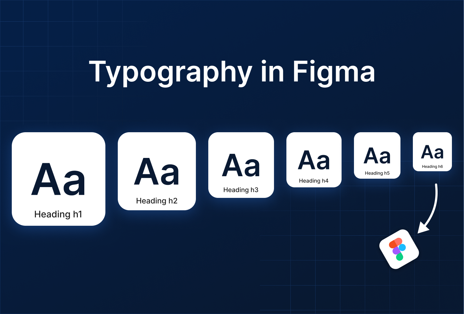
4. Creating Text Styles
Text Styles in Figma allow you to standardize typography across your file.
How to create a Text Style:
- Select a text layer.
- Set the Font, Weight, Size, Line Height, Letter Spacing, and Color.
- Click Style icon (••••) Create style.
- Name it clearly, e.g., Heading / H1 / Bold, Body / Regular / 16px.

Now, updating a Text Style will automatically update all layers using it.
Suggested Text Style System:
- Headings: H1, H2, H3
- Body text: Regular 14–16px
- Captions/Labels: Small 12px
- Buttons/CTAs: Medium 14–16px, bold
5. Applying Text Styles to Layers
- Select any text → Apply a Text Style from the right-hand panel.
- Use consistent line height and spacing to maintain readability.
- Combine with Color Styles for cohesive UI.
Tip: Use Auto Layout to ensure text spacing adjusts naturally as you resize buttons or cards.
6. Scaling and Hierarchy
Typography is more than font choice, it’s about visual hierarchy.
- Make headings clearly larger than body text.
- Use bold or semi-bold weights for emphasis.
- Maintain consistent spacing between sections.
Proper hierarchy ensures users scan your UI naturally and know which actions are most important.


%201.png?width=1016&height=912&name=image%20(54)%201.png)