

2 Minutes Read
Listen to the Blog
Design systems keep your UI consistent.
1. Why Design Systems Matter
A design system is a collection of reusable components, styles, and guidelines that ensures:
- Consistency: Same look and feel across screens and projects
- Efficiency: Reduce repeated work and speed up design
- Scalability: Easily update components across multiple projects
- Collaboration: Team members work with a single source of truth
Tip: Think of a design system as the backbone of your product’s UI — it maintains order while scaling.
2. Key Elements of a Design System
- Color Styles
- Primary, Secondary, Accent, Background, Text colors
- Apply consistently across components
- Typography Styles
- Headings, body text, captions, buttons
- Use Text Styles in Figma for easy updates
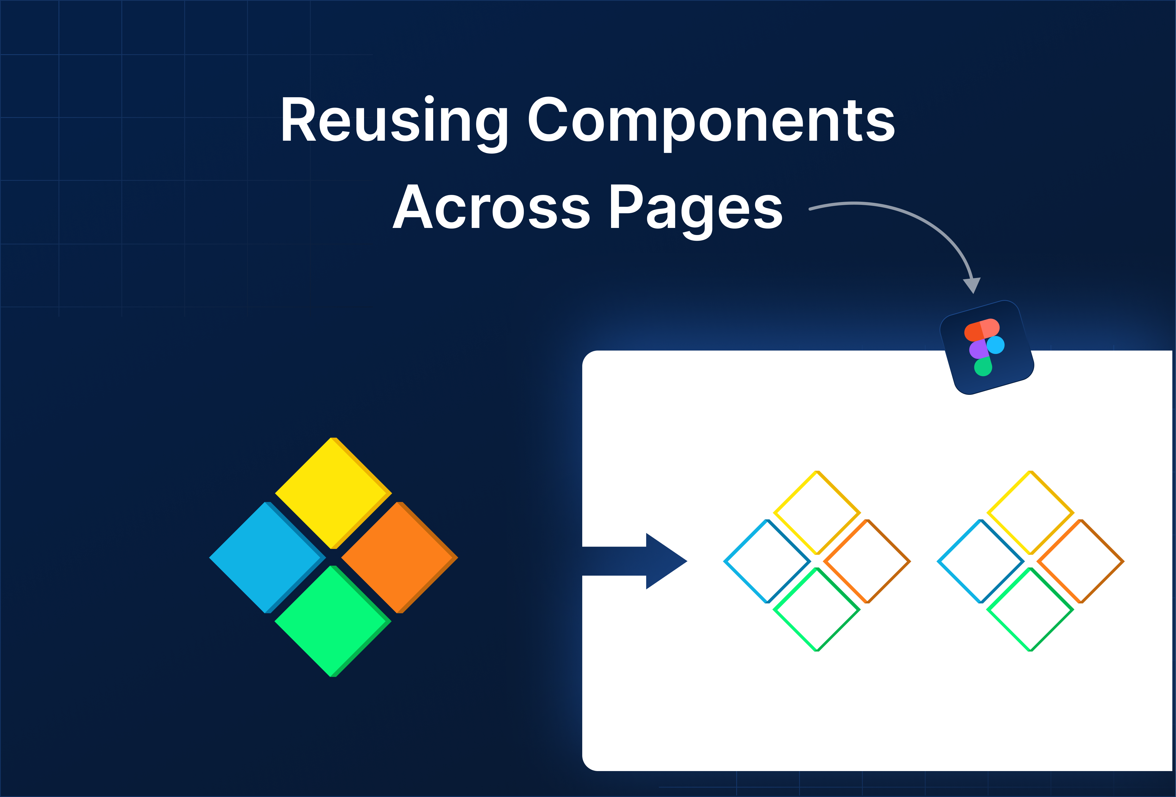
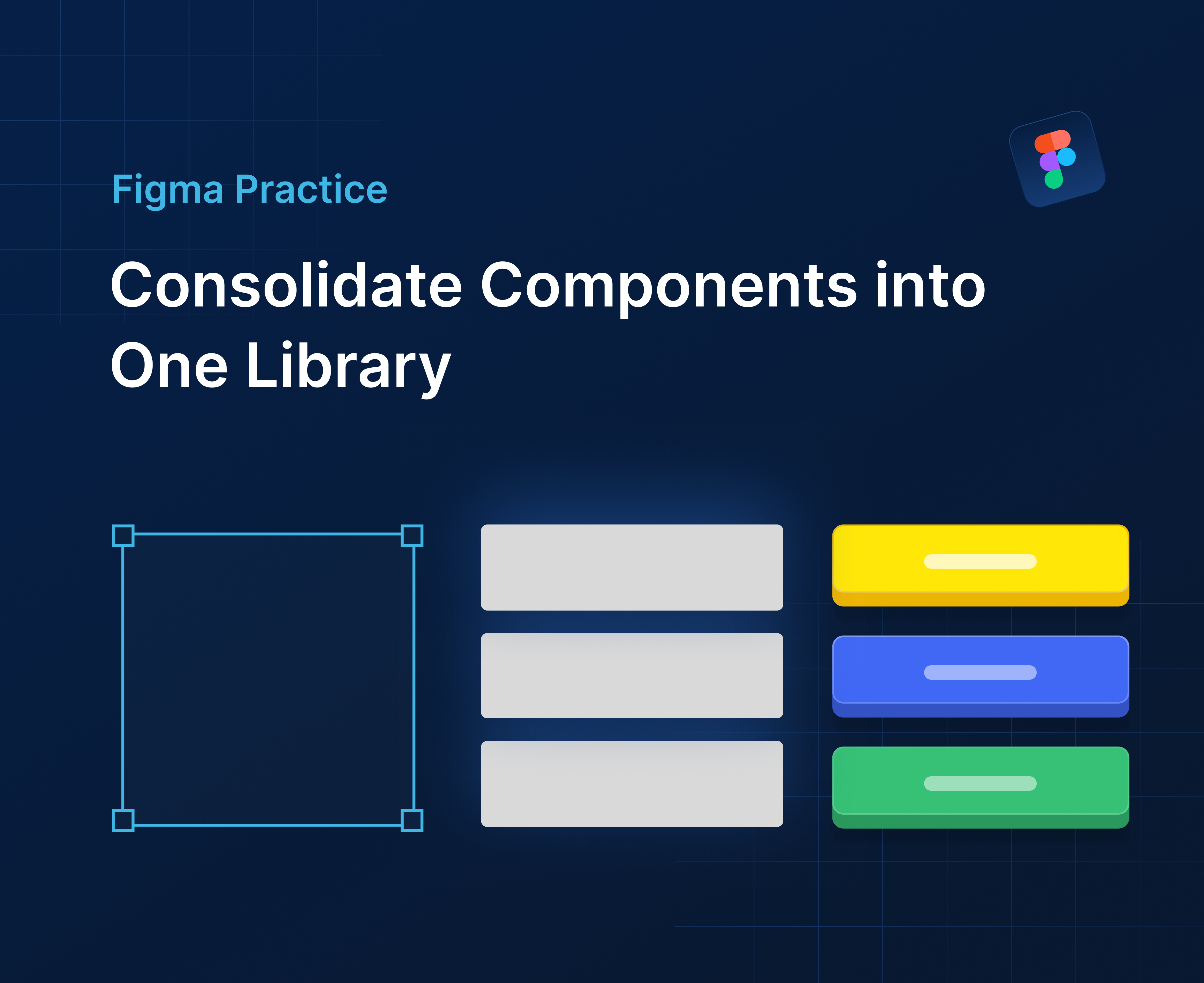
- Components
- Buttons, Cards, Forms, Navigation, Icons
- Create reusable components and variants
- Spacing & Layout
- Grids, padding, margins, and Auto Layout guidelines
- Maintain alignment and consistency
- Interactive Guidelines
- States: Hover, Active, Disabled
- Use Variants and Component Properties
3. Creating Your Design System
- Set up a dedicated Figma file: Name it clearly (e.g.,
Design System 2025). - Define color and text styles: Use consistent naming conventions.
- Build components: Buttons, cards, forms, navbars with proper variants.
- Organize pages: Group by category (Colors, Typography, Components, Layout).
- Document guidelines: Include usage rules, spacing, and accessibility notes.
- Publish as a Team Library: Enable sharing for all projects.

Tip: Regularly update the library to reflect product changes and maintain consistency.
4. Practical Examples
Example 1: Buttons
- Primary and Secondary buttons with hover and disabled states
- Update master → all instances across projects update automatically
Example 2: Card Components
- Product cards with images, titles, prices, and buttons
- Nested Auto Layout + Variants for responsive and scalable use
Example 3: Navigation
- Navbar component with multiple states
- Consistent across all pages
A design system ensures every element is predictable, reusable, and scalable.


%201.png?width=1016&height=912&name=image%20(54)%201.png)