


Blog
Figma Practice: Consolidate Components in One Library for Scalable UI
UX/UI Marketing Specialist
Listen to the Blog
Bring all components, variants, and styles together for a scalable Figma design system.
1. Why Consolidate Components
Consolidating components into a single library ensures:
- Consistency: One master source for buttons, cards, forms, and UI elements
- Efficiency: Designers and developers can use the same elements across multiple projects
- Scalability: Easier updates and maintenance as the design system grows
- Team Collaboration: Shared libraries improve workflow across design teams
Tip: Treat your library as the “single source of truth” for your UI system.
2. Steps to Consolidate Components
- Audit existing components:
- Identify duplicate, outdated, or unused components across files.
- Create a new Figma file:
- Name it clearly (e.g.,
UI Library 2025).
- Name it clearly (e.g.,
- Copy components:
- Bring buttons, cards, forms, navbars, icons, and other reusable elements into this file.
- Organize components:
- Use pages for categories (Buttons, Cards, Forms, Navigation, Icons).
- Name components hierarchically (
Category / Type / State).
- Create Variants & Component Properties:
- Combine multi-state elements into variants (e.g., Button → Default, Hover, Disabled).
- Apply Styles:
- Set up Text, Color, and Effects styles for consistent usage.
- Publish as Team Library:
- Assets → Publish Library → Share with your team.
Tip: Keep the library updated regularly to avoid outdated components in active projects.
3. Best Practices
- Use hierarchical naming: e.g.,
Buttons / Primary / Small / Default - Remove unused components: Keeps the library clean
- Group related elements: e.g., icons inside cards, buttons inside forms
- Document usage guidelines: Helps team members use components correctly
Well-organized libraries = faster design iterations + consistent, scalable UI.
UI/UX Designer and Marketing Specialist who combines creative design and strategy to craft engaging, conversion-driven user experiences. Passionate about clean, human-centered interfaces that deliver real results.
UX/UI Marketing Specialist
Related Post
You may also be interested in
-
Design System Basics in Figma: Keep Your UI Consistent
Design systems keep your UI consistent.
-
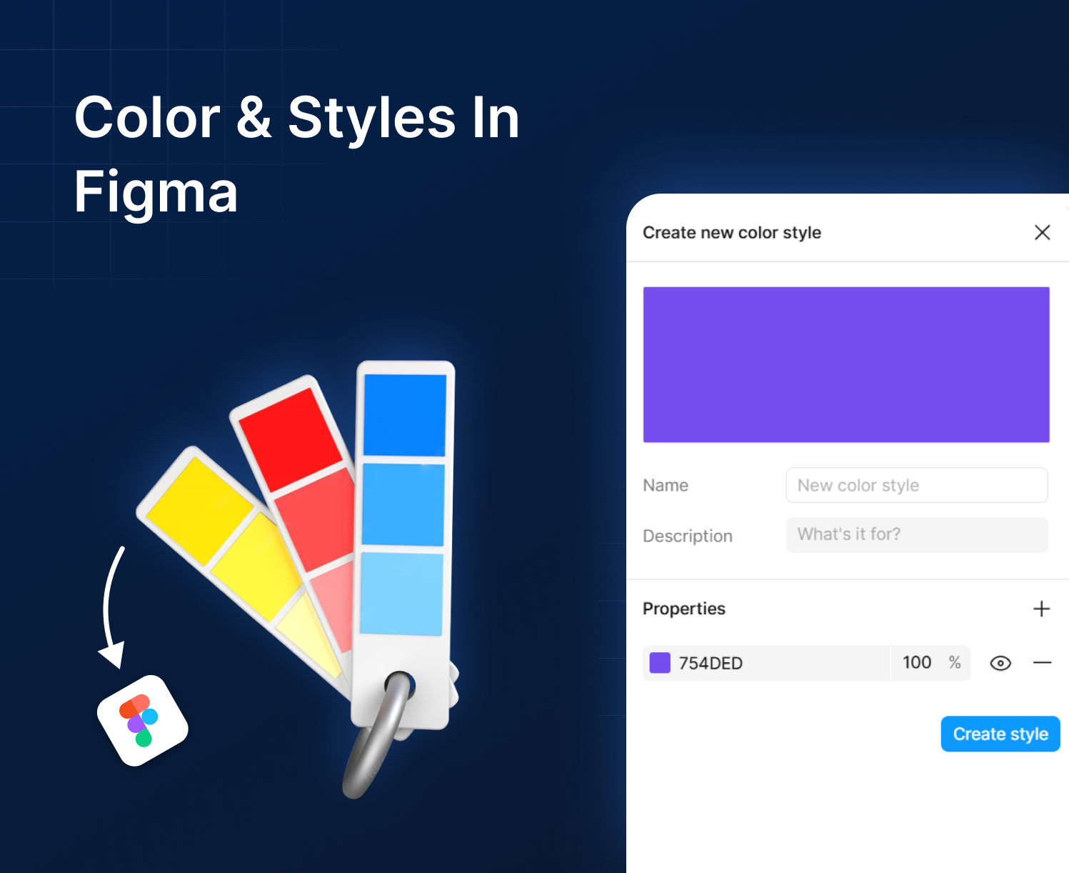
Understanding Color and Styles in Figma: Build a Scalable Design System
Color is more than decoration; it communicates brand and hierarchy.
-
Alignment, Grouping & Constraints in Figma: Flexible & Responsive UI
Keep elements flexible and responsive.