
.png)
2 Minutes Read
Listen to the Blog
Keep elements flexible and responsive.
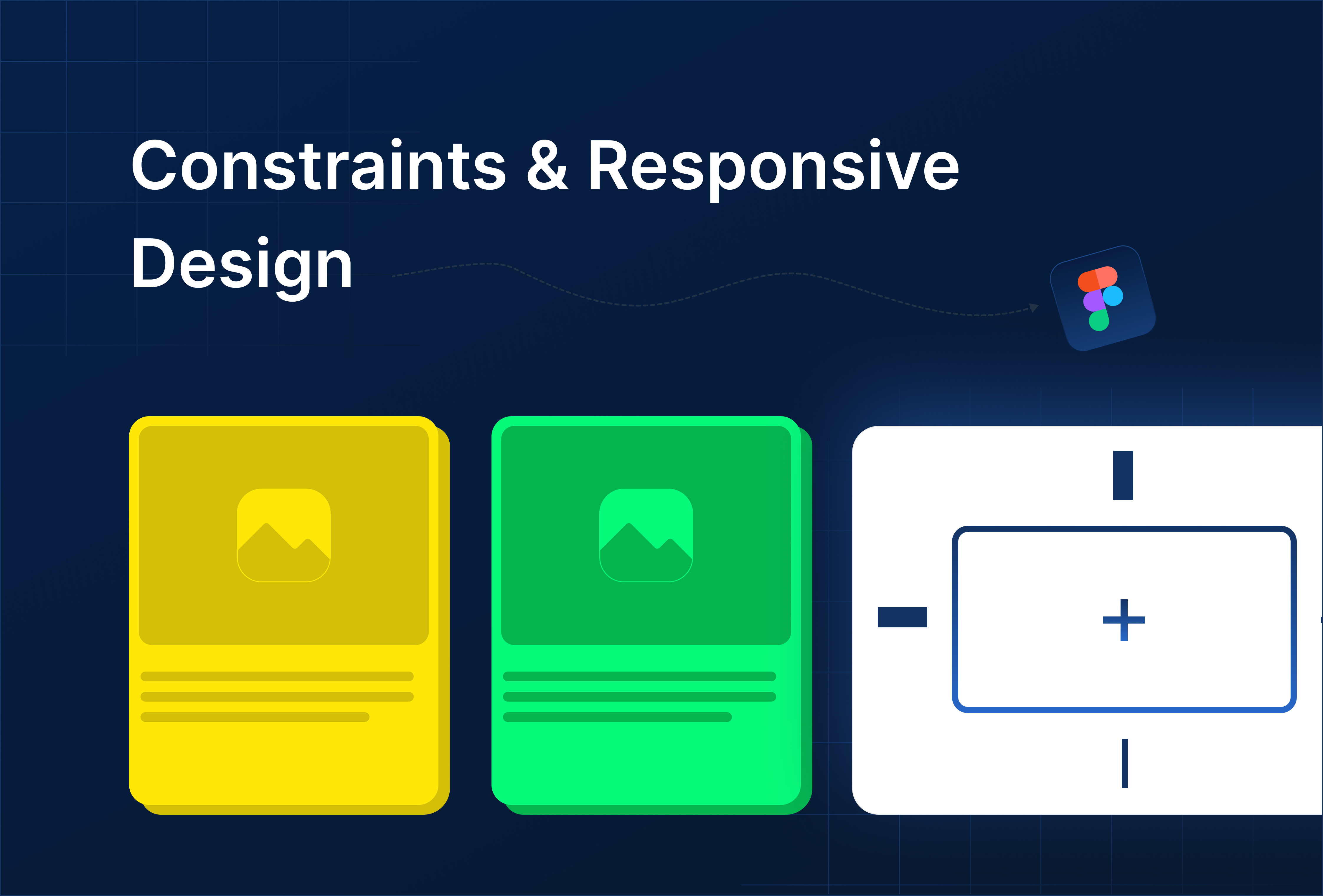
1. Why Alignment, Grouping, and Constraints Matter
Proper alignment, grouping, and constraints help you:
- Maintain clean and balanced layouts
- Make designs responsive to resizing frames
- Organize layers for easier editing and collaboration
- Reduce manual adjustments when updating UI
2. Alignment Basics
- Select multiple layers or objects.
- Use the alignment tools in the top bar (Left, Center, Right, Top, Middle, Bottom).
- Distribute elements evenly using Tidy Up (Shift + Alt + T).

3. Grouping Elements
- Group layers (Ctrl/Cmd + G) to manage multiple elements as a single unit
- Use Frames for better structure and responsiveness
- Name groups and frames logically (e.g., Header / Buttons, Card / Image + Text)

Proper grouping ensures your layout stays organized and makes it easier to apply constraints or auto layout later.
4. Using Constraints
Constraints define how elements behave when a frame resizes:
Select a layer → look for Constraints in the right-hand panel
Options:
- Left / Right / Top / Bottom / Center / Scale

Example:
- Button constrained to the bottom-right corner stays in that position when the frame resizes
- Image constrained to scale maintains aspect ratio
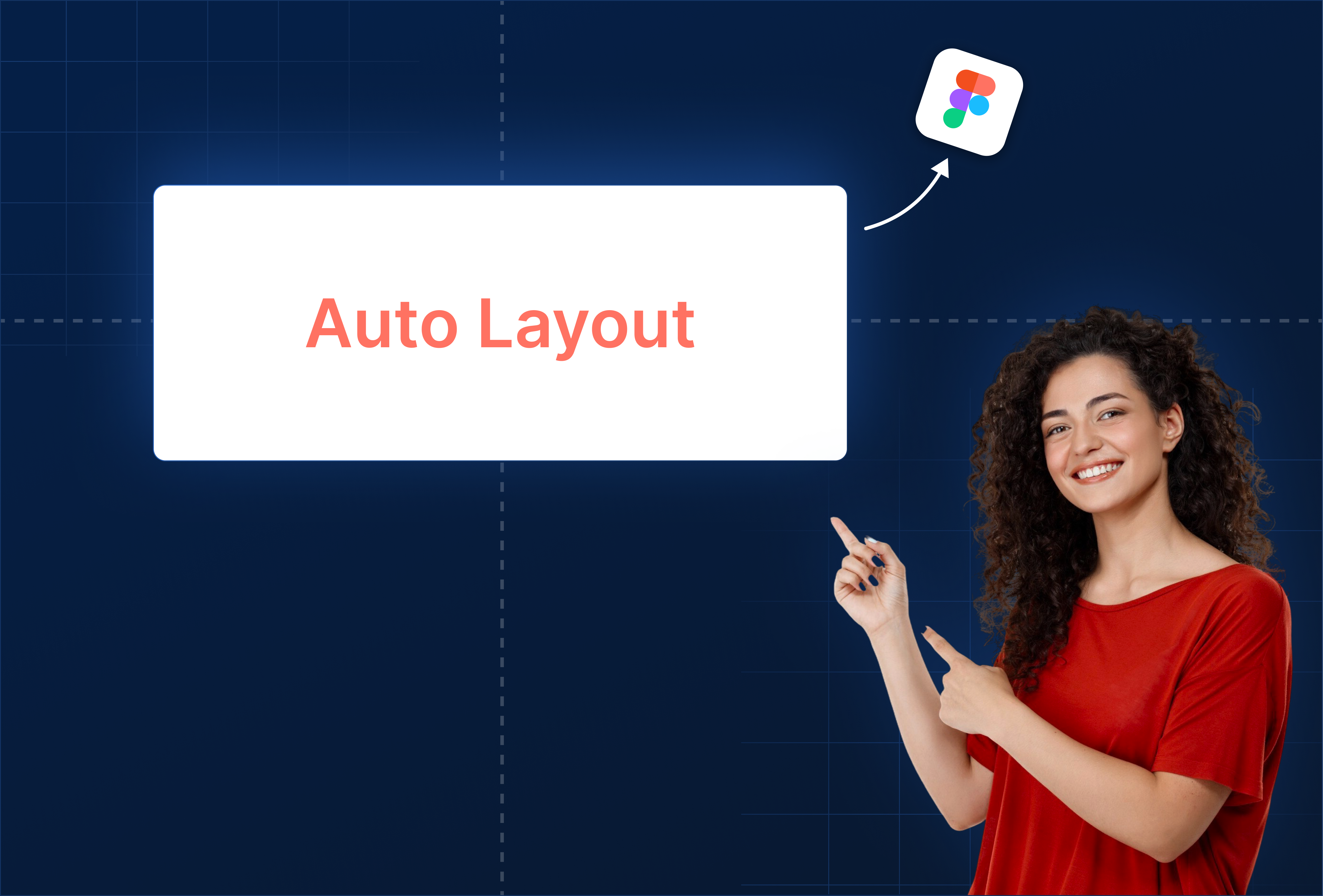
Tip: Combine constraints with auto layout for flexible, adaptive UI.
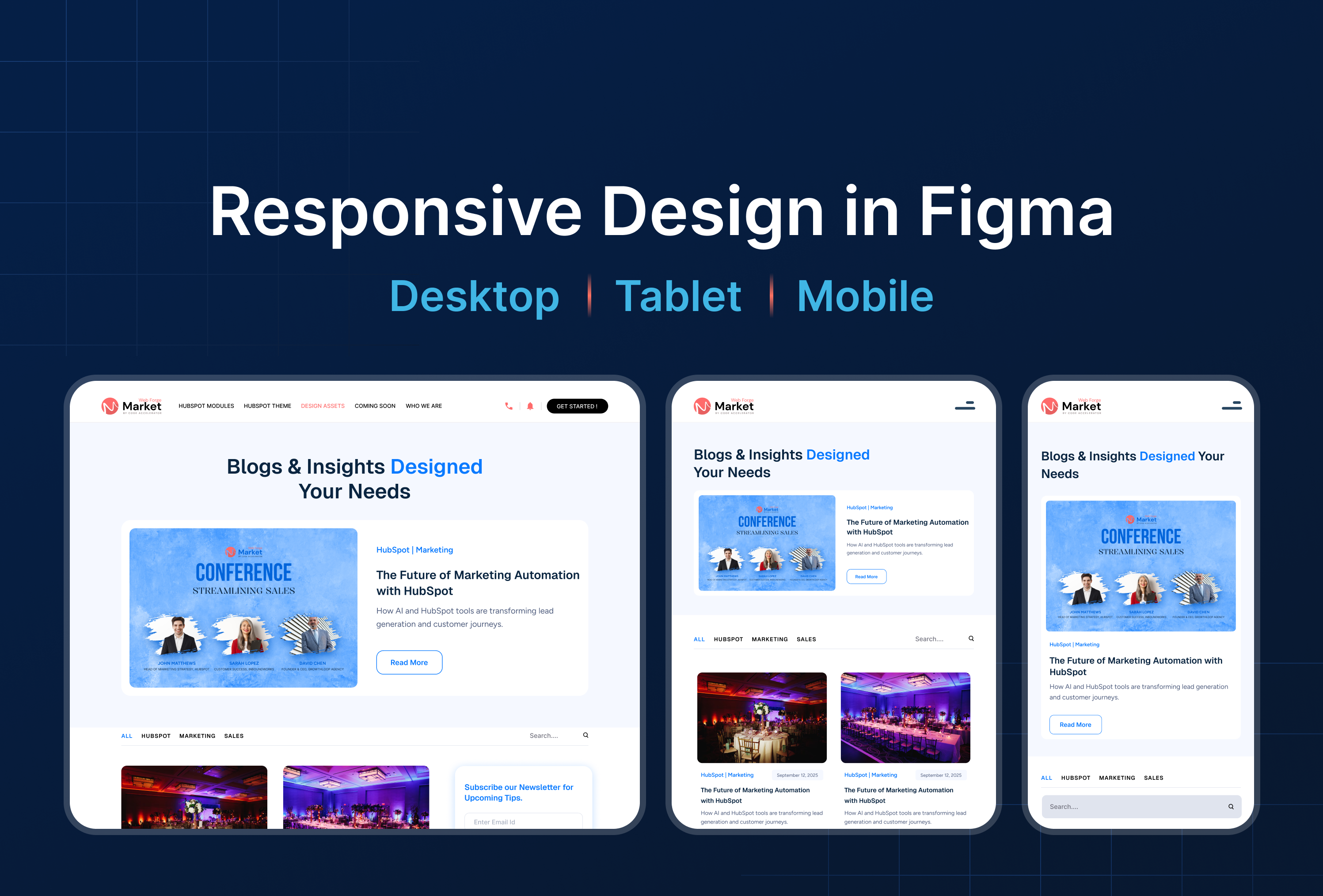
Practical Examples
Example 1: Responsive Header
- Group logo + menu items
- Align vertically and horizontally
- Constrain menu to the right, logo to the left → maintains layout on resize
Example 2: Card Component
- Image + text + button grouped
- Constraints applied to scale and stay aligned when frame changes
Example 3: Footer
- Icons aligned evenly using Tidy Up
- Constrain to bottom → always stays in place on different screen sizes


%201.png?width=1016&height=912&name=image%20(54)%201.png)