
2 Minutes Read
Listen to the Blog
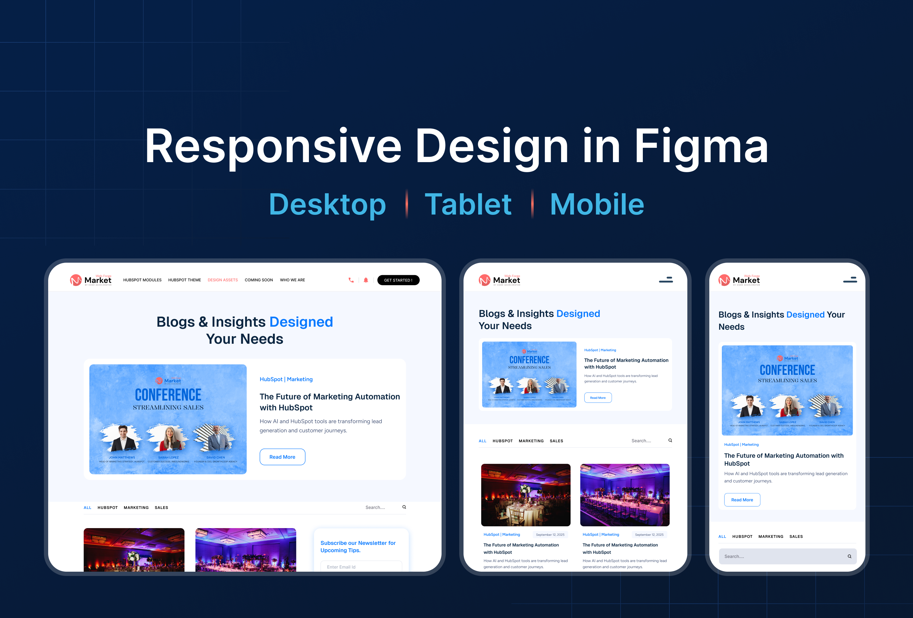
Design for desktop, tablet, and mobile screens.
Why Responsive Design Matters
Users access websites and apps on multiple devices desktop, tablet, and mobile.
Responsive design ensures:
✅ Consistency across devices : your UI adapts without breaking
✅ Better user experience : no horizontal scroll or clipped content
✅ Higher engagement : users can interact comfortably on any screen
✅ Faster development handoff : developers can implement layouts reliably
Goal: Build layouts that flex and scale naturally.
Set Up Frames for Multiple Devices
- Desktop: Start with a 1440px width frame
- Tablet: Create a 768px width frame
- Mobile: Create a 375px width frame

Tip: Use Figma Presets for quick frame sizes.
Use Auto Layout for Flexibility
Auto Layout allows elements to grow, shrink, and distribute evenly:
- Select a container >
Shift + A> Enable Auto Layout - Set direction: Vertical (column) or Horizontal (row)
- Adjust spacing, padding, and alignment

✅ Use “Fill Container” for buttons, cards, or images to expand dynamically.
✅ Combine with Constraints (Left, Right, Top, Bottom) to control responsiveness.
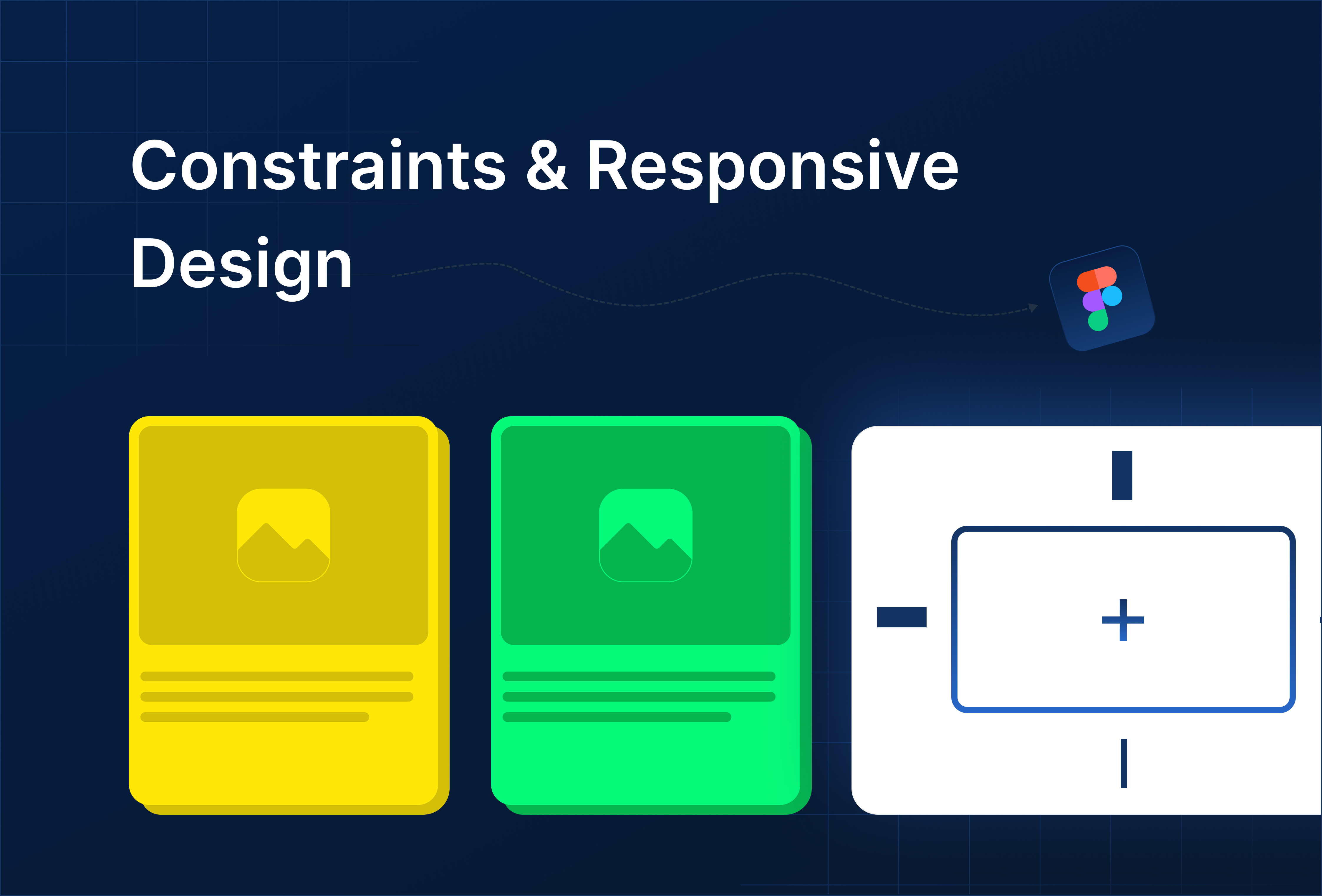
Constraints & Responsive Behavior
- Constraints define how an element reacts when the parent frame resizes.
- Common setups:
- Logo: Top Left (fixed position)
- Hero image: Top & left(stretch with frame)
- Buttons: Center (stay centered on resize)

Tip: Test responsiveness by dragging frame edges in Figma.
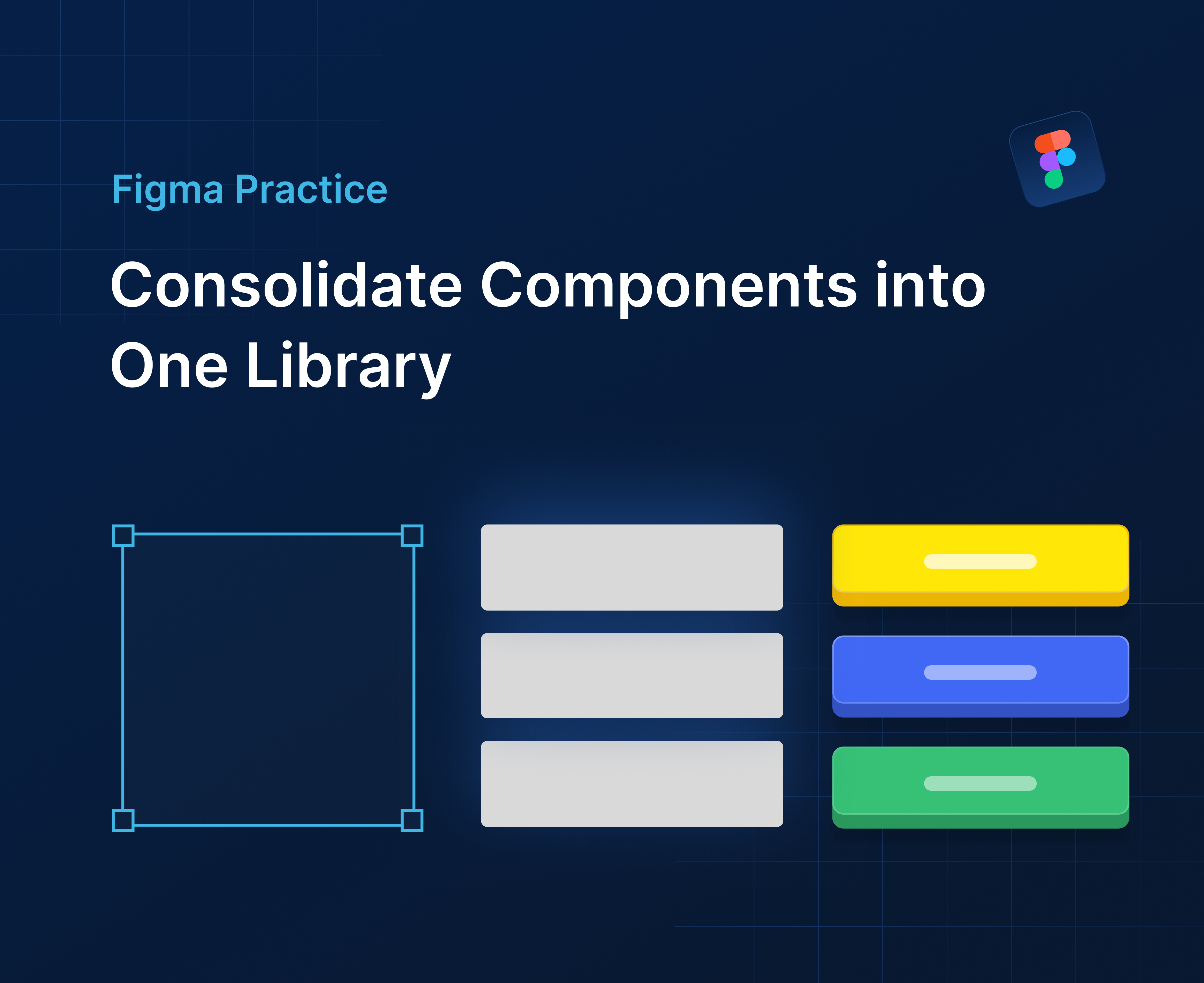
Responsive Components & Variants
- Create reusable components for buttons, cards, and headers.
- Use Variants to adjust layouts for desktop, tablet, and mobile.
- Example: A navigation menu might switch from horizontal (desktop) → hamburger menu (mobile).

Preview & Test
- Use Figma’s Mirror App to preview on mobile devices.
- Adjust frames and constraints until all layouts look good on every screen size.
- Combine with Smart Animate to see smooth transitions between layouts (optional).


%201.png?width=1016&height=912&name=image%20(54)%201.png)