
2 Minutes Read
Listen to the Blog
Grids help maintain balance and alignment.
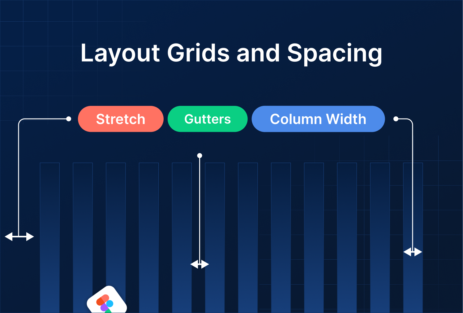
1. Why Layout Grids Matter
Layout grids provide structure to your design. They help you:
- Align elements consistently
- Maintain visual balance
- Build responsive designs
- Simplify handoff to developers
A well-structured grid makes even complex layouts feel clean and organized.
2. Adding Layout Grids in Figma
- Select a Frame (F) that will act as your artboard.
- Open the Layout Grid panel in the right sidebar.
- Click “+” to add a grid.
- Choose a grid type:
- Columns: Ideal for responsive web and content alignment
- Rows: Useful for vertical spacing
- Grid (square): Good for modular design
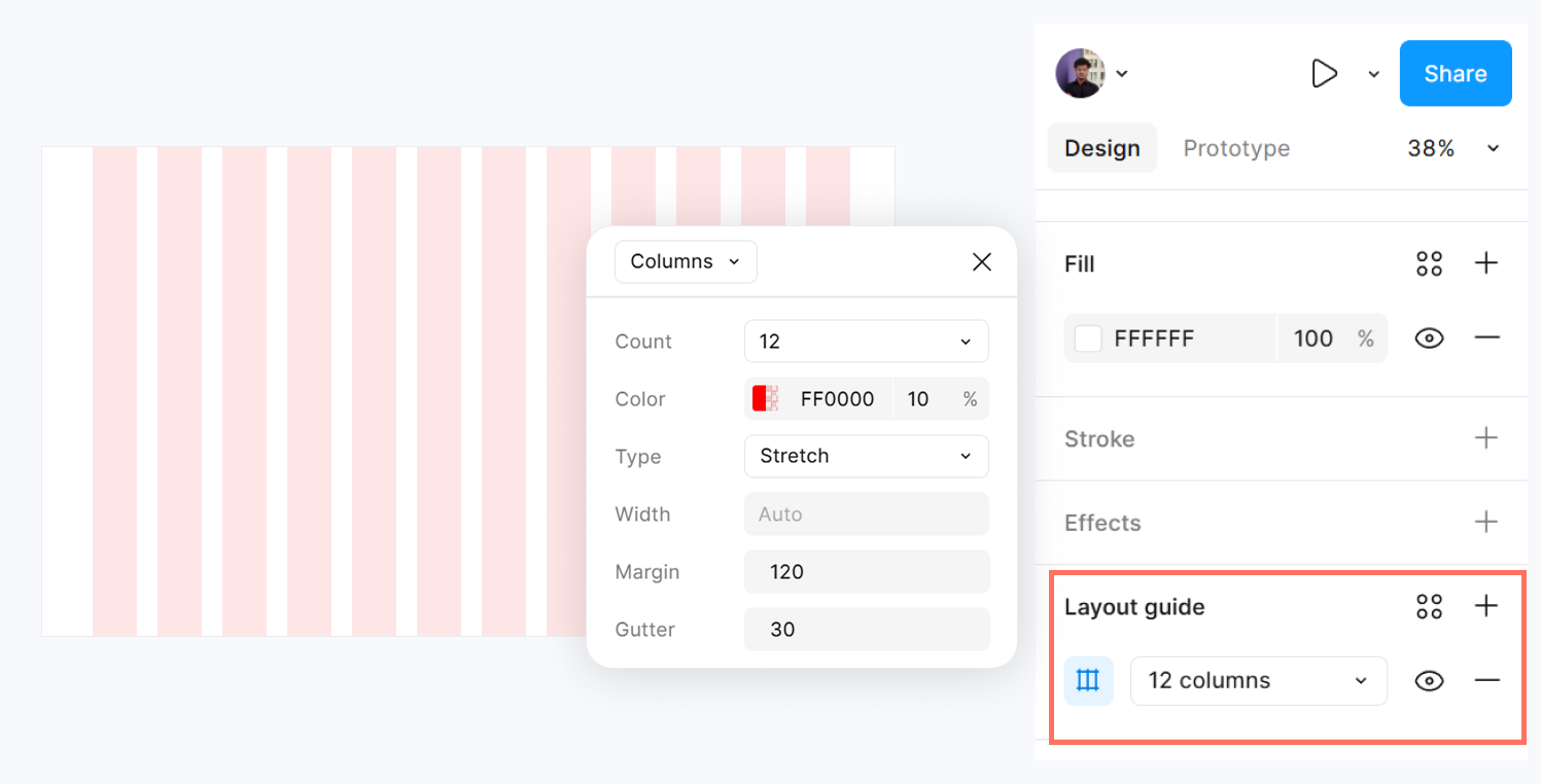
Adjust Count, Gutter, and Margin to match your design needs.
3. Spacing Between Elements
Consistent spacing improves readability and hierarchy.
- Use Smart Guides (View → Show Smart Guides) to snap objects to grid lines.
- Apply consistent padding inside frames.
- Use Auto Layout to automatically manage spacing between buttons, cards, and lists.
Example: Buttons inside a horizontal row with equal gaps using Auto Layout.
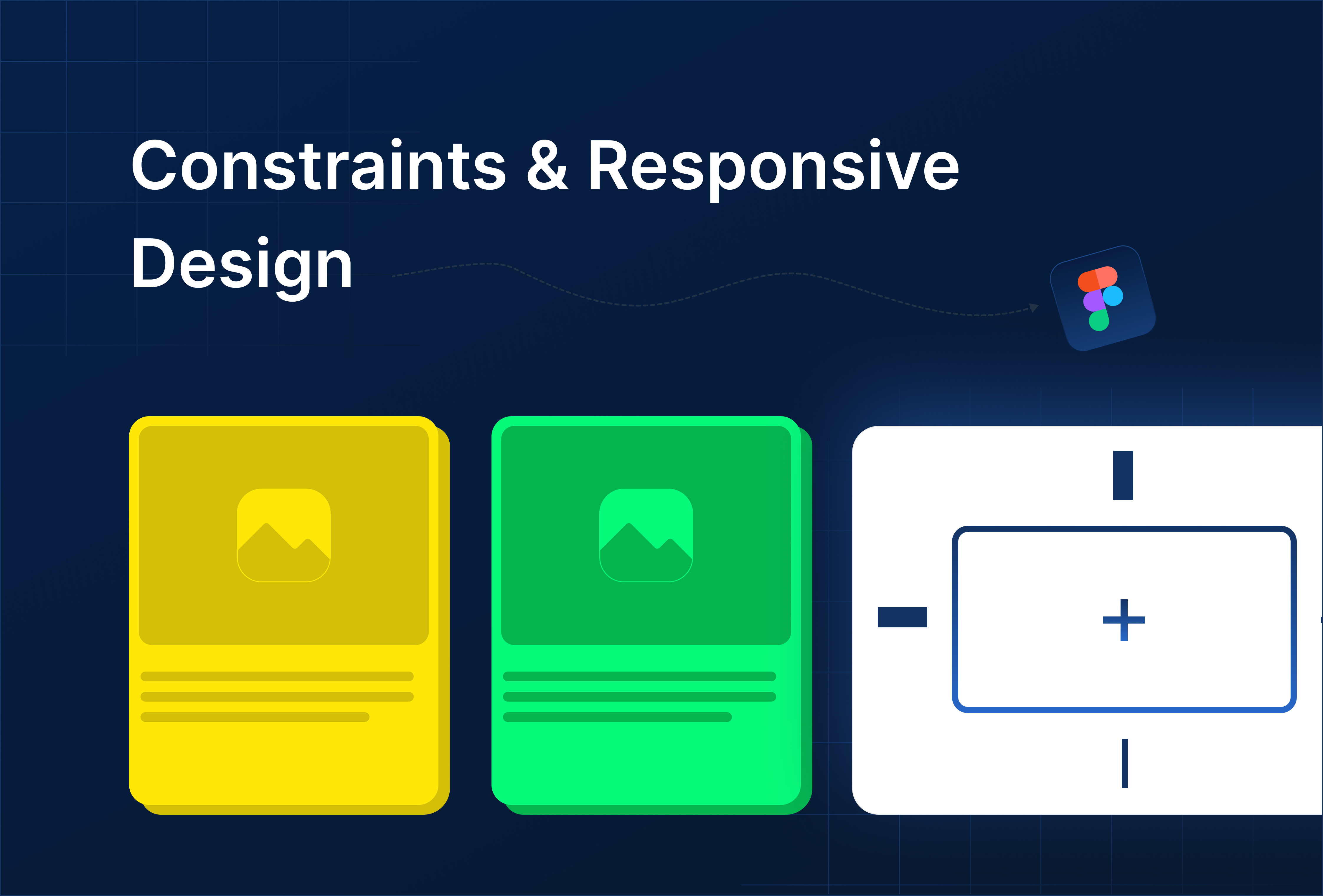
4. Responsive Grids
For responsive designs:
- Use Columns with Stretch or Left / Right alignment.
- Adjust Gutters and Margins based on screen size.
- Nest frames inside a parent frame to maintain consistent spacing when scaling.
Combine Grids + Auto Layout for dynamic, adaptive layouts that resize automatically.
.png)


%201.png?width=1016&height=912&name=image%20(54)%201.png)