
2 Minutes Read
Listen to the Blog
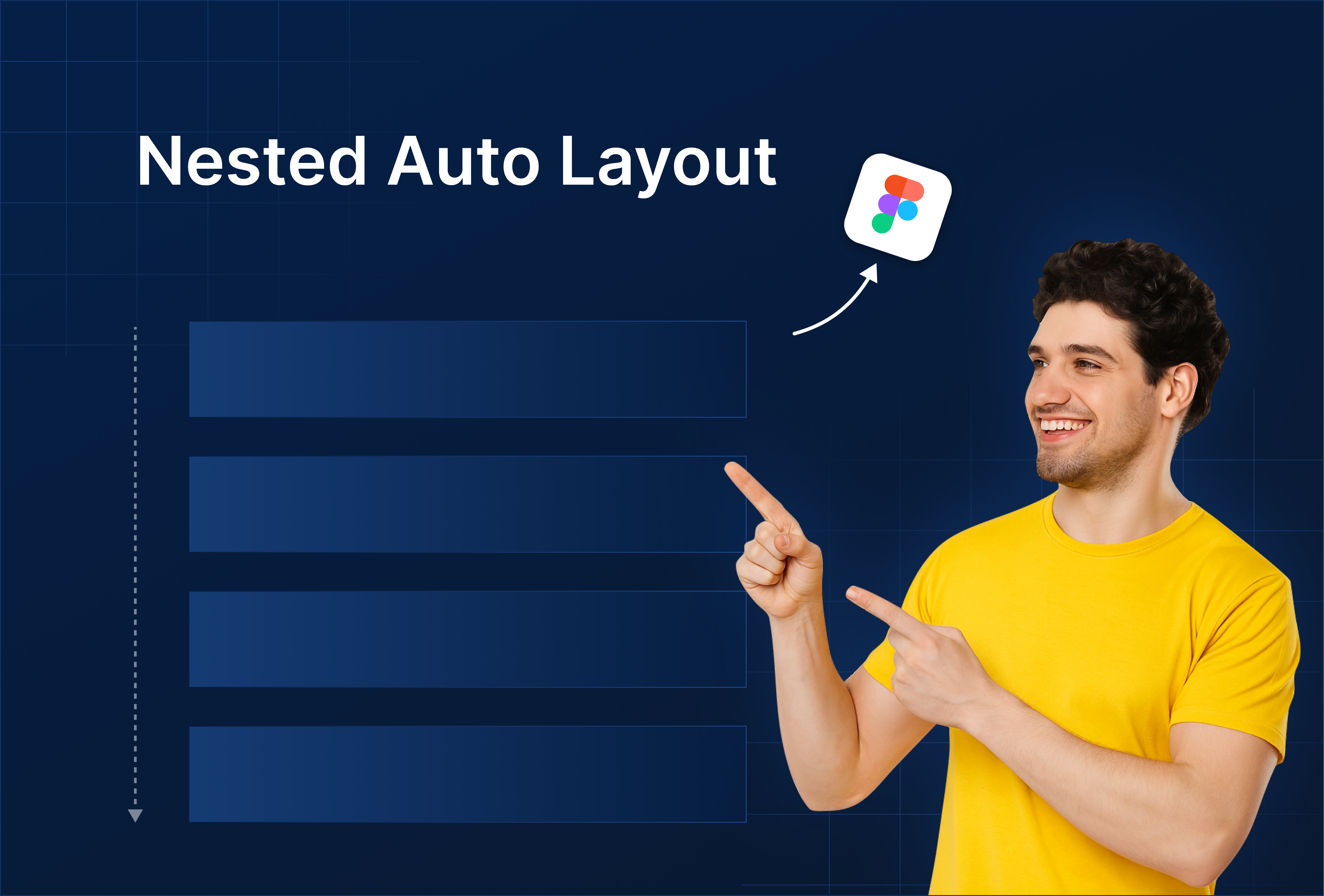
Stack components inside other stacks for complex layouts.
1. Why Nested Auto Layout Matters
Nested Auto Layout allows you to:
- Create complex, responsive UI components (cards, lists, headers, forms)
- Stack elements inside other stacks without manually adjusting spacing
- Maintain consistent alignment and padding across nested elements
- Save time when scaling or updating designs
Think of nested stacks as Russian dolls — each layer adapts automatically when inner elements change.
2. Creating a Nested Auto Layout
- Start with a frame and apply Auto Layout (Shift + A).
- Add multiple elements inside (e.g., image + text + Button).
- Select this frame and apply another Auto Layout to the parent container.
- Adjust spacing, padding, and alignment at each level.

Tip: Use vertical Auto Layout for lists and horizontal Auto Layout for buttons or inline items.
3. Practical Examples
Example 1: Card Component
- Inner stack: Icon + Heading + Subtext
- Outer stack: Multiple cards stacked vertically
- Resizing any text or icon automatically updates the card size and spacing.
Example 2: Form Layout
- Inner stack: Label + Input field
- Outer stack: Multiple form rows stacked vertically with consistent gaps
Example 3: Navbar
- Inner stack: Logo + Menu items
- Outer stack: Navbar aligned horizontally across screen width
Nested Auto Layout is key for scalable, reusable components.
4. Best Practices
- Name frames clearly (
Card / Header / Inner,Card / Outer) - Use consistent spacing in inner and outer stacks
- Combine with Text & Color Styles for consistency
- Test responsiveness by resizing parent frames
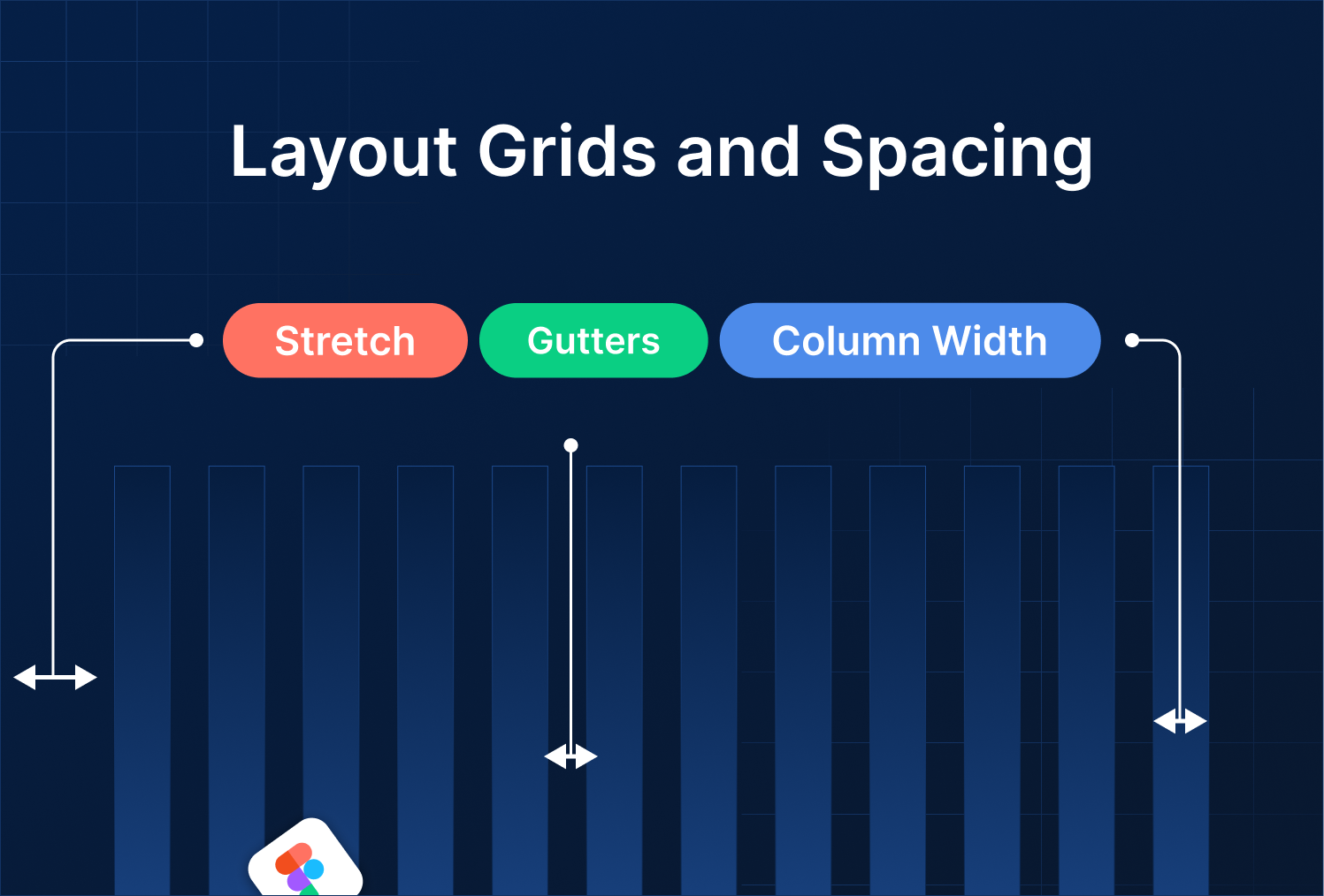
Tip: Nested stacks + Auto Layout + Layout Grids = fully responsive, pixel-perfect UI.

%201.png?width=1016&height=912&name=image%20(54)%201.png)