Listen to the Blog
Introduction
In our previous post, we covered the basics of Figma's Auto Layout and how it helps in creating responsive designs. Now, let's dive deeper into more advanced techniques, exploring how you can manage complex structures and pair Auto Layout with constraints to enhance your design workflow.
What is Advanced Auto Layout?
Advanced Auto Layout allows you to create dynamic, flexible designs that adapt to changes in content, screen sizes, or container dimensions. We'll explore how to build intricate layouts that maintain responsiveness and flexibility, especially when dealing with nested elements, multi-column layouts, and grids.
Using Auto Layout with Complex Structures
- Working with Multi-Layered Layouts:
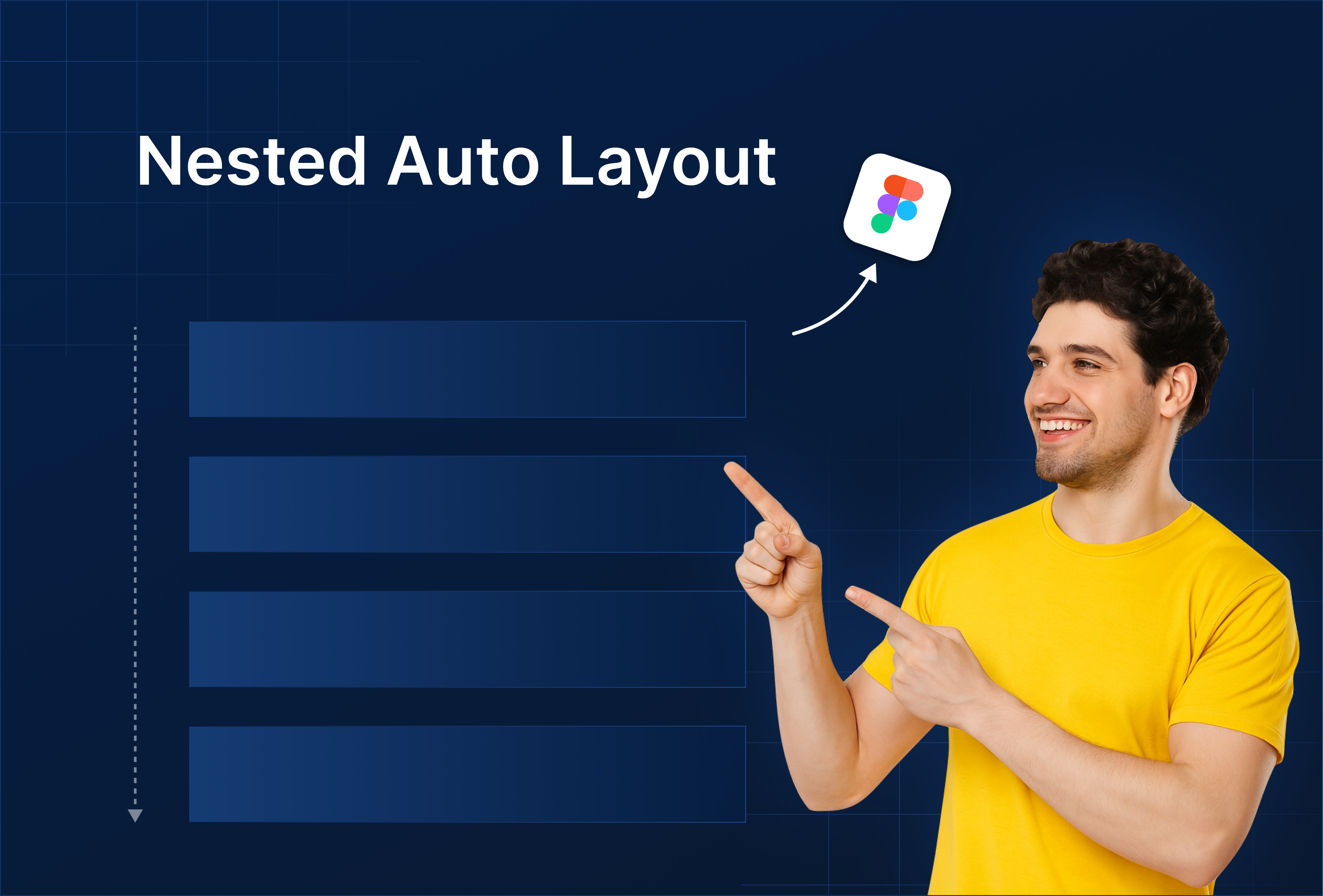
- Nested Auto Layouts allow you to put one layout inside another.
- Each container can have its own resizing and alignment settings.
- Control how inner containers behave when the outer container changes size (e.g., using "fill" or "hug" content).
- Set resizing behaviors individually for each layer to ensure they work together smoothly.

- Mixing Horizontal and Vertical Layouts:
- Combine horizontal and vertical layouts to create more complex designs like dashboards.
- Stack elements in any direction (horizontal or vertical) depending on your needs.
- Nest different Auto Layouts inside each other to mix vertical lists with horizontal rows.

- Managing Spacing and Padding:
- Adjust the spacing between elements to control gaps and create balanced designs.
- Use padding to ensure consistent margins inside containers.
- Optimize spacing, especially when working with content that varies in size, to keep your layout clean and organized.

Practical Examples
- Example 1: Multi-Section Dashboard Layout: Create a dashboard that contains various panels, adjusting their width and height dynamically as the screen size changes.
- Example 2: Flexible Card Layout: Build a card layout where cards resize to fit the container while maintaining consistent margins and padding.
Tips and Best Practices
- Keep Layouts Modular: Use reusable components and Auto Layout structures to keep your designs consistent and scalable.
- Testing Responsiveness: Test your designs across different screen sizes to ensure the layout behaves as expected.
- Watch Out for Over-Nesting: Too many nested Auto Layouts can cause performance issues or overly complicated designs—simplify when possible.
Conclusion
Mastering Auto Layout in Figma, especially when combined with constraints, opens up a new level of control over your designs. Whether you're working on dashboards, responsive websites, or intricate UI designs, these techniques will help you create flexible and dynamic layouts efficiently.


.png)


%201.png?width=1016&height=912&name=image%20(54)%201.png)