
3 Minutes Read
Listen to the Blog
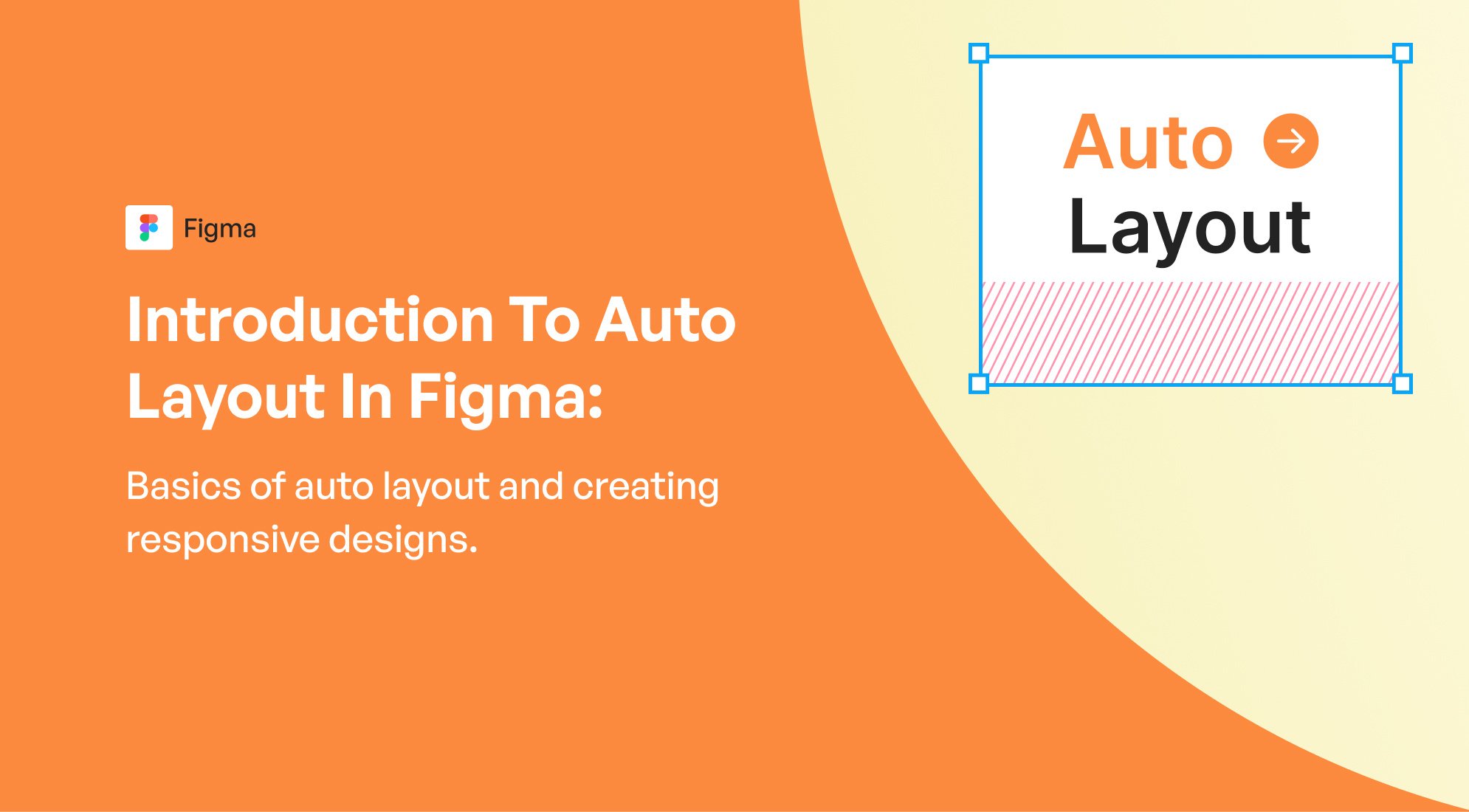
Auto Layout in Figma is a powerful feature that allows you to create responsive and adaptable designs. By using Auto Layout, you can ensure that your designs adjust dynamically to different screen sizes or content changes. This is especially useful for designing UI elements like buttons, cards, lists, and entire layouts.
Basics of Auto Layout
1. Auto Layout Properties:
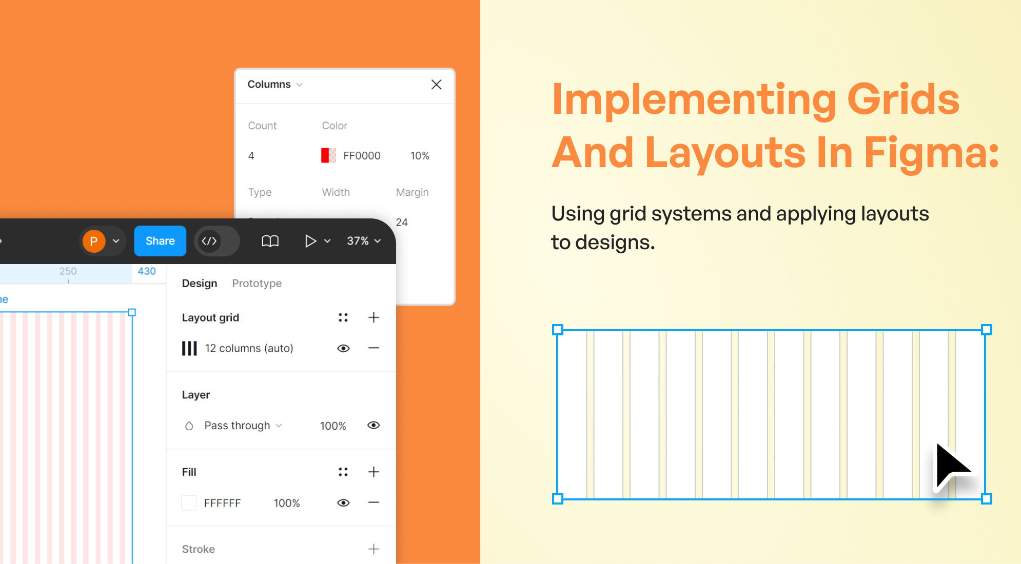
- Direction: Define the direction of the layout, either vertically (stacked) or horizontally (in a row).
- Spacing: Control the space between items within the Auto Layout frame.
- Padding: Add padding around the content inside the Auto Layout frame.
- Alignment: Align items within the Auto Layout frame (left, center, right, top, bottom).
- Resizing Options: Items can be set to "Hug contents," "Fill container," or have a fixed size.

2. Creating Auto Layout:
-
Step 1: Select the items you want to apply Auto Layout to (e.g., text and a button).
-
Step 2: Right-click and choose "Add Auto Layout" or use the shortcut Shift + A.
-
Step 3: Adjust the Auto Layout settings in the right-hand properties panel.

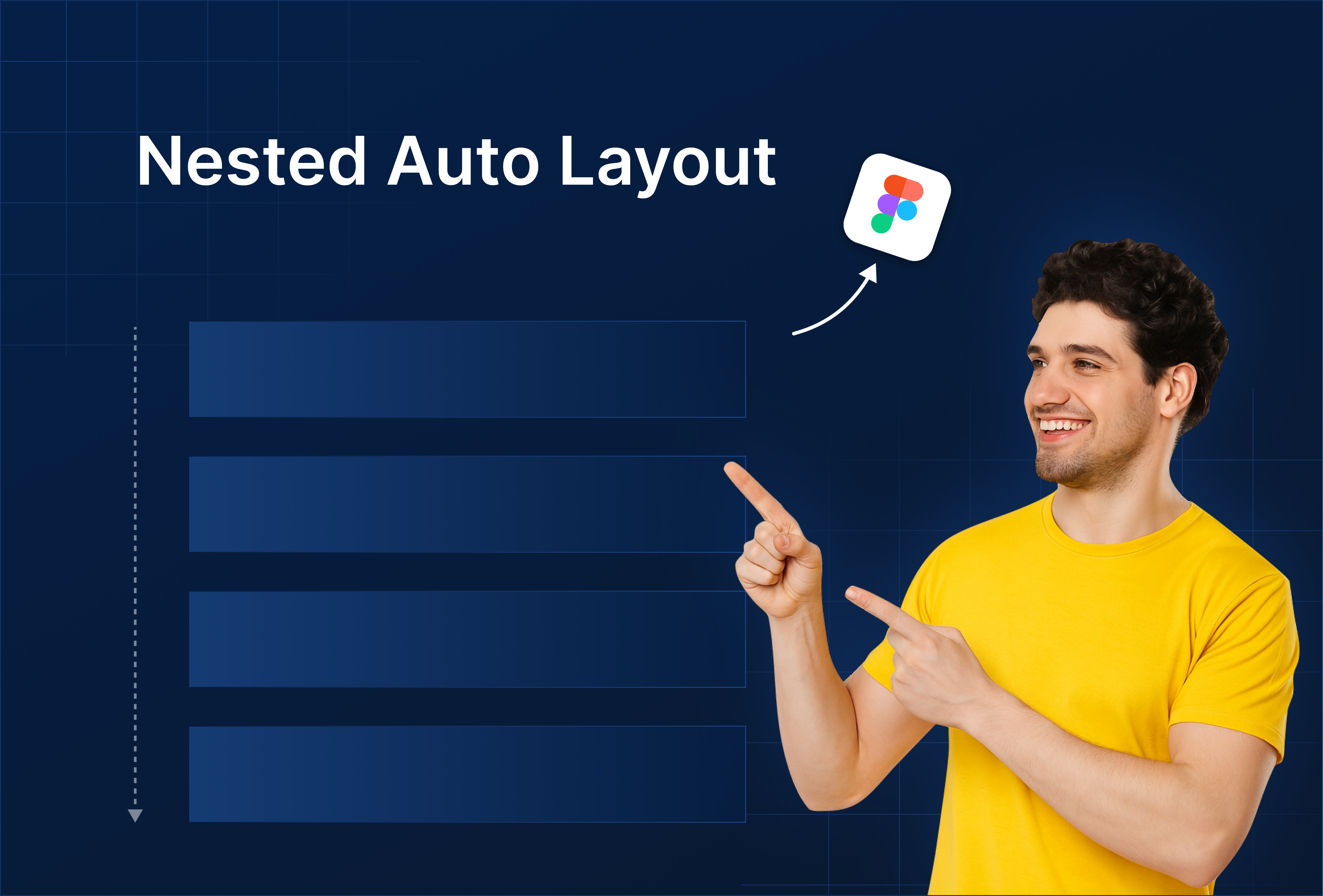
3. Nesting Auto Layout:
You can create complex designs by nesting Auto Layout frames within other Auto Layout frames. This allows for flexible, responsive designs that can adapt to various content and screen sizes.

4. Responsive Design:
- Hug Contents: The frame size adjusts to fit the content, making it ideal for buttons and text boxes.
- Fill Container: The content inside the frame will stretch to fill the container, which is useful for creating flexible layouts that adapt to screen sizes.
- Fixed Size: The frame maintains a specific size regardless of its content.

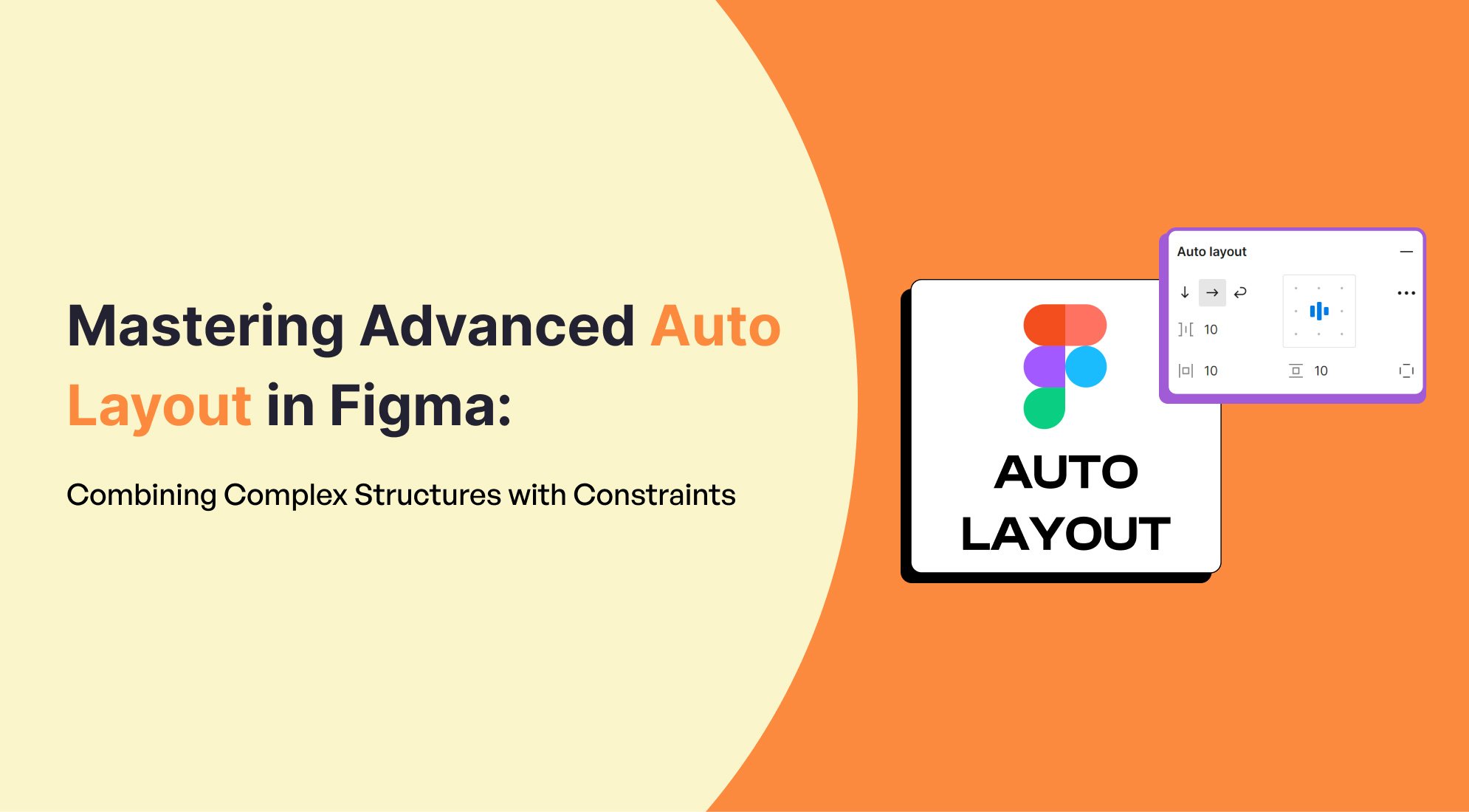
5. Combining with Constraints:
Use Auto Layout in combination with constraints to control how elements behave when the parent frame resizes. This ensures your design maintains its structure across different screen sizes.

Creating Responsive Designs with Auto Layout:
To create a responsive design using Auto Layout, follow these steps:
1. Design a Simple Layout:
- Start with a simple layout, such as a card with an image, title, and description.
- Apply Auto Layout to group the elements together.
- Set spacing and padding as needed.
2. Adjust Resizing Properties:
- Set the image to "Fill container" to ensure it scales with the card.
- Set text elements to "Hug contents" so they adapt to the amount of text.
- Experiment with different resizing options to see how the layout adjusts.
3. Test Responsiveness:
- Resize the parent frame to see how the Auto Layout behaves.
- Make adjustments to the alignment, padding, and resizing settings to achieve the desired responsive behavior.
4. Nesting Auto Layout for Complex Layouts:
Create more complex layouts by nesting Auto Layout frames within each other. For example, a navigation bar with a logo on the left and links on the right can be achieved by nesting a horizontal Auto Layout within a vertical one.
Practice and Experimentation
The best way to learn Auto Layout in Figma is through practice. Start with simple components and gradually move to more complex layouts. Experiment with different settings to understand how they affect your design. With time, you'll become proficient in creating responsive designs that adapt seamlessly to any screen size or content change.

%201.png?width=1016&height=912&name=image%20(54)%201.png)