
3 Minutes Read
Listen to the Blog
Implementing grids and layouts in Figma is an essential part of creating well-structured, responsive designs. Here's how you can set up and use grids and layouts effectively in Figma:
1. Understanding Grids and Layouts
- Grid Systems: Grids are the backbone of your design's structure, providing a consistent framework. They can help you align elements and ensure spacing is uniform across different screens.
- Layouts: Layouts in Figma often refer to the use of grid systems, columns, rows, and gutters to structure the design.

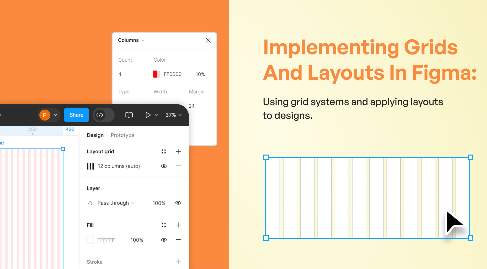
2. Setting Up a Grid
- Select a Frame: Grids can only be applied to frames (artboards in Figma). Start by selecting the frame you want to apply the grid to.
- Access Layout Grids: Go to the right sidebar and find the "Layout Grid" section. Click on the "+" to add a new grid.
- Types of Grids:
- Uniform Grid: This is a basic grid with equal-sized squares. You can set the grid size and opacity.
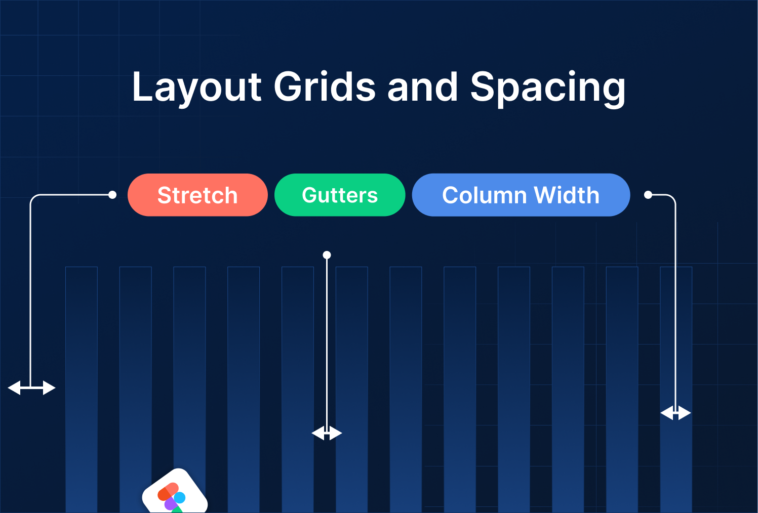
- Column/Grid Layout: Use this to create a more structured grid system with columns. You can adjust the number of columns, gutter width (space between columns), and margin (space around the edges).
- Rows: Less commonly used, but you can also set up rows similarly to columns, which is useful for horizontal designs.

3. Customizing Grids
- Grid Settings: Customize the grid by clicking on the grid icon in the "Layout Grid" section. You can choose the type (Grid, Columns, or Rows) and adjust the count, size, gutter, and margin.
- Responsive Design: For responsive design, you might want to set grids to be fluid. This means setting the width of columns to "Auto" or using percentages, ensuring your design adapts to different screen sizes.
4. Applying Layout Grids in Design
- Aligning Elements: Use the grid as a guide to place and align your elements. Figma's snapping feature will help you align objects to the grid.
- Consistency Across Frames: Apply the same grid system across multiple frames to maintain consistency in your design.
- Overriding Grids: You can override grid settings on individual elements if necessary, but it’s recommended to maintain consistency.

5. Tips for Using Grids Effectively
- Stick to a Baseline Grid: Establish a baseline grid for typography to ensure text lines up across different sections.
- Use Grid Variations: You can set up different grid styles (e.g., 12-column grid for desktop, 4-column grid for mobile) and apply them based on the design needs.
- Test Responsiveness: Always test your design by resizing frames to see how well your grid system holds up.

6. Practical Use Cases
- Web Design: Use a 12-column grid for desktop designs, which is a common standard.
- Mobile Design: Use a 4 or 6-column grid, as these are typical for mobile interfaces.
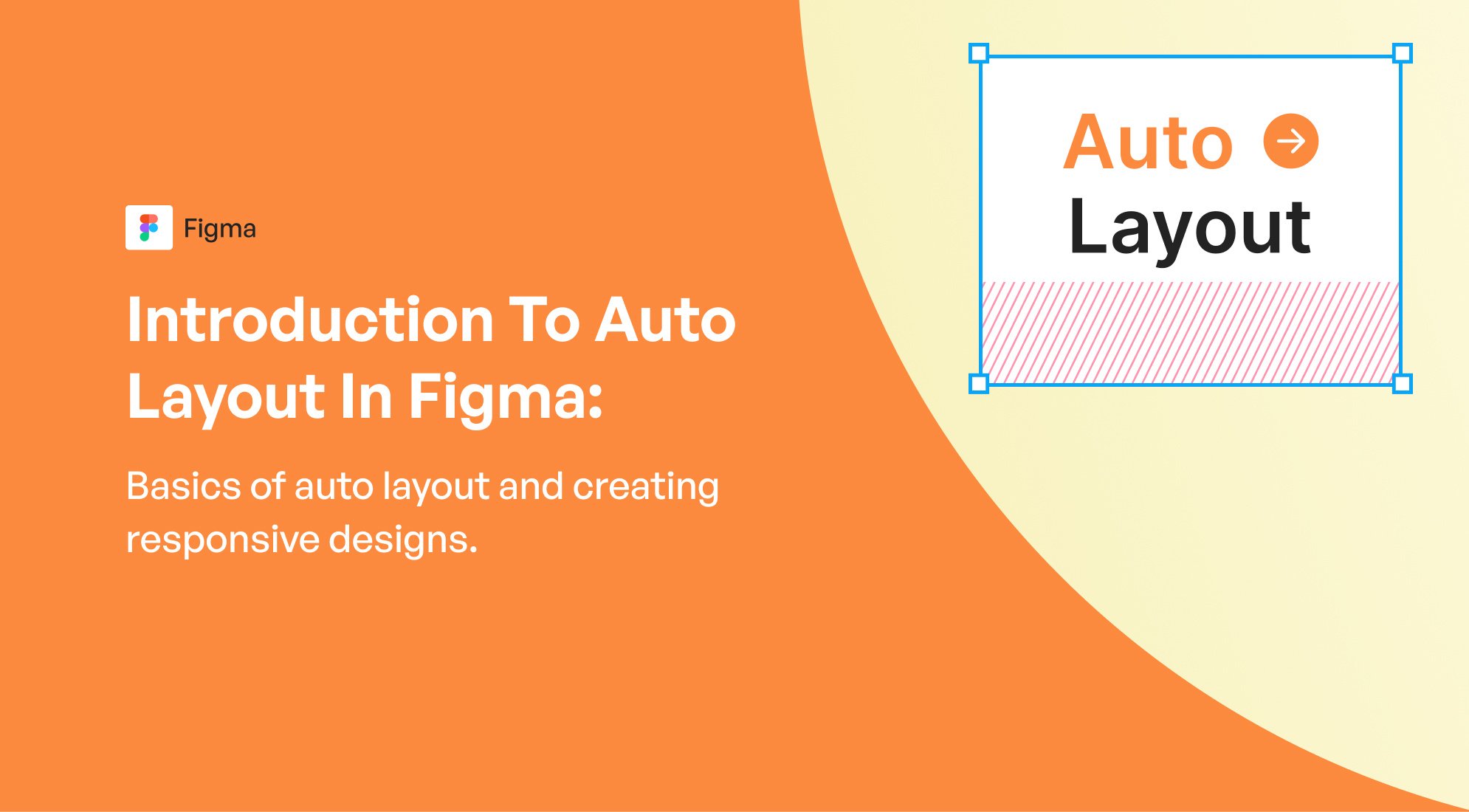
- Complex Layouts: Combine grids with Figma's Auto Layout feature to create more complex, flexible designs.
7. Collaborating with Grids
- Shared Grids in Design Systems: If working in a team, consider adding your grid systems to a shared design system so everyone can maintain consistency.
- Feedback and Iteration: Use Figma's comments and collaboration features to gather feedback on grid usage and make adjustments as needed.
Conclusion
By mastering grids and layouts in Figma, you can ensure that your designs are not only aesthetically pleasing but also functional and adaptable to different screen sizes.


%201.png?width=1016&height=912&name=image%20(54)%201.png)