
2 Minutes Read
Listen to the Blog
Auto Layout saves time when spacing multiple elements.
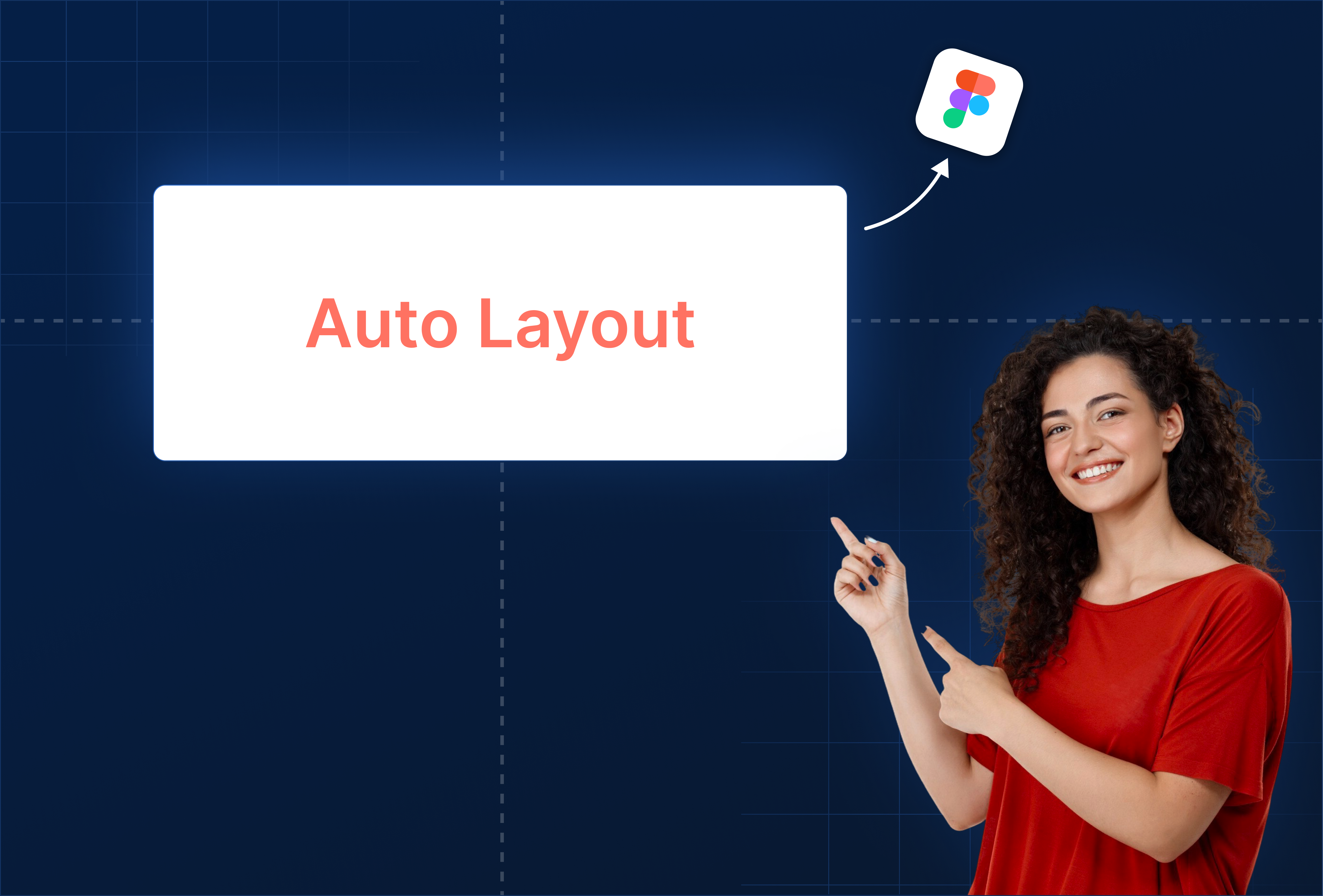
1. Why Auto Layout Matters
Auto Layout in Figma allows you to:
- Automatically manage spacing between elements
- Ensure consistent alignment across components
- Build responsive designs that scale without manual adjustments
- Reduce repetitive work for buttons, cards, menus, and forms
Tip: Think of Auto Layout as “dynamic grouping” - the layout adapts when you resize, add, or remove elements.
2. Adding Auto Layout
Steps:
- Select a frame or a group of elements.
- Press Shift + A or click + Auto Layout in the right-hand panel.
- Elements are now stacked vertically by default (you can switch to horizontal).
- Adjust padding, spacing between items, and alignment in the right-hand panel.

You can nest Auto Layout frames for complex components (e.g., buttons inside cards inside a list).
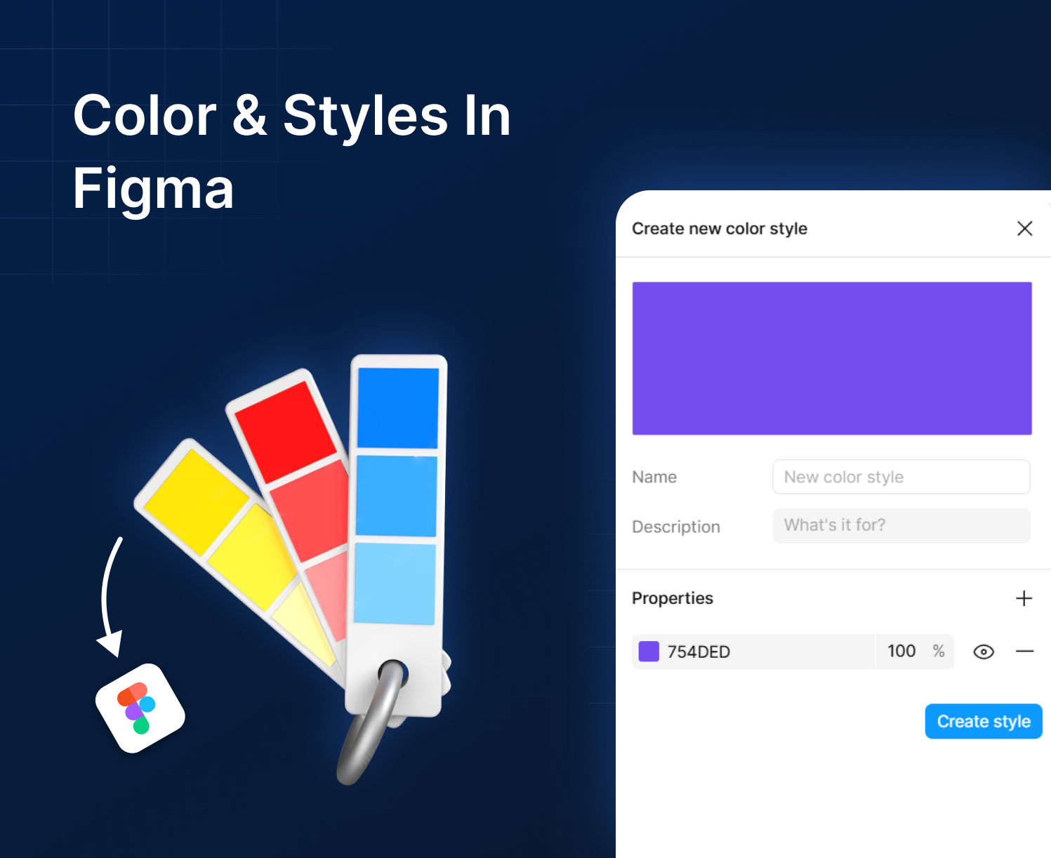
3. Controlling Spacing & Alignment
- Spacing Between Items: Adjust consistent gaps between elements.
- Padding: Control space inside the container (top, bottom, left, right).
- Alignment: Left, center, right, top, middle, and bottom works for all nested elements.
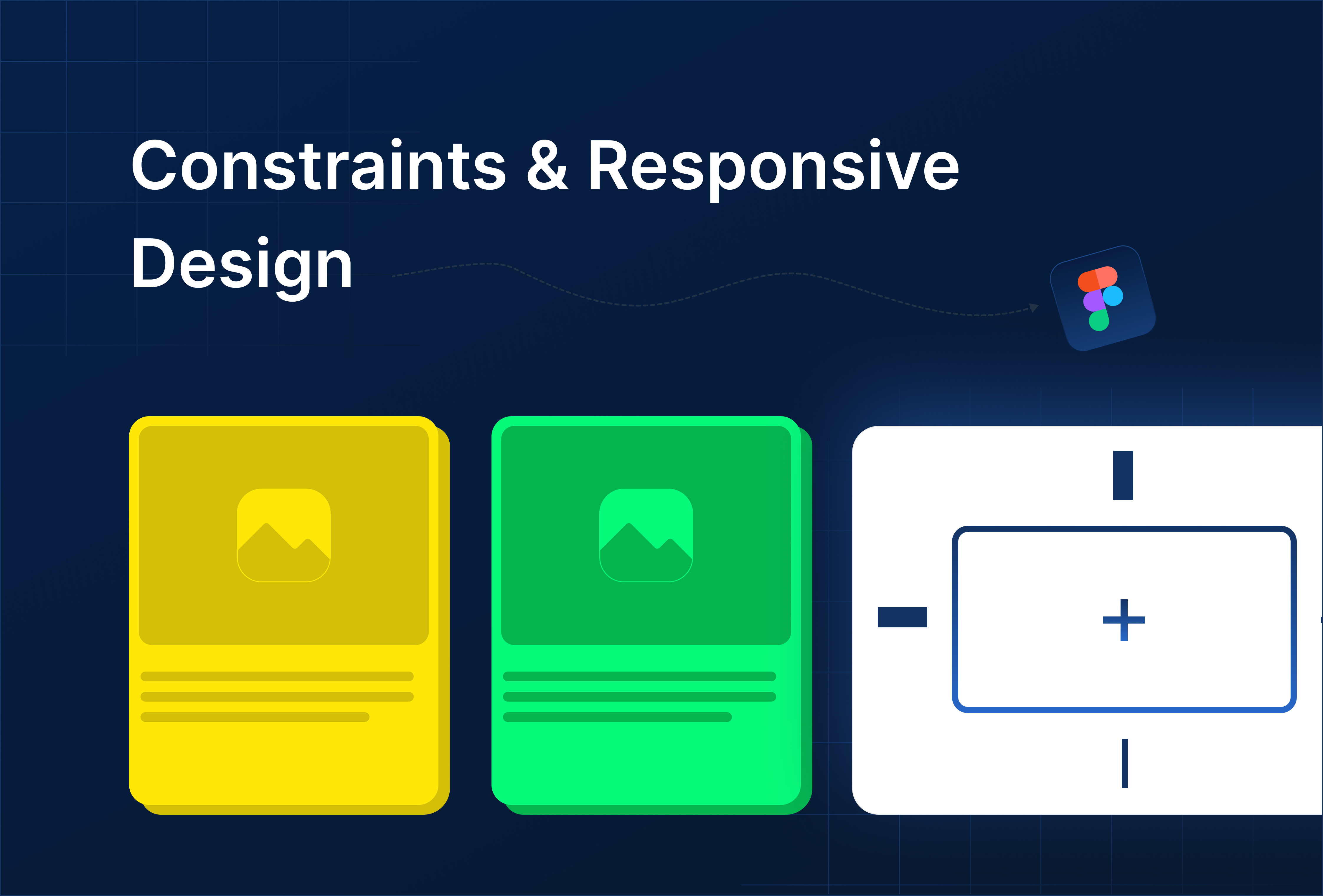
- Resizing Behavior:
- Hug contents: frame resizes to fit child elements
- Fill container: child elements stretch to fill available space
- Fixed size: keeps elements at a specific size
Example: A row of buttons that automatically adjusts spacing when adding a new button.

4. Practical Use Cases
- Buttons & Menus: Keep uniform spacing without manual adjustments.
- Cards & Lists: Stack cards vertically with equal gaps; resizing the frame updates spacing automatically.
- Forms & Inputs: Auto Layout ensures consistent padding between labels, fields, and buttons.
- Responsive Layouts: Combine Auto Layout with Layout Grids to create flexible UI across screen sizes.


%201.png?width=1016&height=912&name=image%20(54)%201.png)