
2 Minutes Read
Listen to the Blog
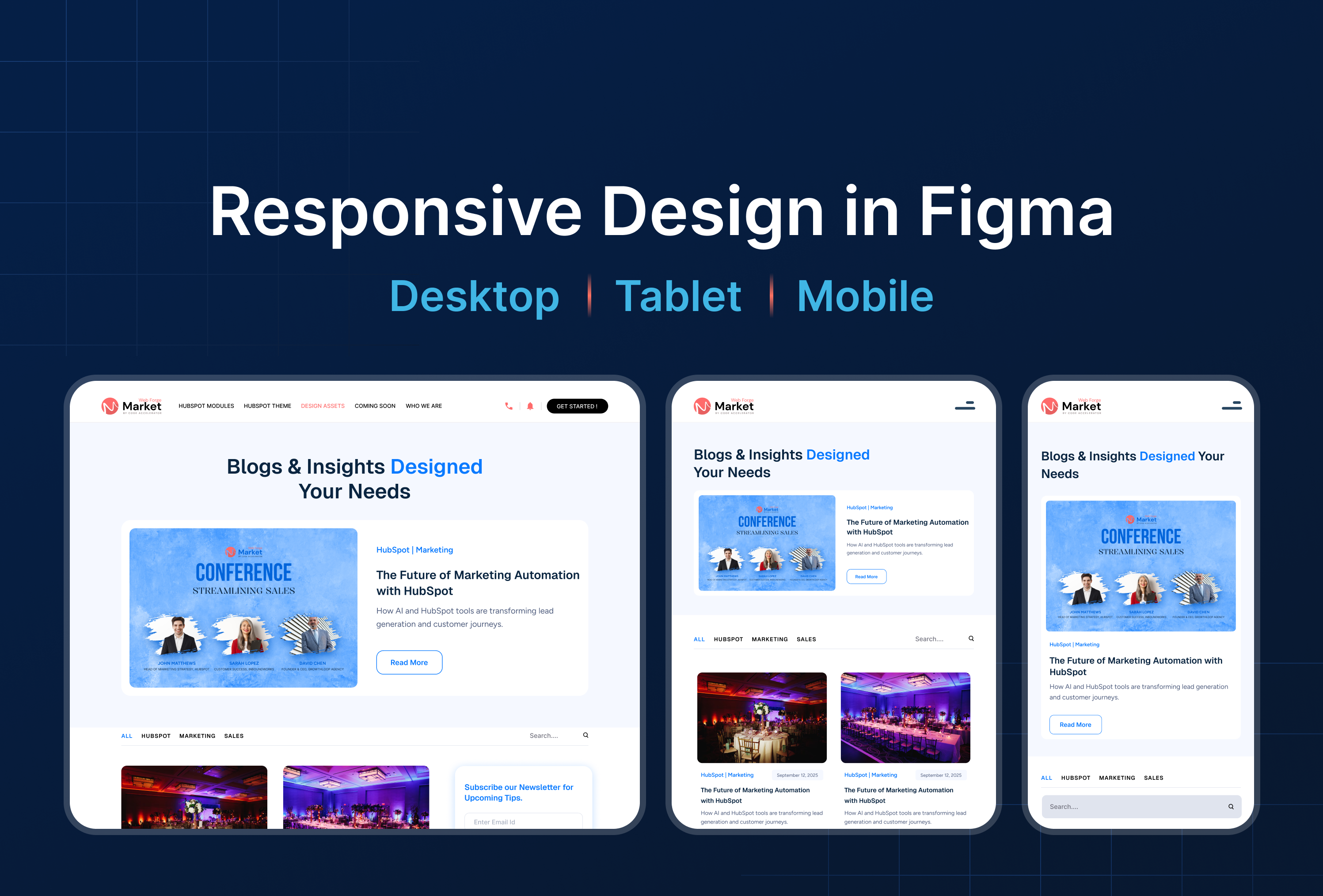
Make your designs flexible for different screen sizes.
1. Why Constraints Are Key for Responsive Design
Constraints in Figma control how elements behave when frames resize, allowing you to:
- Build flexible layouts that work on desktop, tablet, and mobile
- Maintain alignment, spacing, and scale across devices
- Reduce manual adjustments when adapting designs
- Improve workflow efficiency for multi-screen projects
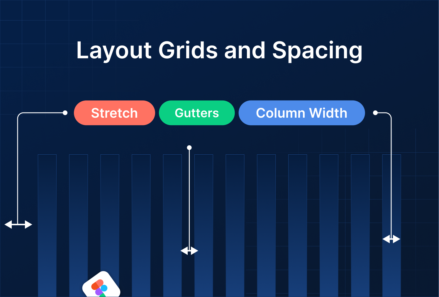
Tip: Combine constraints with Auto Layout and Layout Grids for fully responsive designs.
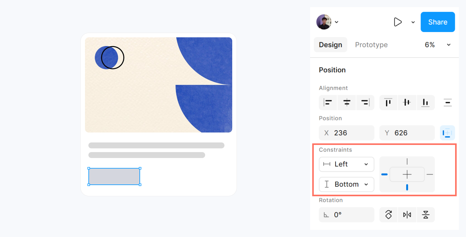
2. Setting Constraints
- Select a layer or component inside a frame.
- In the right-hand panel, locate Constraints.
- Choose options:
- Left, Right, Top, Bottom: Stick elements to specific edges
- Center: Keep elements centered horizontally/vertically
- Scale: Resize element proportionally with the frame
Tip: Use different constraints for nested elements to make cards, buttons, and headers adapt automatically.
3. Combining Constraints with Frames
- Fixed Frame: Elements maintain exact size and position → not responsive
- Resizable Frame: Elements adapt based on constraints → responsive layout
- Test by resizing the frame to see elements move/scale accordingly
Example: Navbar logo constrained to left, menu items constrained to right → layout adapts across desktop, tablet, and mobile.
4. Practical Examples
Example 1: Buttons
- Constrain buttons to the bottom-right corner
- Buttons maintain position when resizing container
Example 2: Cards
- Image constrained to scale proportionally
- Text constrained to top/left remains readable
Example 3: Hero Section
- Headline centered horizontally
- CTA button constrained to bottom
- Background image scaled responsive across screen sizes
Tip: Combine constraints + Auto Layout + Variants for responsive, multi-state components.
.png)

%201.png?width=1016&height=912&name=image%20(54)%201.png)