2 Minutes Read
Listen to the Blog
Figma Variants & Component Properties: Build Multi-State UI Components
1:46
Variants allow multiple states in one component.
1. Why Variants Matter
Variants in Figma let you:
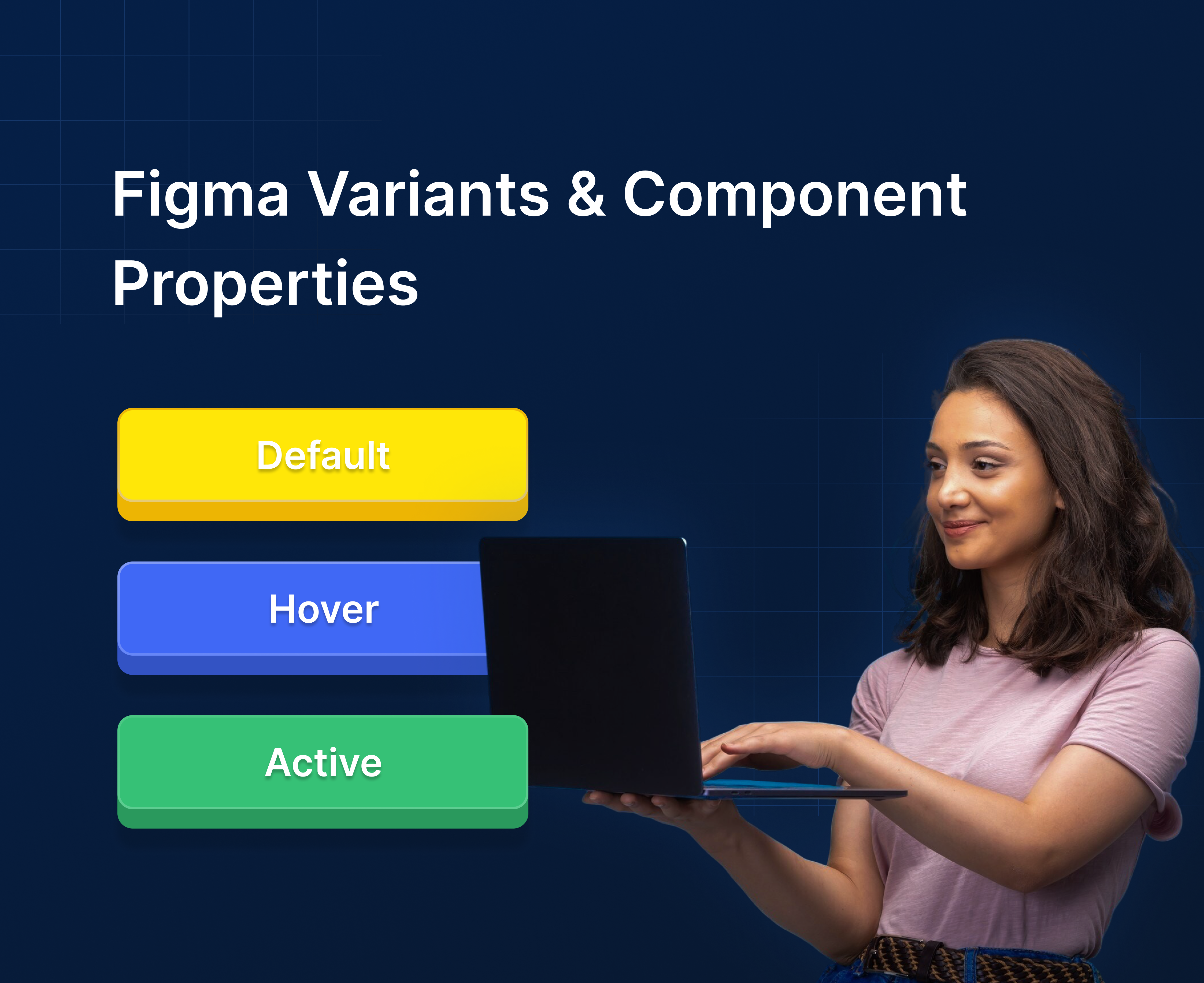
- Combine multiple component states (e.g., Default, Hover, Disabled) in one master component
- Switch states easily for design consistency
- Reduce the number of separate components in your library
- Build interactive components for prototypes and design systems
Tip: Variants + Component Properties = efficient, scalable UI design workflow.
2. Creating a Variant
- Select a component (e.g., a button).
- Click Add Variant in the right-hand panel.
- Set the Property name (e.g.,
State) and Property values (Default,Hover,Active,Disabled). - Adjust each variant’s appearance individually.

Tip: Use consistent naming conventions for states, makes switching easier in design and prototyping.
3. Using Component Properties
Component Properties extend Variants:
- Boolean: Toggle options (e.g., Icon On/Off, Rounded Corners)
- Text: Override default text in instances
- Instance Swap: Swap internal components (e.g., different icons inside a button)
How to add a property:
- Select a variant.
- Click + Add Property → choose Boolean / Text / Instance Swap.
- Name it logically (e.g.,
Icon,Label,Size).
Properties give you flexibility to reuse the same component in multiple contexts without duplicating it.
4. Practical Examples
Example 1: Button Component
- Variants: Default, Hover, Disabled
- Properties: Icon On/Off, Label text override
Example 2: Card Component
- Variants: Normal, Selected, Highlighted
- Properties: Swap image placeholder, toggle badge visibility
Example 3: Form Inputs
- Variants: Focused, Error, Disabled
- Properties: Placeholder text override, show/hide icon
Nested Variants + Properties make components fully interactive and adaptive.


%201.png?width=1016&height=912&name=image%20(54)%201.png)