
2 Minutes Read
Listen to the Blog
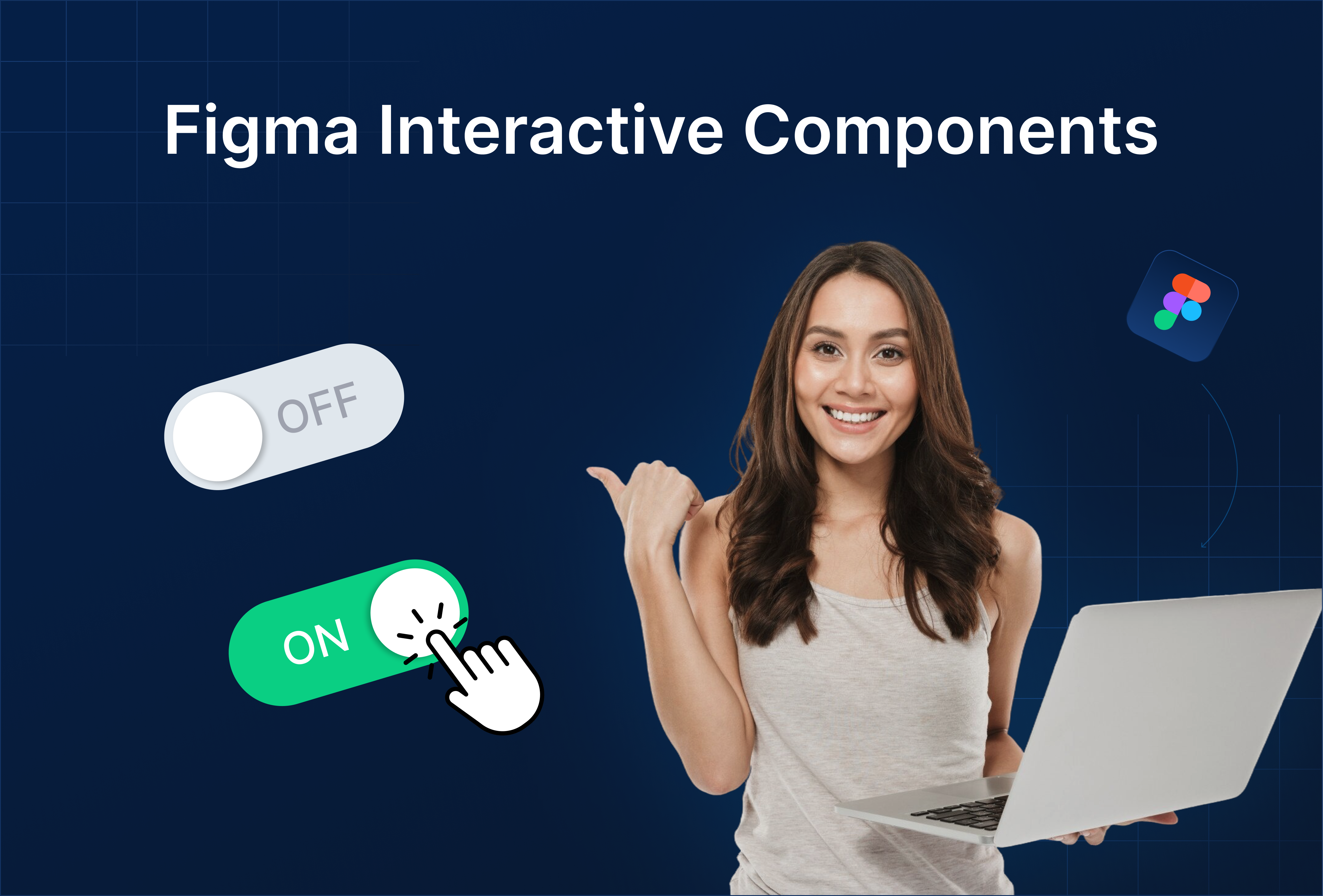
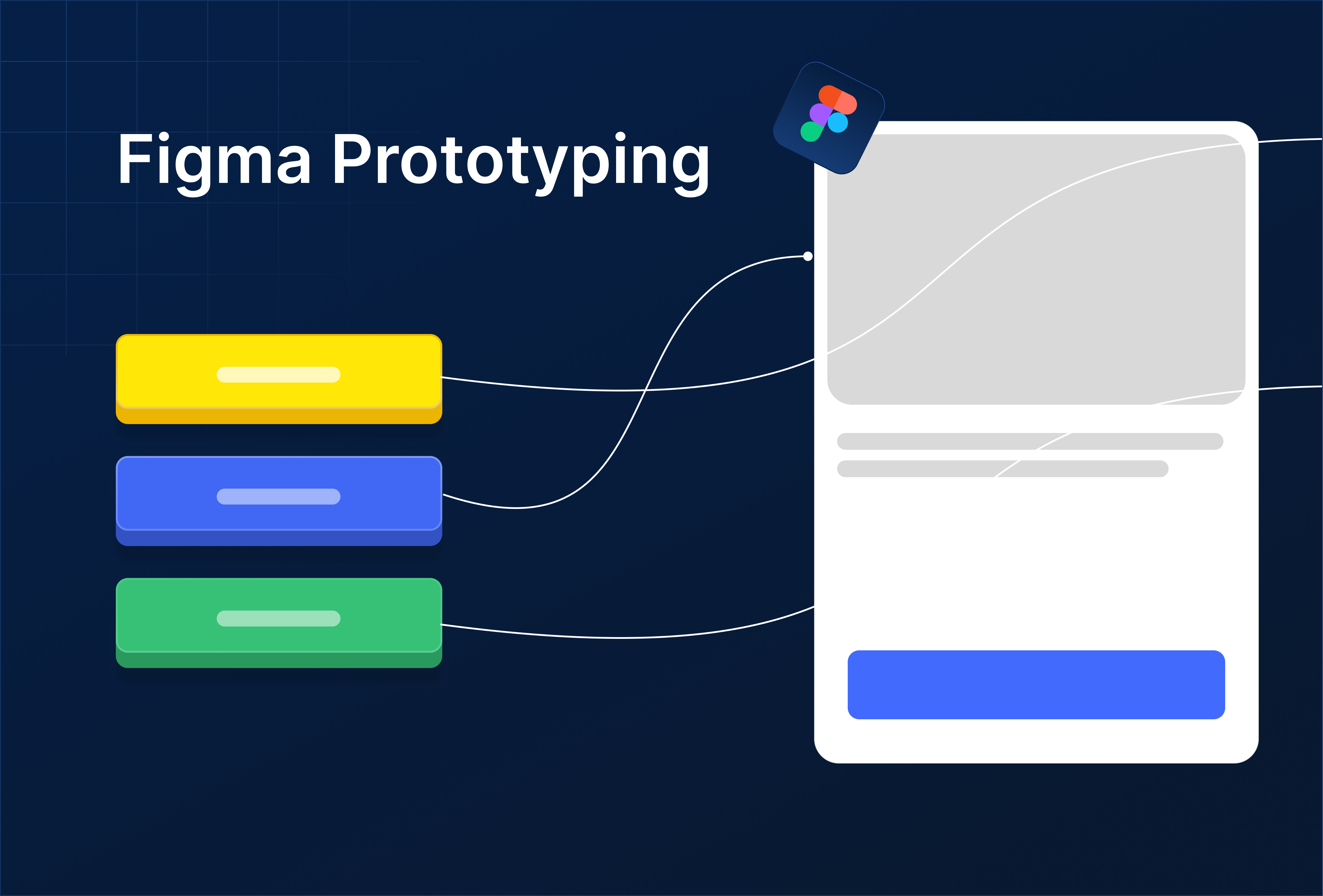
Build buttons, toggles, menus with click interactions.
1. What Are Interactive Components?
Interactive components let you add click or hover interactions directly inside components, so you don’t need to prototype every instance manually.
They bring realism to your designs by simulating real UI behavior like button clicks, toggles, or dropdowns right inside your design system.
Make components feel alive, responsive, and ready for user testing without wiring up every screen.
2. Why They Matter
- Save time by reusing built-in interactions
- Simplify prototypes fewer manual links
- Show realistic micro-interactions in design reviews
- Test user flows faster and more accurately
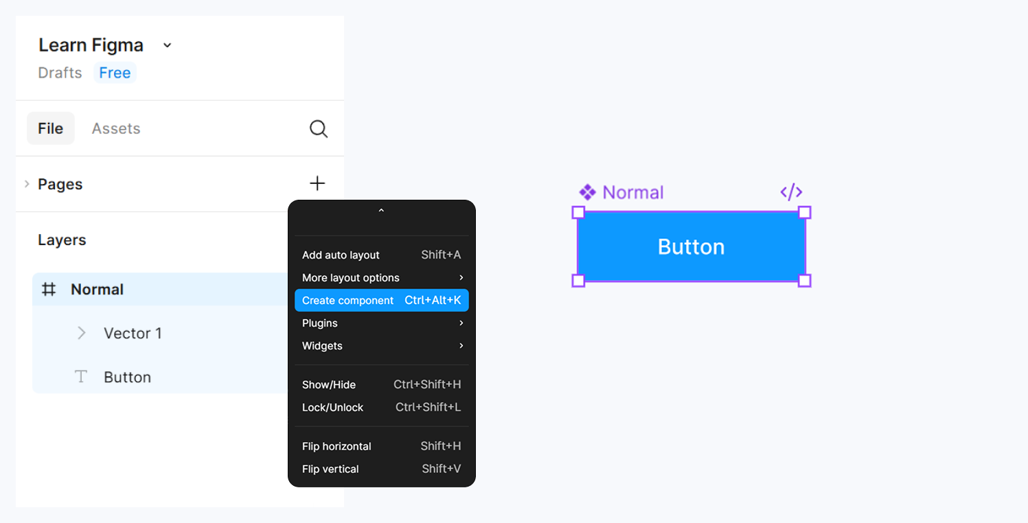
3. Creating Your First Interactive Component
Step 1: Create Your Base Component
- Design a simple button (e.g., rectangle + text).
- Convert it to a Component (
Ctrl + Alt + K/Cmd + Option + K).
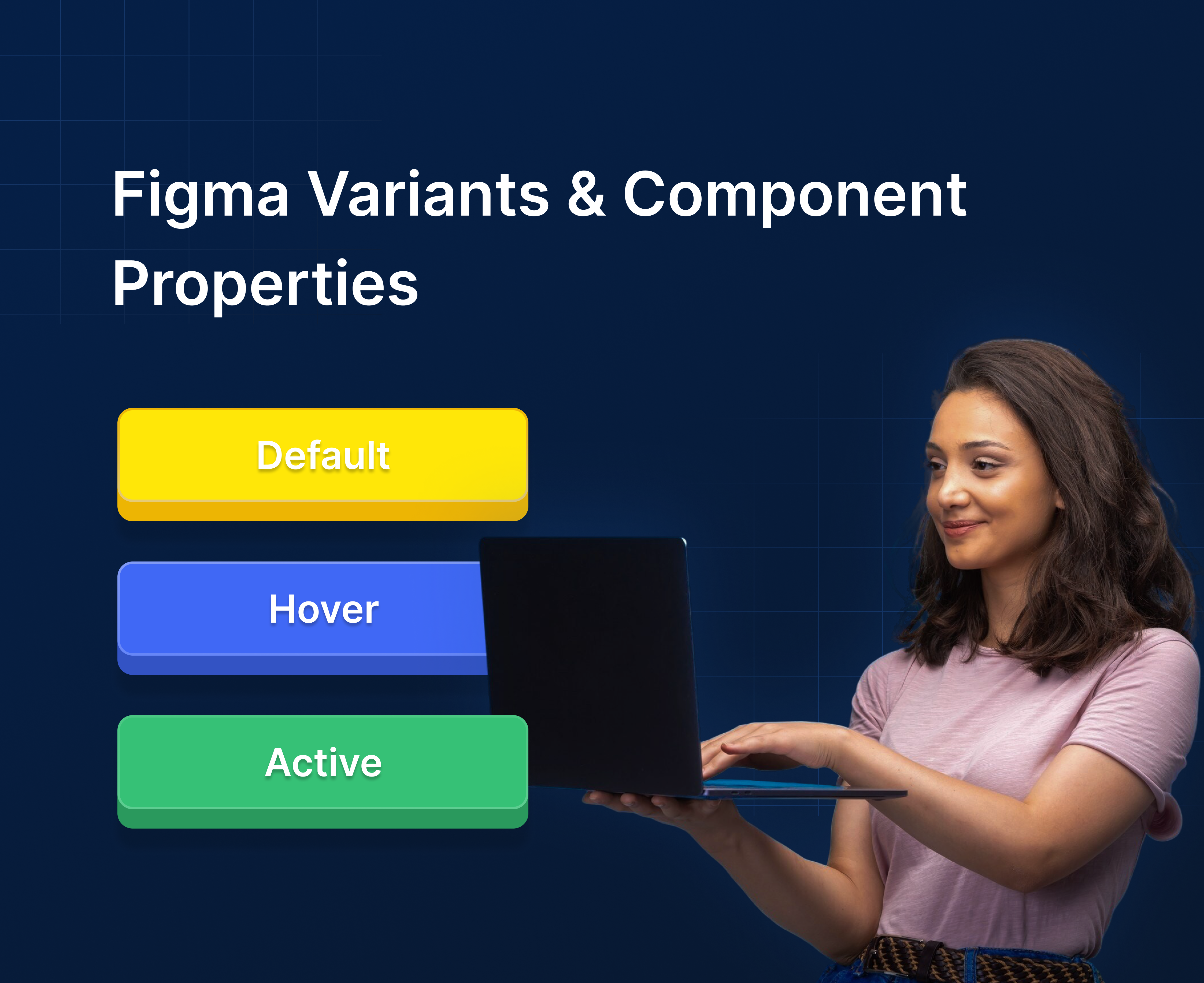
Step 2: Create a Variant
- Duplicate your main component inside a Variant Set.
- Name them:
DefaultHoverPressed

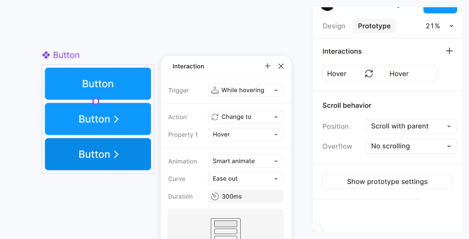
Step 3: Add Interaction Between Variants
- Switch to Prototype Mode.
- Select the
Defaultvariant → drag the blue arrow toHover. - Set:
- Trigger: On hover
- Action: Change to
Hover - Animation: Smart Animate
- Do the same from
Hover→Pressed(Trigger: On click).
Step 4: Test Your Component
- Enter Prototype Mode → Present.
- Hover and click to see transitions in real time.
4. Example Components
Buttons
- Default, Hover, Pressed, Disabled states.
- Add color transitions or scale effects.
Toggles / Switches
- Two variants: On / Off
- Trigger: On click → Change to other variant
Menus / Dropdowns
- Closed / Open variants
- Use “Open overlay” for dropdown animations
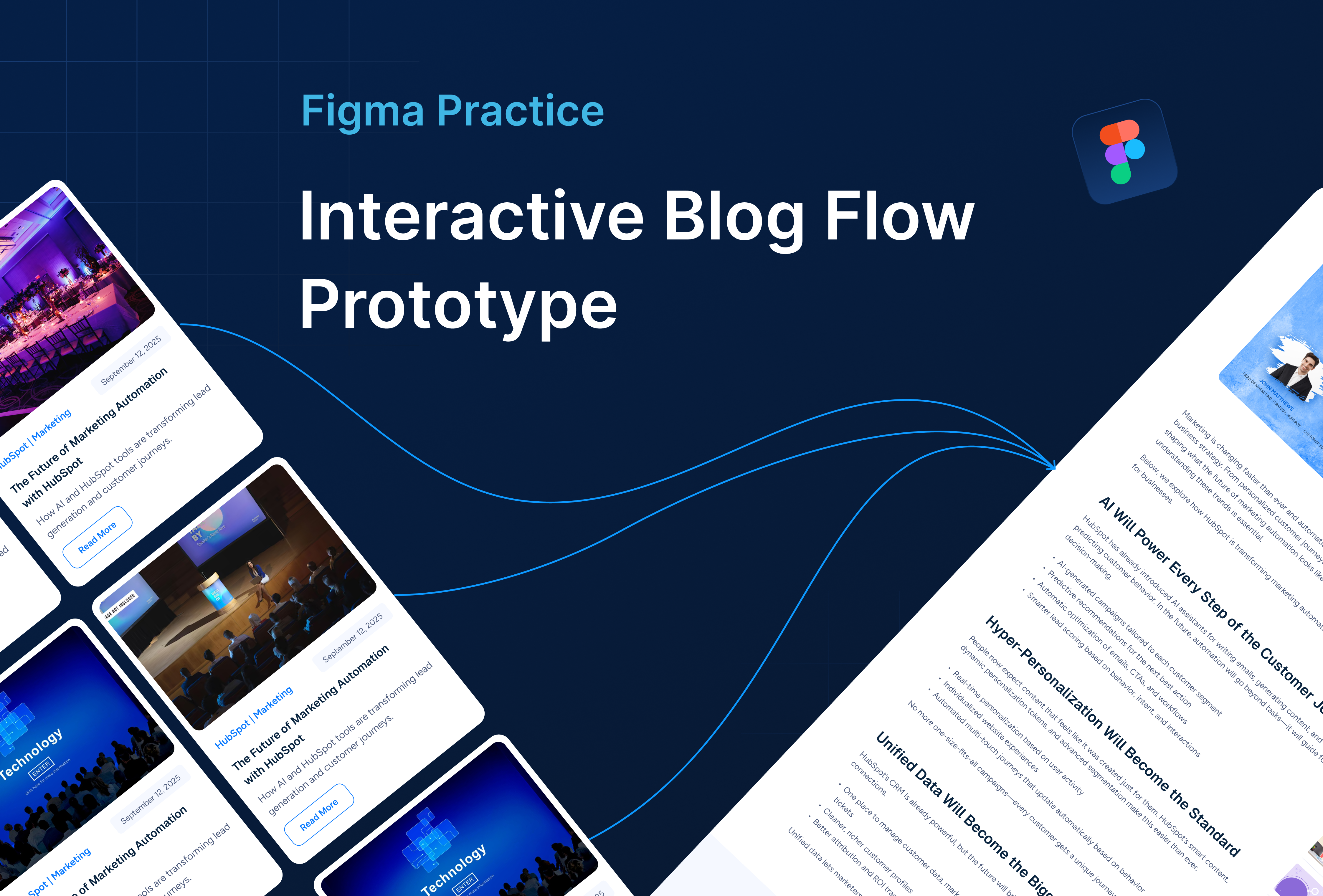
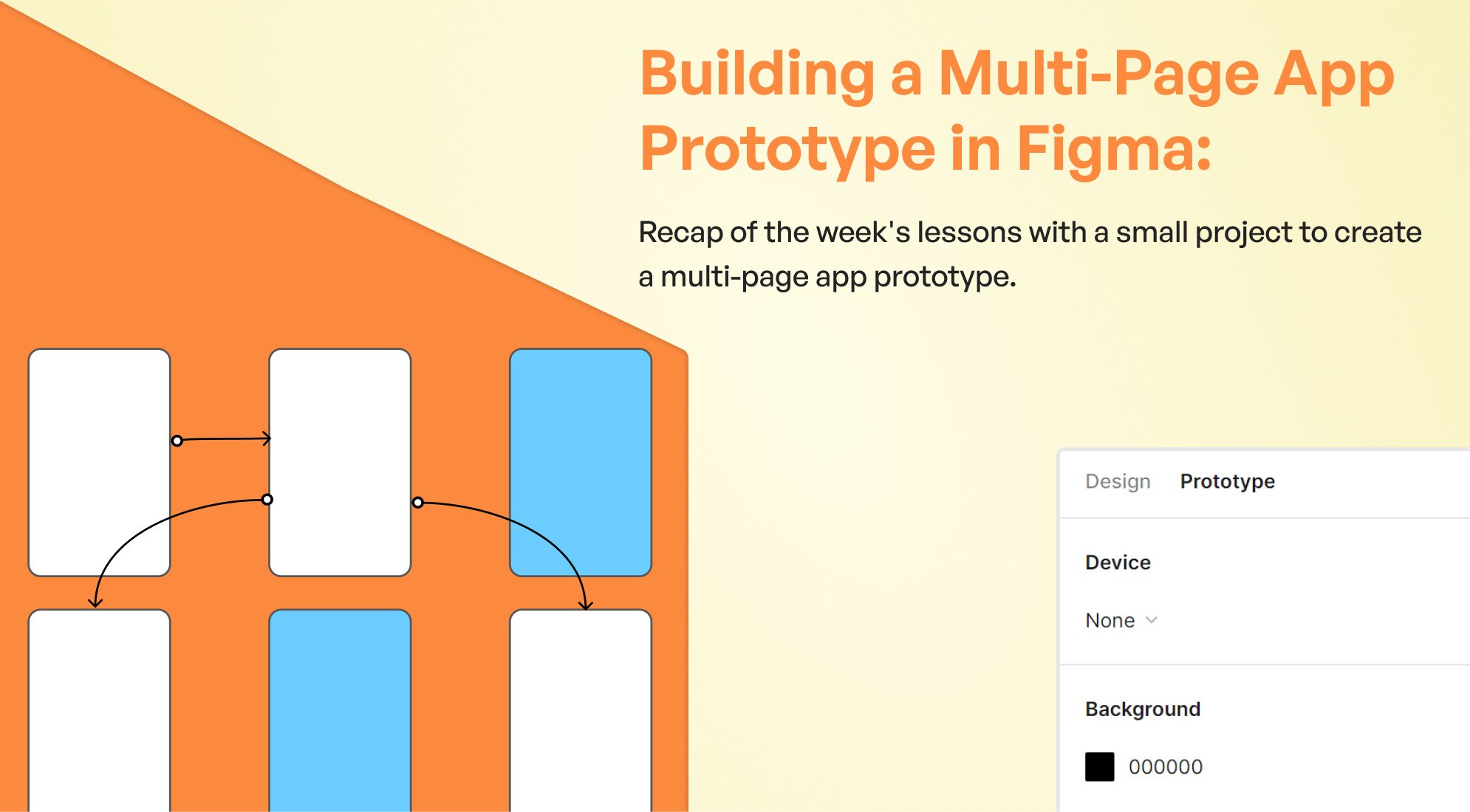
Combine interactive components into larger prototypes no extra wiring needed.
5. Best Practices
Keep variant names clear (Default / Hover / Active).
Use consistent animations (Smart Animate preferred).
Limit too many transitions keep interactions natural.
Reuse across multiple projects through your Component Library.

%201.png?width=1016&height=912&name=image%20(54)%201.png)