
2 Minutes Read
Listen to the Blog
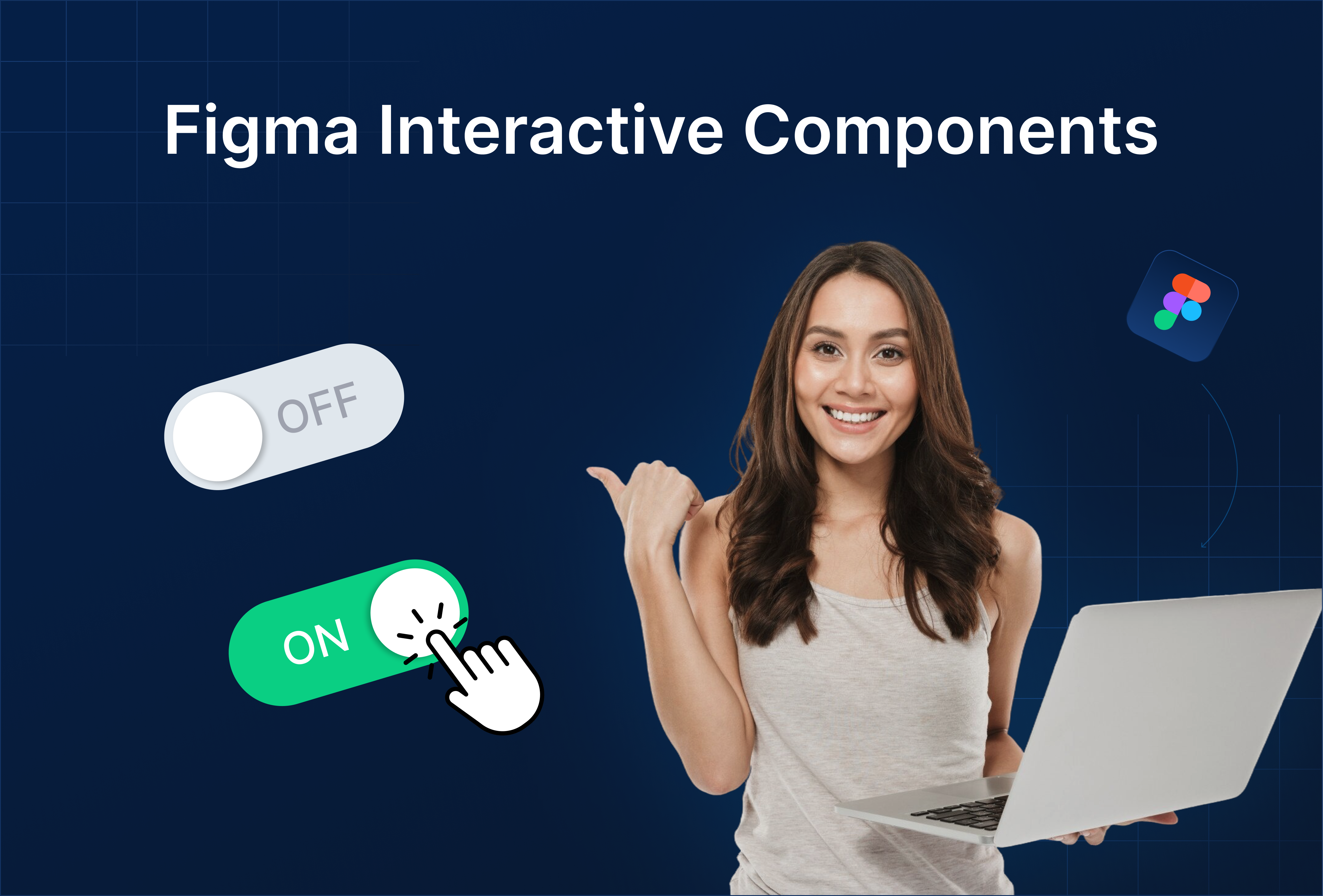
Figma Component Library: Publish & Share Components with Team
2:11
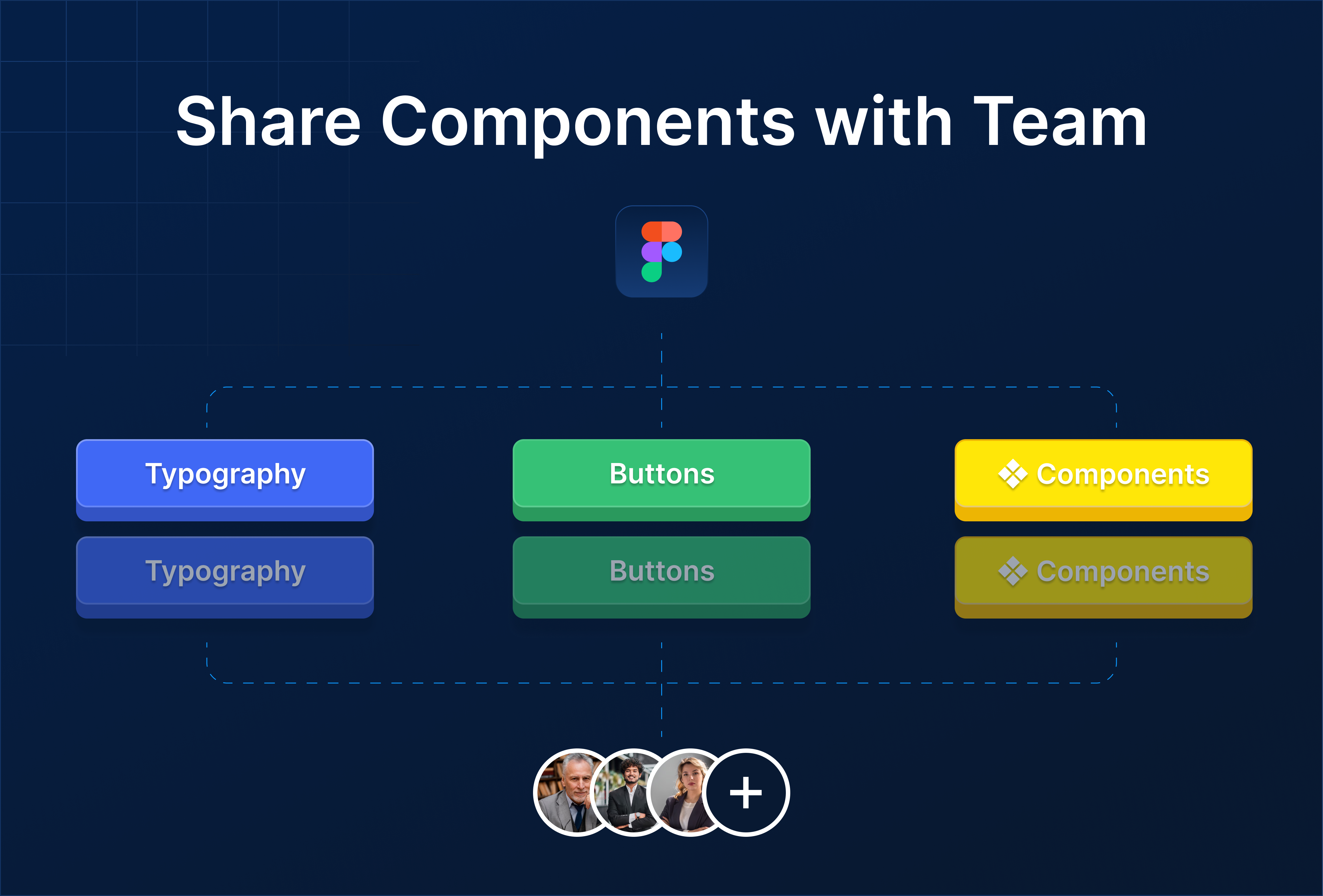
1. Why a Component Library Matters
A component library allows your team to:
- Maintain consistency: All designers use the same buttons, cards, forms, and navigation elements
- Save time: Reuse pre-built components instead of recreating them
- Collaborate efficiently: Updates to components propagate across projects automatically
- Scale design systems: Supports multiple projects with a single source of truth
Tip: Treat your component library as the backbone of your team’s design workflow.
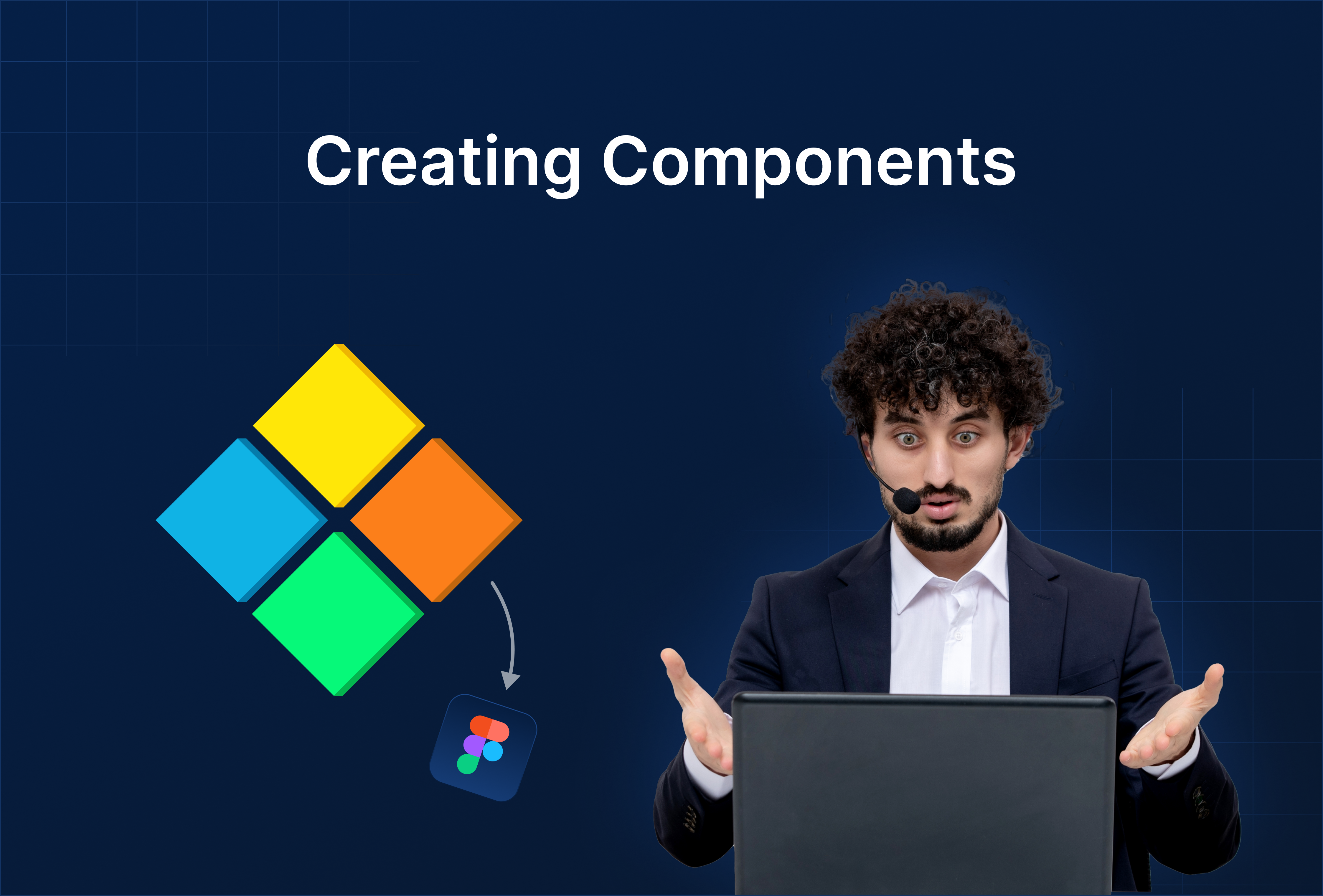
2. Setting Up Your Component Library
- Create a dedicated Figma file: Name it clearly (e.g.,
Team UI Library). - Organize components:
- Pages for categories: Buttons, Cards, Forms, Navigation, Icons
- Hierarchical naming:
Category / Type / State
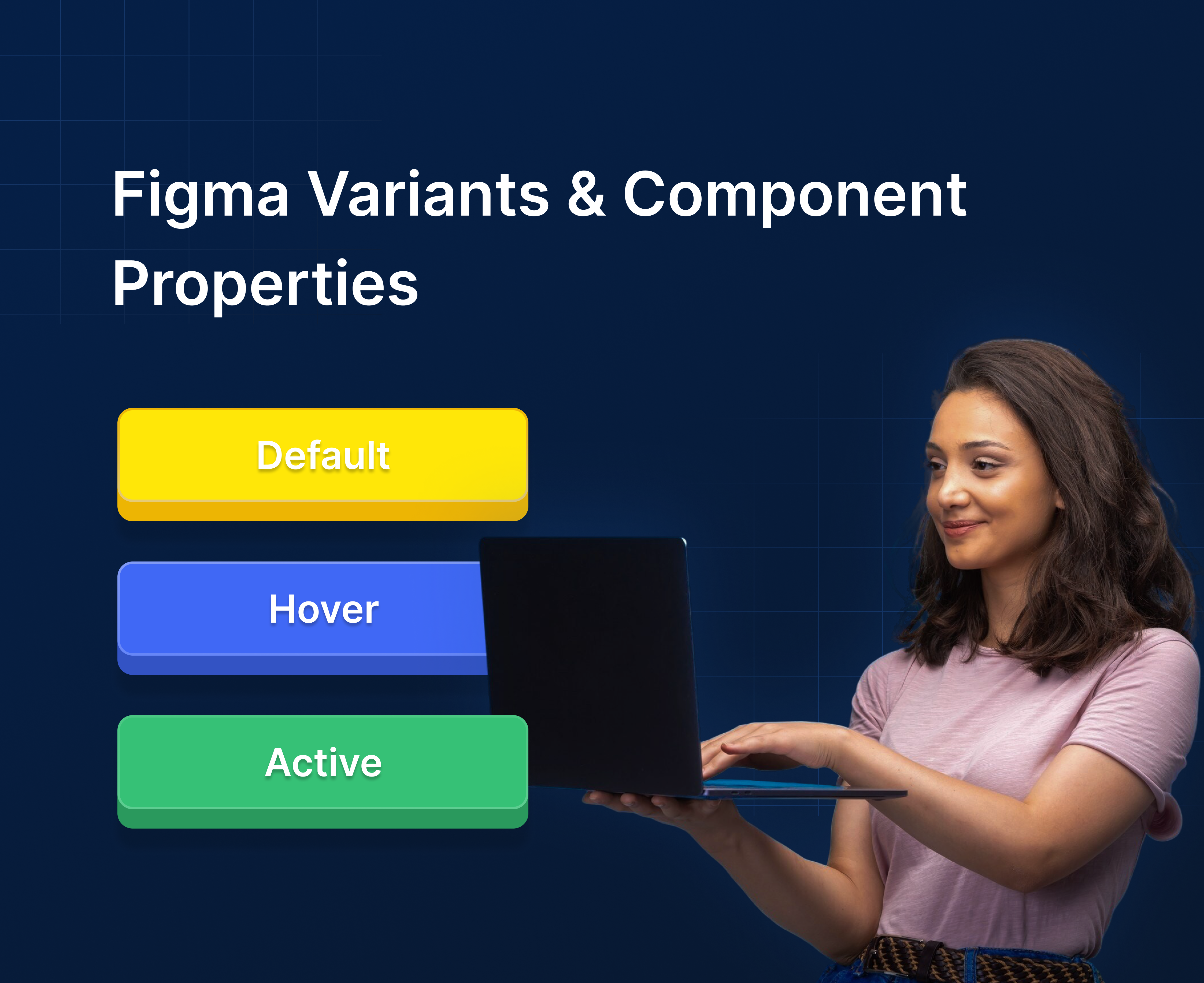
- Add Variants & Component Properties:
- Combine multi-state elements (hover, disabled, active) into single components
- Add boolean, text, or instance swap properties where needed
- Apply Styles:
- Use Text, Color, and Effects styles for consistency
- Publish Library:
- Go to Assets → Team Library → Publish
- Give the library a descriptive name for your team
- Enable Library in Other Files:
- In other Figma projects, go to Assets → Team Library → Enable
- Drag components from the library into any frame
Tip: Regularly audit and update your library to ensure only active components are available.
3. Best Practices
- Use clear naming conventions: Helps designers quickly find components
- Organize logically: Group related components together
- Include usage guidelines: Notes on spacing, alignment, and interaction states
- Version control: Keep track of updates to avoid breaking designs in active projects
Well-maintained libraries = faster design iterations + team-wide consistency.
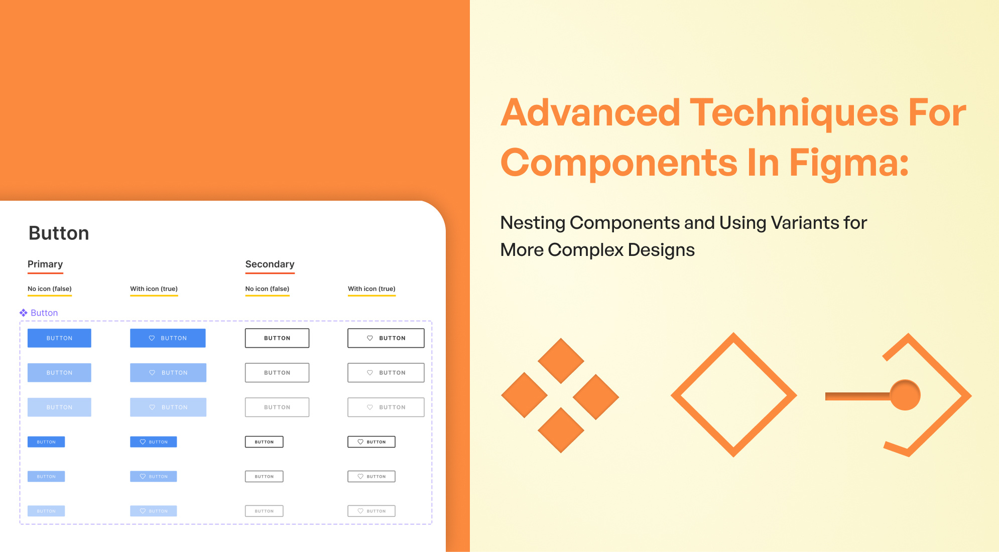
4. Practical Examples
Example 1: Buttons
- Primary, Secondary, and Tertiary buttons with hover and disabled states
- Updates to master component → reflected in all files
Example 2: Cards
- Product cards with nested Auto Layout and variants
- Reusable across multiple pages and projects
Example 3: Navigation
- Navbar with multiple states, shared across website pages
- Easy updates for logo or menu items

%201.png?width=1016&height=912&name=image%20(54)%201.png)