
6 Minutes Read
Listen to the Blog
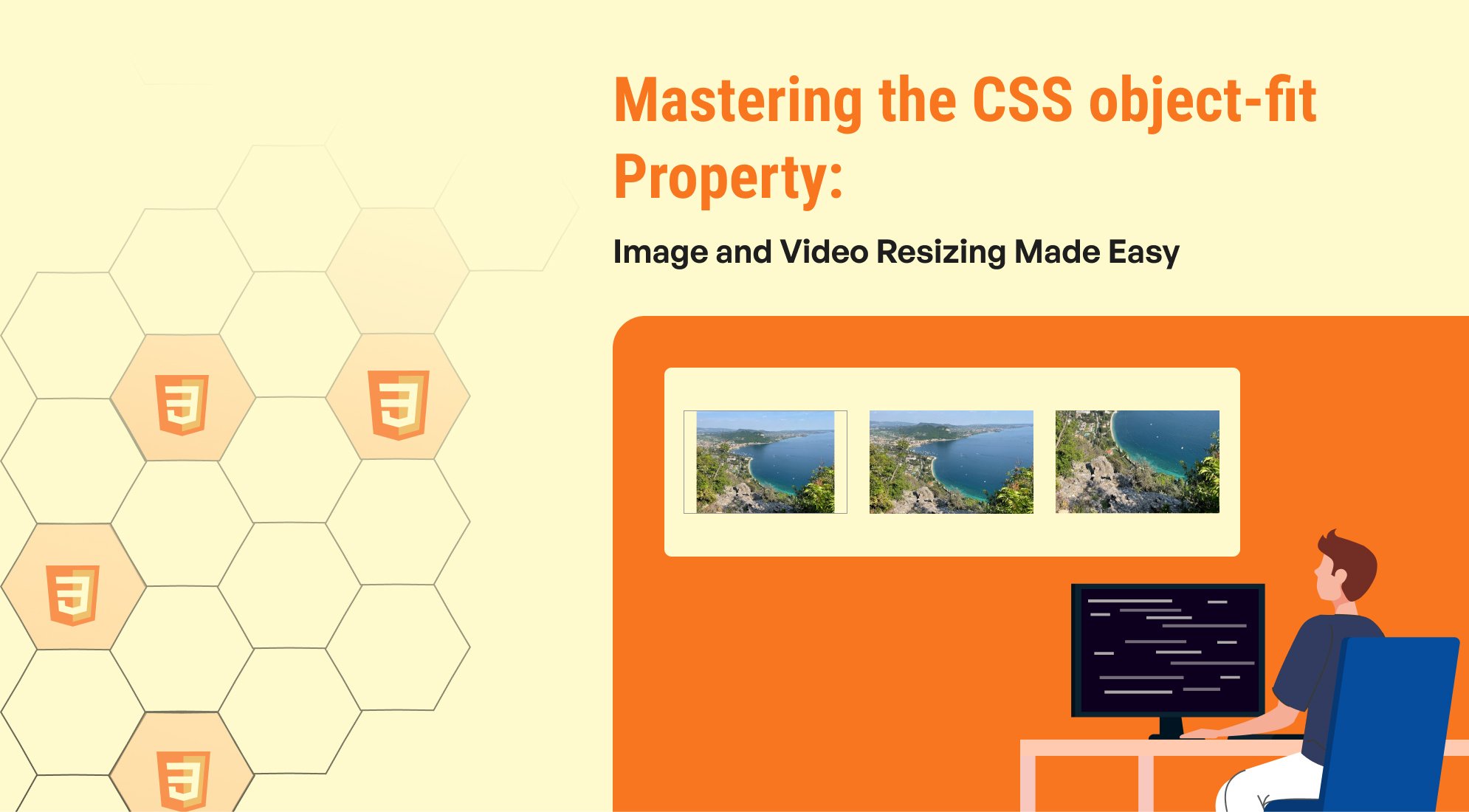
The object-fit property in CSS is an essential tool for web developers looking to effectively manage the display of images and videos within containers. This property allows for flexible and responsive design, ensuring that media elements fit neatly without distortion, making it easier to create visually appealing layouts.
Understanding object-fit
The object-fit property is particularly useful for replaced elements like <img>, <video>, and <iframe>. It provides a way to control how these elements resize and fill their container, preserving their aspect ratios while achieving the desired visual outcome.
Available Values
1. fill (default)
- Description: The content is resized to fill the entire container, potentially distorting the aspect ratio.
- Use Case: Suitable for scenarios where exact filling is more important than maintaining the aspect ratio.
2. contain
- Description: The content is scaled to fit within the container while maintaining its original aspect ratio. This might result in letterboxing (empty spaces).
- Use Case: Ideal for thumbnails or images where full visibility is needed without cropping.
3. cover
- Description: The content is resized to cover the entire container while maintaining its aspect ratio, which may lead to cropping.
- Use Case: Perfect for background images or hero sections where a clean fill is desired.
4. none
- Description: The content retains its original size, which might overflow the container.
- Use Case: Use when you need the image to stay at its natural dimensions, regardless of container size.
5. scale-down
- Description: The content is scaled down to fit either its original size (
none) or as large as it can be within the container (contain). - Use Case: Useful for preventing images from exceeding their natural dimensions while still fitting into a responsive layout.
Using object-fit: fill
The object-fit: fill value allows an image or video to stretch to fill its container entirely, regardless of its aspect ratio. This can lead to distortion of the media, but it's useful when the specific dimensions of the container are more important than preserving the original proportions of the media.

body { display: flex; justify-content: center; align-items: center; height: 100vh; background-color: #f0f0f0; } .container { width: 300px; /* Fixed width */ height: 200px; /* Fixed height */ overflow: hidden; /* Prevent overflow */ border: 2px solid #333; display: flex; justify-content: center; align-items: center; background-color: #fff; } .fill { object-fit: fill; /* Stretch to fill */ width: 100%; /* Full width of the container */ height: 100%; /* Full height of the container */ }
Using object-fit: contain
The object-fit: contain value allows an image or video to be resized to fit within its container while maintaining its original aspect ratio. This means that the entire image will be visible, but there may be empty space (letterboxing) around it if the aspect ratio of the image does not match that of the container.

body { display: flex; justify-content: center; align-items: center; height: 100vh; background-color: #f0f0f0; } .container { width: 300px; /* Fixed width */ height: 200px; /* Fixed height */ overflow: hidden; /* Prevent overflow */ border: 2px solid #333; display: flex; justify-content: center; align-items: center; background-color: #fff; } .contain { object-fit: contain; /* Maintain aspect ratio */ width: 100%; /* Full width of the container */ height: 100%; /* Full height of the container */ }
Using object-fit: cover
The object-fit: cover value allows an image or video to be resized to completely cover its container while maintaining its original aspect ratio. This means that the content may be cropped if the aspect ratio of the media does not match the aspect ratio of the container. This technique is often used for backgrounds and hero images where a full fill is desired without distorting the image.

body { display: flex; justify-content: center; align-items: center; height: 100vh; background-color: #f0f0f0; } .container { width: 300px; /* Fixed width */ height: 200px; /* Fixed height */ overflow: hidden; /* Prevent overflow */ border: 2px solid #333; display: flex; justify-content: center; align-items: center; background-color: #fff; } .cover { object-fit: cover; /* Fill the container while maintaining aspect ratio */ width: 100%; /* Full width of the container */ height: 100%; /* Full height of the container */ }
Using object-fit: none
The object-fit: none value allows an image or video to retain its original size and dimensions, which may cause it to overflow its container if it is larger than the container. This setting is useful when you want the media to be displayed in its natural size without any resizing.

body { display: flex; justify-content: center; align-items: center; height: 100vh; background-color: #f0f0f0; } .container { width: 300px; /* Fixed width */ height: 200px; /* Fixed height */ border: 2px solid #333; overflow: hidden; /* Prevent overflow */ display: flex; justify-content: center; align-items: center; background-color: #fff; } .none { object-fit: none; /* Maintain original size */ width: auto; /* Original width */ height: auto; /* Original height */ }
Using object-fit: scale-down
The object-fit: scale-down value combines the behavior of none and contain. It scales the image down to fit the container only if it is larger than the container's dimensions, while keeping its original size if it's smaller. This is useful when you want to ensure that an image does not exceed its natural size but still want it to fit within the specified dimensions

body { display: flex; justify-content: center; align-items: center; height: 100vh; background-color: #f0f0f0; } .container { width: 300px; /* Fixed width */ height: 200px; /* Fixed height */ border: 2px solid #333; overflow: hidden; /* Prevent overflow */ display: flex; justify-content: center; align-items: center; background-color: #fff; } .scale-down { object-fit: scale-down; /* Scale down if larger than container */ width: 100%; /* Full width of the container */ height: 100%; /* Full height of the container */ }
Conclusion
The object-fit property is a powerful addition to the CSS toolbox, enabling web developers to create responsive, visually appealing layouts with images and videos. By mastering this property, you can ensure that your media content is displayed in the best possible way, enhancing the overall user experience on your website. Whether you're building a simple gallery or a complex web application, understanding how to effectively use object-fit will elevate your design skills.
Let me know if you need any help implementing these effects in your projects

%201.png?width=1016&height=912&name=image%20(54)%201.png)