
4 Minutes Read
Listen to the Blog
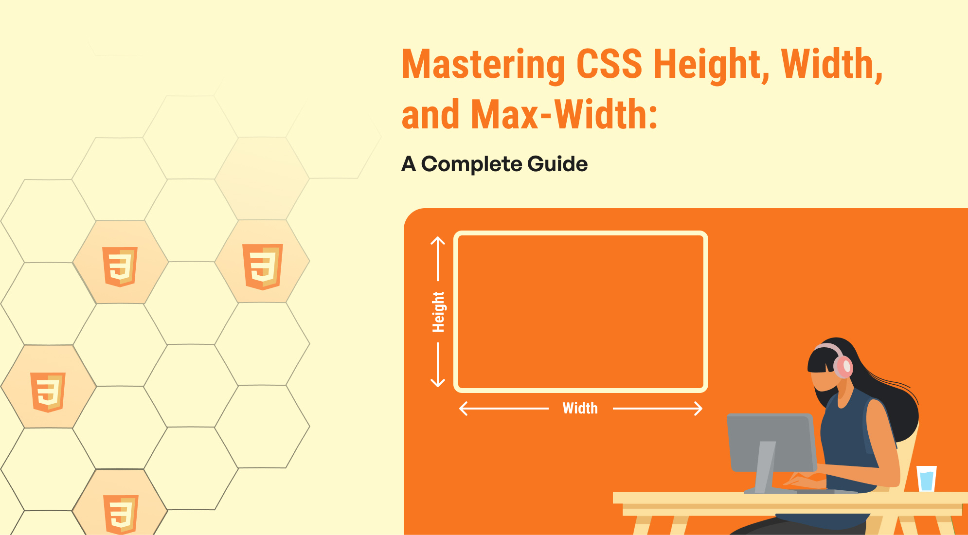
Start with a brief overview of how understanding CSS properties like height, width, and max-width is crucial for responsive and flexible web design. Mention that in this guide, you’ll cover the differences between these properties, when to use them, and provide practical examples.
Understanding the Basics of CSS Height, Width, and Max-Width
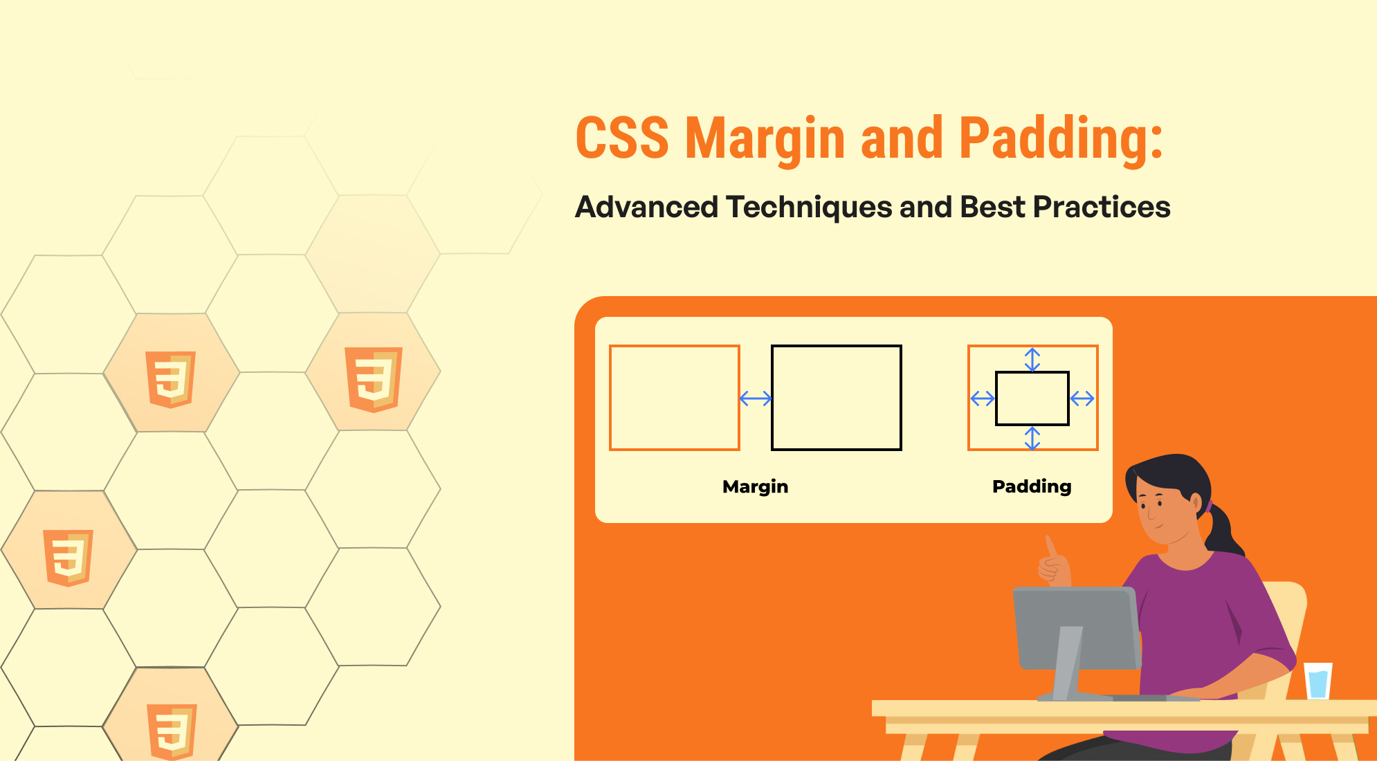
The CSS Box Model is a fundamental concept for designing and layout in web development. It represents how elements are rendered on a webpage, including their dimensions, padding, borders, and margins.
- Height: Explain how the height property defines the vertical size of an element.
- Width: Explain how the width property defines the horizontal size of an element.
- Max-Width: Introduce how max-width is used to limit the width of an element without forcing it to be smaller than needed.
When to Use Width vs. Max-Width
- Discuss the scenarios where width works best (e.g., fixed layout elements).
- Explain how max-width shines in responsive design by preventing overflow while allowing flexibility.
Understanding the height Property
The height property in CSS is used to set the vertical size of an element. It determines how tall an element is, allowing you to control how much vertical space it occupies on the page. The height can be defined using units like pixels (px), percentages (%), or viewport height (vh).

This is a fixed-height box.
.box { height: 200px; width: 300px; background-color: lightblue; border: 2px solid darkblue; text-align: center; line-height: 200px; /* Centers text vertically */ }
- The class(.box) element is given a height of 200px. This means the box will always be exactly 200 pixels tall, regardless of its content.
- The width is set to 300px for better visibility, though this is not necessary to demonstrate the height property.
- The background color (lightblue) and border help visualize the element clearly.
- The text inside the box is centered vertically using the line-height property, which is equal to the height of the box.
The Role of the width Property
The width property in CSS controls the horizontal size of an element. It defines how wide an element should be, allowing you to control how much horizontal space it takes up. The width can be set using units like pixels (px), percentages (%), or viewport width (vw).
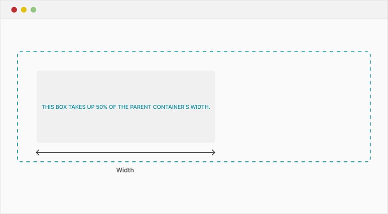
This box takes up 50% of the parent container's width.
.box { width: 50%; background-color: lightcoral; padding: 20px; border: 2px solid darkred; text-align: center; }
- The .box element has a width set to 50%. This means the box will occupy 50% of the available width of its parent container, making it responsive to changes in screen size.
- The padding (20px) and border help give the box some additional styling and space inside.
- The text-align: center; aligns the text in the middle of the box horizontally.
Maximizing Flexibility with max-width
The max-width property in CSS sets the maximum width an element can have. It prevents an element from growing wider than a specified limit, even if there’s extra space available. Unlike the width property, which strictly controls the size, max-width allows the element to be flexible and adapt to different screen sizes.
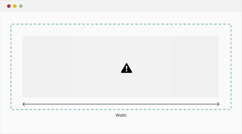
This container is responsive but will not exceed 800px in width.
.container { width: 100%; max-width: 800px; background-color: lightgreen; margin: 0 auto; padding: 20px; text-align: center; border: 2px solid darkgreen; }
- The .container element has a width set to 100%, meaning it will stretch to fill the entire width of its parent container.
- The max-width is set to 800px, which restricts the container from growing wider than 800 pixels, even on large screens.
- The margin: 0 auto; centers the container horizontally within its parent.
- The padding and border give the container some internal spacing and visual structure.
Conclusion
CSS properties like height, width, and max-width offer powerful ways to control the dimensions of your web elements. Understanding when and how to use each property is key to creating layouts that are both responsive and visually consistent across devices.


%201.png?width=1016&height=912&name=image%20(54)%201.png)