Listen to the Blog
CSS Margin and Padding are fundamental properties for controlling spacing and layout in web design. Understanding how to use these properties effectively can greatly enhance the organization and appearance of your web pages.
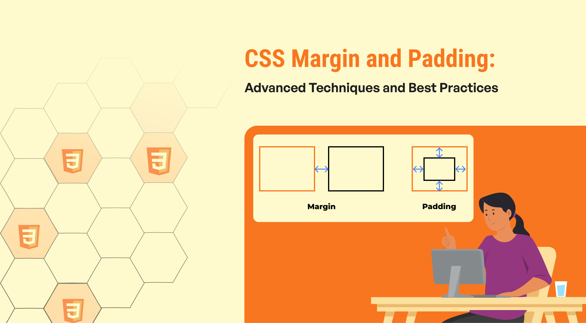
Margin is the space outside the border of an element. It creates separation between an element and its surrounding elements or the edge of its container. Margins are essential for positioning elements relative to others and controlling the overall layout. They help in creating space between elements, ensuring that they do not touch each other or the container’s edges. Margins can be set using various units such as pixels (px), ems (em), rems (rem), percentages (%), and more. The auto value is particularly useful for centering block-level elements horizontally within their container. Margins can also be negative, allowing elements to overlap or pull closer together. The shorthand property allows setting margins for all four sides of an element in a single line, with options to specify one, two, three, or four values to control spacing in different ways.
Padding, on the other hand, is the space inside an element’s border, creating distance between the content and the element’s edges. Padding is used to improve the readability of content by adding space inside the element, making sure that text or other content does not touch the borders. It also enhances the visual appeal of elements, such as buttons and input fields, by preventing content from being too close to the edges. Padding values can be specified in units like pixels (px), ems (em), rems (rem), percentages (%), etc. Unlike margins, padding cannot be negative; it only increases the internal spacing. The shorthand property for padding allows setting values for all four sides in one line, with options to specify one, two, three, or four values for different spacing configurations.
In summary, margin controls the external spacing around elements, affecting their layout relative to other elements, while padding controls the internal spacing within an element, affecting how content is positioned and displayed. Mastery of these properties enables more precise control over your page’s layout and design, contributing to a well-structured and aesthetically pleasing user experience.
Understanding the CSS Box Model
The CSS Box Model is a fundamental concept for designing and layout in web development. It represents how elements are rendered on a webpage, including their dimensions, padding, borders, and margins.
- Content: This is the actual content of the element, like text, an image, or a video. The content area is where the text and images appear.
- Padding: Padding is the space between the content and the border. It’s inside the element and can have different values on each side (top, right, bottom, left). The padding expands the element but does not affect neighboring elements.
- Border: The border wraps around the padding and content. You can style the border with different colors, widths, and styles (like solid, dashed, or dotted).
- Margin: The margin is the outermost layer that creates space between the element and its surrounding elements. It’s outside the border and doesn’t affect the element’s size directly.

Difference Between Margin and Padding in CSS Games
In CSS, margin and padding are both used to create space around elements, but they serve different purposes and behave differently.
1. Margin:
- Purpose: Margin creates space outside an element’s border, pushing it away from neighboring elements.
- Effect on Layout: It affects the distance between the element and other elements.
- Collapsing Margins: Vertical margins of adjacent elements can collapse, meaning they can combine into a single margin (the larger of the two).
- Visual Example: Think of margin as the outer space around a box that separates it from other boxes.
2. Padding:
- Purpose: Padding creates space inside an element’s border, between the content and the border.
- Effect on Layout: It increases the size of the element without affecting the distance between it and other elements.
- No Collapsing: Padding does not collapse like margins do.
- Visual Example: Think of padding as the cushioning inside a box, giving space between the content and the box’s border.
Key Differences Recap
- Margin: Controls the space outside the element.
- Padding: Controls the space inside the element, between the content and the border.

When to Use Margin in CSS
Margins in CSS are used to control the space outside an element, affecting its distance from adjacent elements. Here’s when to use margins and an example to illustrate their application:
Use Case: Spacing Between Elements
Margins are often used to create space around elements to improve layout and readability. This is particularly useful when you need to separate content, such as creating distance between paragraphs, sections, or images.

Welcome to My Website
This is a paragraph of text that appears below the heading. The space between the heading and this paragraph is controlled by the margin.
In this example:
- The margin-bottom: 20px; on the <h1> element adds a 20px space below the heading.
- This ensures there is a clear separation between the heading and the paragraph, enhancing the visual structure of the content.
Margins help to manage layout spacing effectively, making content easier to read and visually appealing.
When to Use Padding in CSS
Padding in CSS is used to create space inside an element, between the element's content and its border. It’s useful for controlling the internal spacing of an element, which can enhance readability and improve the overall layout.
Use Case: Adding Space Inside Elements
Padding is typically used when you need to add space between the content and the edge of an element. This is helpful for improving text readability, making elements look less cramped, or adjusting the spacing within containers.

In this example:
- padding: 10px 20px;adds 10px of space on the top and bottom and 20px on the left and right inside the button element.
- This padding makes the button’s text more centered and provides space around it, improving the button's appearance and usability.
Padding is crucial for enhancing the internal spacing of elements, making them look more organized and easier to interact with.
Conclusion
Margins and padding are essential CSS properties used to control the spacing around and inside elements, respectively. Understanding their differences and appropriate usage is crucial for effective web design and layout.



%201.png?width=1016&height=912&name=image%20(54)%201.png)