
6 Minutes Read
Listen to the Blog
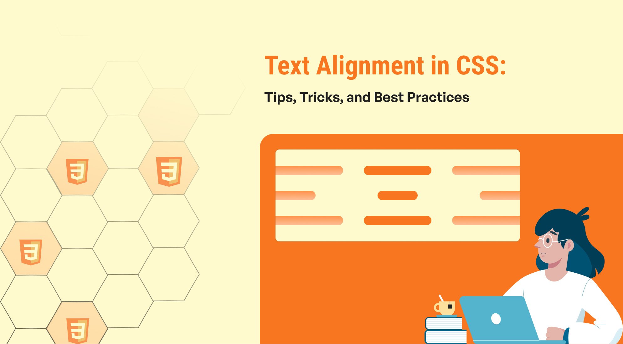
The text-align property in CSS is used to set the horizontal alignment of text within an element. It works for block-level elements such as <p>, <div>, <h1>, etc. Here are the common values for text-align:
- left: Aligns the text to the left. This is the default setting.
- right: Aligns the text to the right.
- center: Centers the text horizontally within its container.
- justify: Stretches the text so that each line has equal width, aligning both left and right edges.
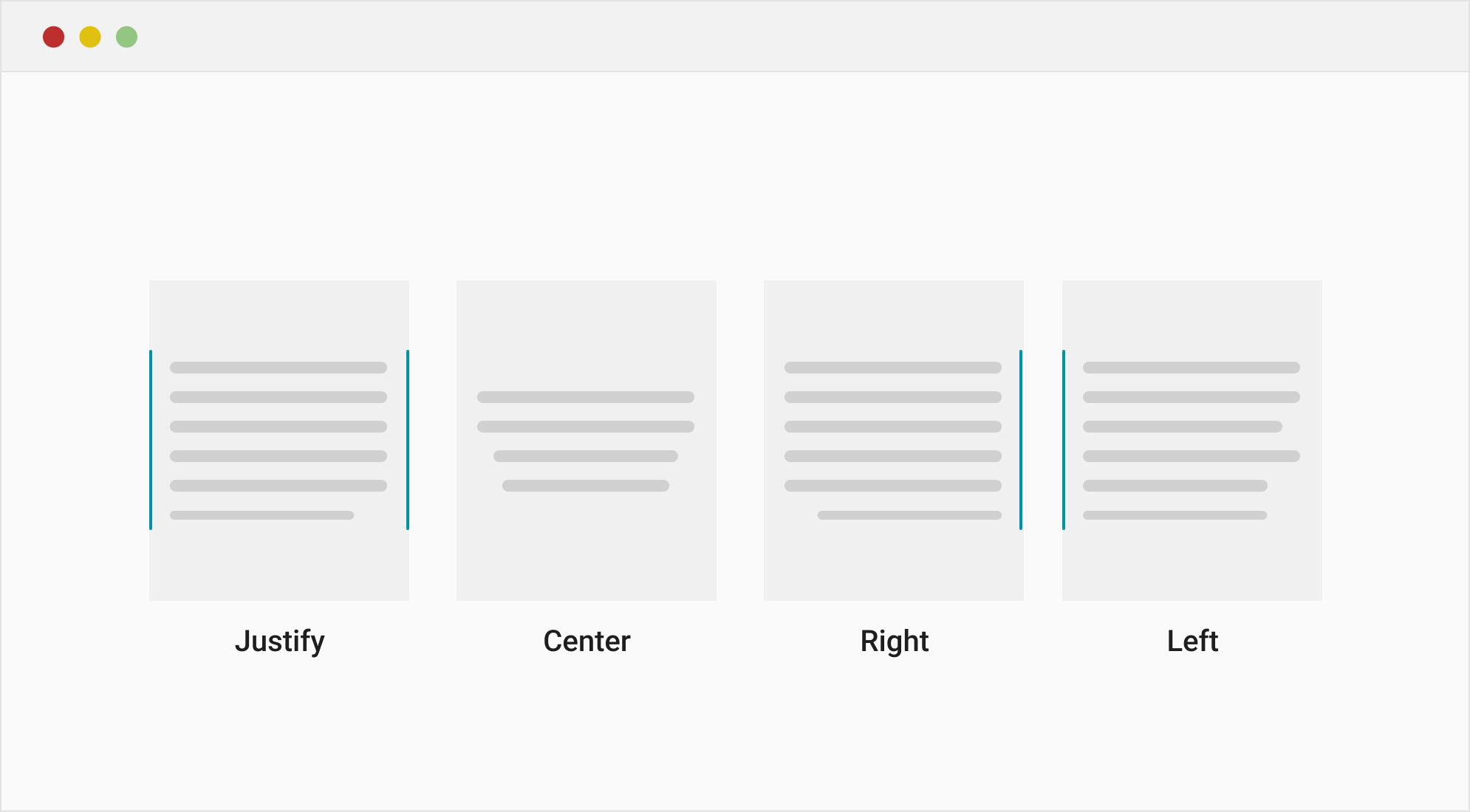
Left Aligned Text
This text is aligned to the left. This is the default alignment for most languages written from left to right.
Right Aligned Text
This text is aligned to the right. It is commonly used for stylistic purposes or for languages written from right to left.
Centered Text
This text is centered. Centered text is often used for headings, titles, and important information.
Justified Text
This text is justified. Justification stretches the text so that each line has the same width, aligning both the left and right edges. It is often used in newspapers and magazines for a clean look.
.left { text-align: left; } .right { text-align: right; } .center { text-align: center; } .justify { text-align: justify; }
Vertical Text Alignment
To demonstrate the different values of the vertical-align property—baseline, middle, top, and bottom—within a single example, we can use an HTML snippet that contains text and images (or other inline elements) aligned differently within the same line. This example will show how these values affect the vertical alignment of elements in an inline context.
Common values include:
- baseline: Aligns the element's baseline with the parent's baseline.
- middle: Aligns the middle of the element with the middle of the line height.
- top and bottom: Aligns the element with the top or bottom of the line height.

Text with baseline,
middle,
top, and
bottom alignments.
.container { font-size: 20px; /* Increase font size for visibility */ line-height: 1.5; /* Set line height for clear alignment */ } .baseline { vertical-align: baseline; /* Aligns with the baseline of the text (default) */ width: 40px; height: 40px; border: 2px solid #4CAF50; } .middle { vertical-align: middle; /* Aligns with the middle of the text line */ width: 40px; height: 40px; border: 2px solid #FF5733; } .top { vertical-align: top; /* Aligns with the top of the line */ width: 40px; height: 40px; border: 2px solid #2196F3; } .bottom { vertical-align: bottom; /* Aligns with the bottom of the line */ width: 40px; height: 40px; border: 2px solid #FFC107; }
Aligning Text in Flexbox
Aligning text with Flexbox is a powerful way to center or position text both horizontally and vertically within a container. Flexbox provides easy and efficient alignment properties for various layout requirements.
Below is a single example that demonstrates how to align text both horizontally and vertically in a container using Flexbox.
Key properties:
- justify-content:Aligns content along the main axis (horizontally by default).
- align-items:Aligns content along the cross axis (vertically by default).


Centered Text
.flex-container { display: flex; /* Enables Flexbox */ justify-content: center; /* Centers content horizontally */ align-items: center; /* Centers content vertically */ height: 200px; /* Sets the height of the container */ border: 2px solid #4CAF50; /* Adds a border for visibility */ font-size: 24px; /* Increases font size for better visibility */ background-color: #f0f0f0; /* Adds a background color */ }
Aligning Text in CSS Grid
CSS Grid is another powerful layout system in CSS that allows for fine control over both horizontal and vertical alignment of content within a container. It provides more flexibility than Flexbox when dealing with both rows and columns simultaneously.
Below is a single example that demonstrates how to align text both horizontally and vertically using CSS Grid properties like justify-content, align-content, justify-items, and align-items.
Key properties:
- jalign-content:Aligns the entire grid inside the container.
- justify-content:Aligns the grid along the inline axis.
- align-items and justify-items:Aligns individual grid items within their cells.
Left Text
Centered Text
Right Text
.grid-full { display: grid; grid-auto-flow: column; width: 850px; } .grid-container { width: 250px; display: grid; /* Enables CSS Grid */ justify-content: center; /* Centers the grid content horizontally */ align-content: center; /* Centers the grid content vertically */ justify-items: center; /* Centers each grid item horizontally */ align-items: center; /* Centers each grid item vertically */ height: 200px; /* Sets the height of the container */ border: 2px solid #FF5733; /* Adds a border for visibility */ background-color: #f0f0f0; /* Adds a background color */ font-size: 24px; /* Increases font size for better visibility */ padding: 10px; } .grid-container.left { justify-content: left; /* Centers the grid content horizontally */ align-content: left; /* Centers the grid content vertically */ justify-items: left; /* Centers each grid item horizontally */ align-items: left; /* Centers each grid item vertically */ } .grid-container.right { justify-content: right; /* Centers the grid content horizontally */ align-content: right; /* Centers the grid content vertically */ justify-items: right; /* Centers each grid item horizontally */ align-items: right; /* Centers each grid item vertically */ }
Tips for Perfect Text Alignment
- Responsive Design:Always test text alignment on different screen sizes. Use media queries to adjust the alignment for various devices.
- Accessibility Considerations:Ensure that justified text is readable. Avoid it for body text on smaller screens, as it can cause uneven spacing.
- Combine with Line Height and Letter Spacing:Adjust line-height and letter-spacing properties to improve readability and balance.
- Use CSS Frameworks:Leverage CSS frameworks like Bootstrap or Tailwind CSS that offer utility classes for quick text alignment.
Common Pitfalls and How to Avoid Them
- Avoid Overusing Centred Text:While centred text can be visually appealing, it can reduce readability, especially for large blocks of text. Use it sparingly.
- Be Mindful of Justified Text:ustified text can look great in print, but it can create uneven gaps between words on the web. Consider using text-align: justify; only for larger screens.
- Check Browser Compatibility: Although most CSS properties are widely supported, always check for browser compatibility, especially when using advanced properties like those in CSS Grid or Flexbox.
Conclusion
Mastering text alignment in CSS is key to creating clean, professional, and readable web designs. By understanding and utilising CSS properties like text-align, vertical-align, Flexbox, and Grid, you can align text and other elements perfectly, improving the user experience on your website.
Experiment with different properties, and always keep accessibility and responsiveness in mind to ensure your designs work well for all users.

%201.png?width=1016&height=912&name=image%20(54)%201.png)