
4 Minutes Read
Listen to the Blog
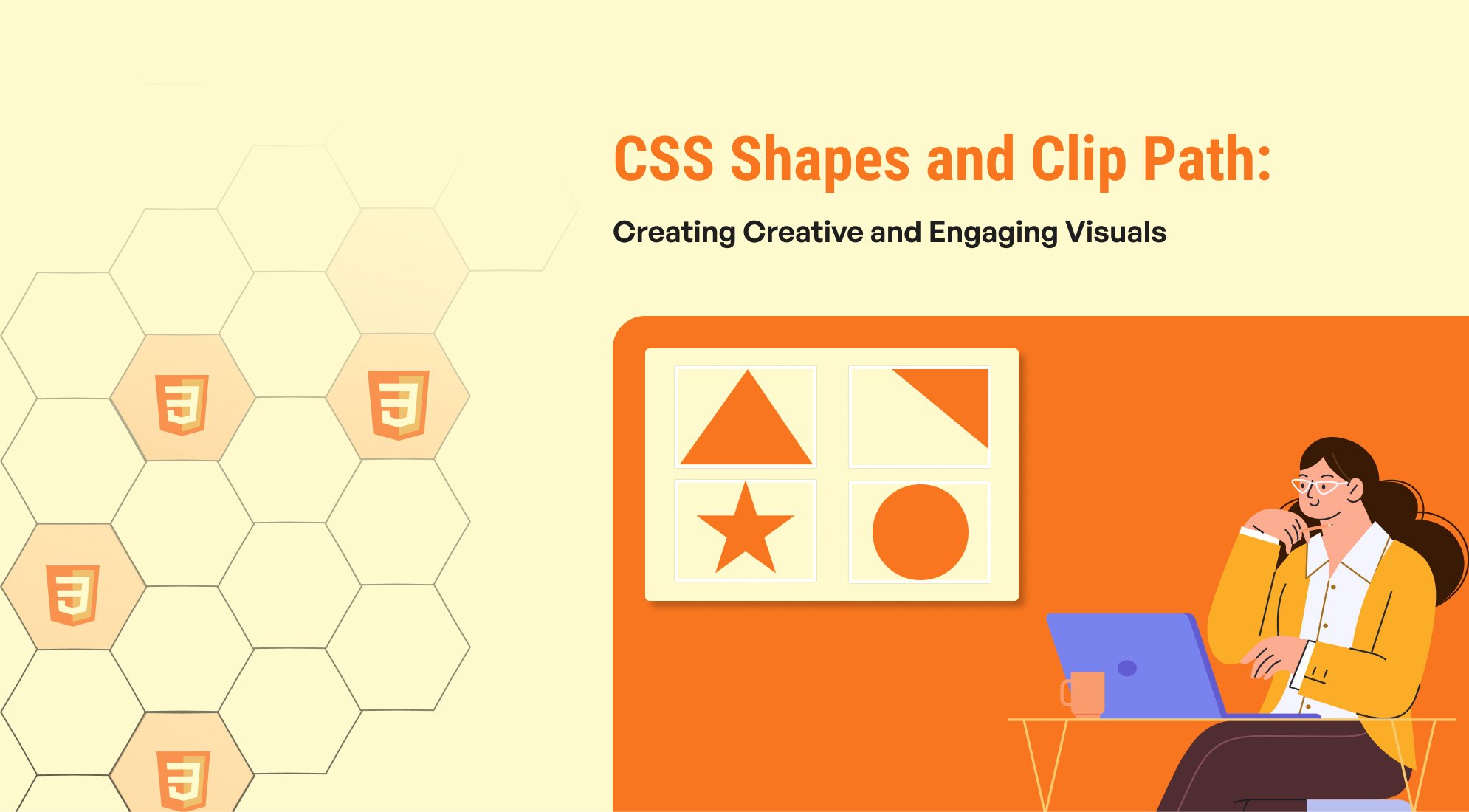
CSS has evolved tremendously over the years, allowing web developers to create visually stunning and engaging designs. Among the exciting features are CSS Shapes and the clip-path property, which enable designers to break away from the traditional boxy layout and create unique and engaging visuals. In this blog, we'll explore these properties, their applications, and how to implement them with practical examples.
What Are CSS Shapes?
CSS Shapes allow text to wrap around custom shapes, providing designers with the flexibility to create more dynamic layouts. Instead of wrapping text around a rectangular image or element, you can define any shape—circle, polygon, or even a path—for text to follow.
Circle: Clip Path

circle { background: #456BD9; clip-path: circle(50%); height: 5em; width: 5em; }
What Is clip-path?
The clip-path property in CSS allows you to create complex clipping shapes to control which part of an element is visible. One of its most versatile values is the polygon() function, which lets you define custom shapes using a series of points.
Example: Clip Path Polygon

.card { clip-path: url("#triangle"); }
Combining CSS Shapes and clip-path
You can combine CSS Shapes and clip-path to create even more intricate designs. For example, you could clip an image into a heart shape and wrap text around it using a corresponding custom shape.

body { margin: 0; } p { margin: 5px; } .container { margin: 70px; display: flex; flex-wrap: wrap; gap: 10px 120px; } .heart-1 { width: 24px; /* Size of the path */ height: 24px; /* Size of the path */ background: #FF5252; /* Color */ clip-path: path("M12 4.248c-3.148-5.402-12-3.825-12 2.944 0 4.661 5.571 9.427 12 15.808 6.43-6.381 12-11.147 12-15.808 0-6.792-8.875-8.306-12-2.944z"); transform: scale(5); } .heart-2 { width: 24px; /* Size of the path */ height: 24px; /* Size of the path */ background: #FF5252; /* Color */ clip-path: path("M12 21.593c-5.63-5.539-11-10.297-11-14.402 0-3.791 3.068-5.191 5.281-5.191 1.312 0 4.151.501 5.719 4.457 1.59-3.968 4.464-4.447 5.726-4.447 2.54 0 5.274 1.621 5.274 5.181 0 4.069-5.136 8.625-11 14.402m5.726-20.583c-2.203 0-4.446 1.042-5.726 3.238-1.285-2.206-3.522-3.248-5.719-3.248-3.183 0-6.281 2.187-6.281 6.191 0 4.661 5.571 9.429 12 15.809 6.43-6.38 12-11.148 12-15.809 0-4.011-3.095-6.181-6.274-6.181"); transform: scale(5); } .heart-3 { width: 24px; /* Size of the path */ height: 24px; /* Size of the path */ background: #FF5252; /* Color */ clip-path: path("M12 4.419c-2.826-5.695-11.999-4.064-11.999 3.27 0 7.27 9.903 10.938 11.999 15.311 2.096-4.373 12-8.041 12-15.311 0-7.327-9.17-8.972-12-3.27z"); transform: scale(5); }
Browser Support
Both CSS Shapes and clip-path have good support in modern browsers, but always test your designs across browsers to ensure compatibility. For older browsers, consider providing fallback styles
Tools and Resources
- CSS Clipping and Masking Guide
- CSS Shapes Module
- Clip Path Maker
Conclusion
CSS Shapes and the clip-path property empower developers to break free from traditional rectangular layouts, enabling the creation of unique and engaging designs. Whether you're creating circular images, diamond-shaped sections, or complex paths, these tools provide endless possibilities for enhancing your web projects. Experiment with these properties and see how they can elevate your designs to the next level!

%201.png?width=1016&height=912&name=image%20(54)%201.png)