Listen to the Blog
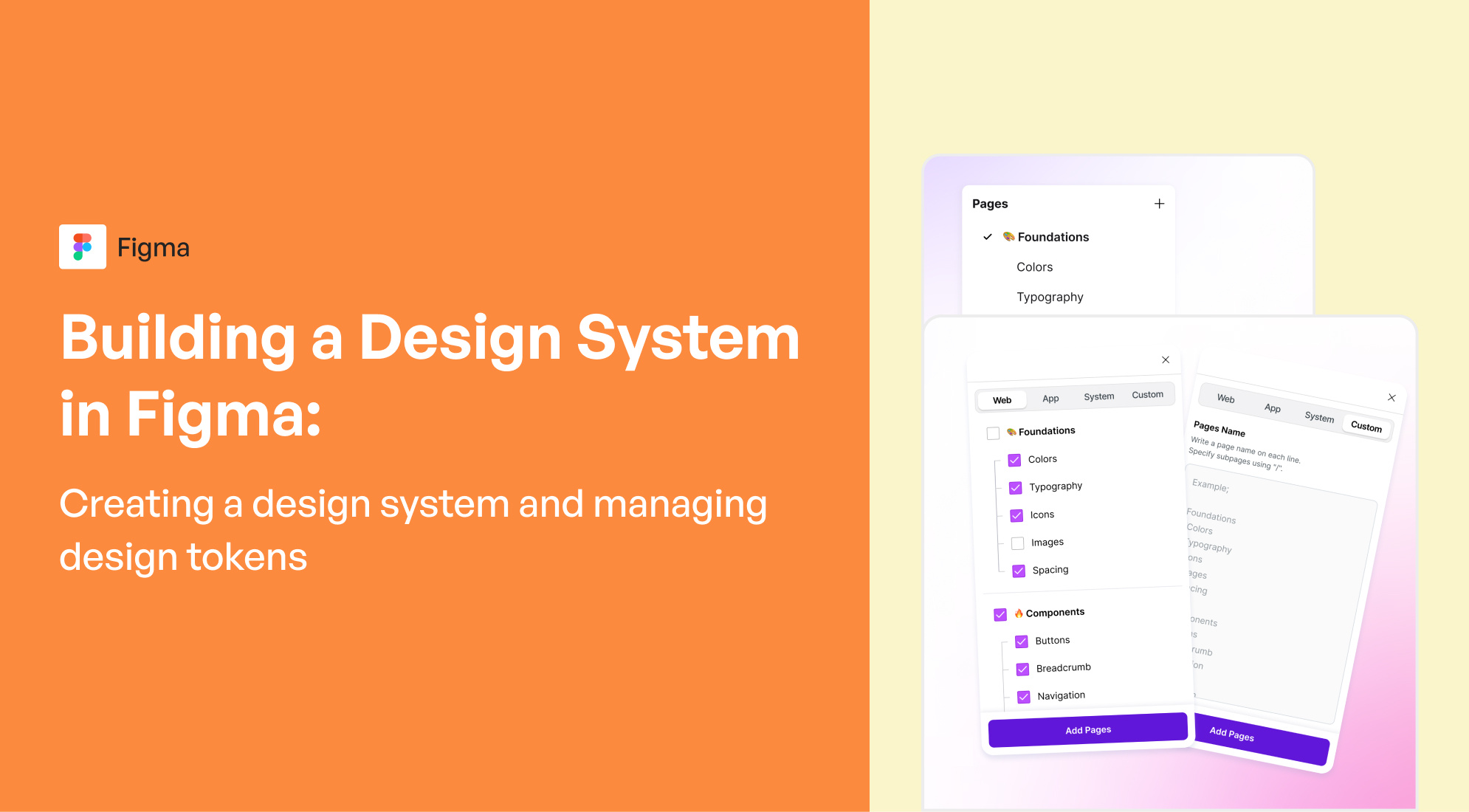
Creating a design system in Figma and managing design tokens involves several key steps. Here's a comprehensive guide to help you through the process.
Step 1: Plan the Design System
Before you start building your design system, it’s crucial to plan it. Think of this as the blueprint for how the system will operate, including its scope and the key components you need, such as:
- Typography
- Color palettes
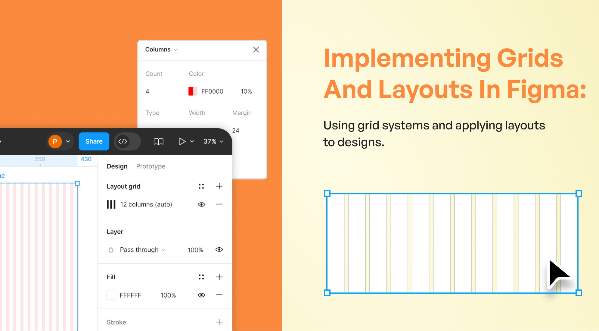
- Grid system
- Spacing
- Icons
- Components (buttons, inputs, modals, etc.)
Step 2: Create and Organize Styles
Figma allows you to define Styles for colors, typography, and other design attributes that can be reused across the design system.
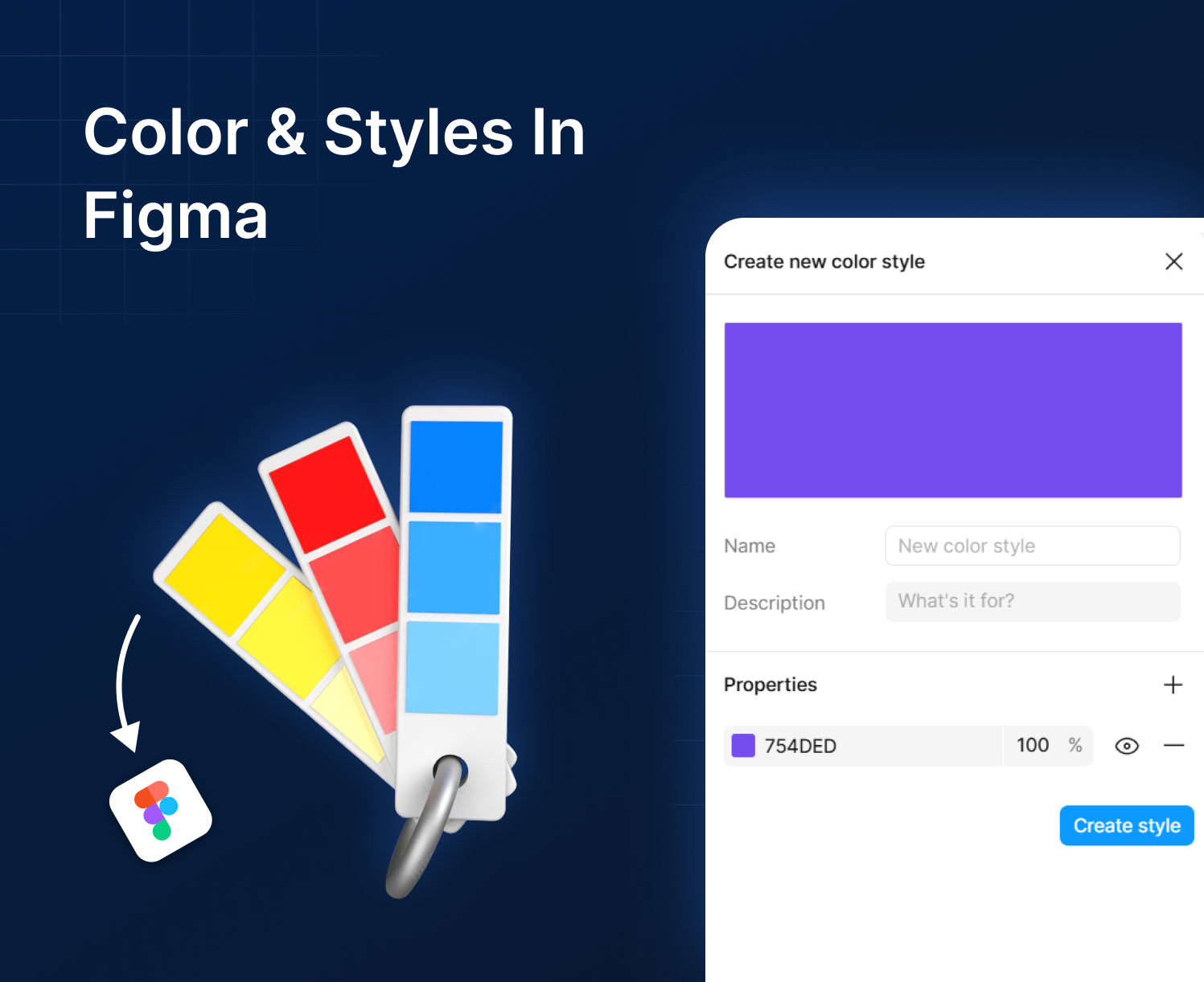
1. Color Styles
- In the Figma file, create color styles for your primary, secondary, and neutral colors.
- Define variants like light, dark, and contrast versions.
- Apply them globally to maintain consistency.
Steps to create color styles:
- Select any object.
- Go to the right panel and click on the color swatch under “Fill.”
- Choose a color and click the "Style" icon (four dots).
- Click on the "+" icon to create a new color style.

2. Typography Styles
Similarly, create typography styles for different text elements (H1, H2, body text, captions, etc.).
Steps to create text styles:
- Select a text layer.
- Choose the font, size, weight, and other text properties.
- In the right panel, click the “Style” icon.
- Create a new text style.

3. Effects and Shadows
You can also create reusable styles for things like shadows, borders, and blurs to apply consistently across components.
Step 3: Design Components
Components are reusable UI elements like buttons, cards, and input fields.
- Create Components:
- Design elements like buttons, dropdowns, and input fields.
- Select the element and click “Create Component” in the toolbar or press Cmd + Alt + K (Mac) / Ctrl + Alt + K (Windows).
- Use Variants for Different States: Figma allows you to create Variants for different states of a component (e.g., hover, active, disabled states for buttons).
Steps to create variants:
- Select the component.
- In the right panel, click “+” in the variants section to create different states for the component.

Step 4: Define and Manage Design Tokens
Design tokens are the smallest reusable elements in a design system (e.g., colors, spacing values, border radius, typography). In Figma, design tokens aren’t native but can be managed manually or via plugins.
Manual Approach
- Define token names for each style (e.g., $primary-color, $font-body, etc.).
- Apply these tokens consistently when naming styles and components.
Plugin Approach
- Install plugins like Figma Tokens or Styler to manage design tokens.
- Use these plugins to define tokens for colors, typography, and spacing.
- Sync the tokens with your codebase if needed.

Step 5: Organize Components in Design System
Organizing the design system makes it easier for designers and developers to navigate.
- Create Pages:
- Create pages for different parts of the system (e.g., Colors, Typography, Components).
- Use Naming Conventions: Name your components and styles following a consistent convention. For example:
- button/primary/default
- heading/H1
- Structure Your Components: Organize your components into meaningful categories in the asset panel (use Figma's component sets).

Step 6: Share the Design System
- Once the design system is ready, share it as a Team Library in Figma.
- Go to the Assets panel, click the library icon, and publish the components to the Team Library.
- Document Your Design System: Document how and when to use each component, style, and design token. This helps ensure consistency across your team.

Step 7: Maintain and Evolve the System
A design system needs regular updates. Ensure there’s a process in place to:
- Add new components.
- Deprecate old ones.
- Make updates without disrupting existing designs.
Useful Plugins for Managing Design Tokens:
- Figma Tokens: Helps you create and sync design tokens with code.
- Styler: Provides more control over managing styles in Figma.
Conclusion
Building a design system in Figma involves creating a well-structured system of reusable components, styles, and tokens. By establishing clear design principles, managing design tokens, and building components with variants, teams can create more consistent and scalable products. As your design system evolves, be sure to update tokens and components, maintaining a single source of truth that designers and developers can rely on.


%201.png?width=1016&height=912&name=image%20(54)%201.png)