
4 Minutes Read
Listen to the Blog
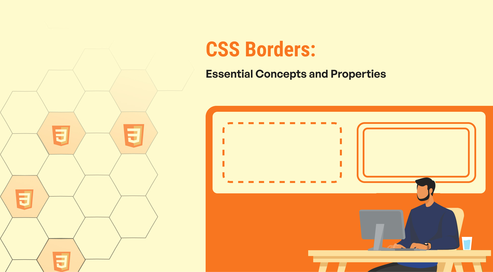
CSS borders are fundamental in web design for defining the edges of HTML elements. They are essential for creating visual separations, enhancing the aesthetics of elements, and improving layout structure.
CSS Border Style
The border-style property in CSS specifies the style of the border around an element. It controls how the border line is rendered and can greatly influence the visual presentation of the element. Here’s a comprehensive look at the different border styles available in CSS:
- None: Specifies no border
- Solid: A continuous, unbroken line.
- Dashed: A border composed of dashed lines.
- Dotted: A border made up of dots.
- Double: Two solid lines with space between them.
- Mixed: You can set different border styles for each side of an element using individual border properties
- Groove: Creates a 3D effect with an inset appearance.
- Ridge: Creates a 3D effect with an outset appearance.
- Inset: Makes the element appear embedded into the page.
- Outset: Gives the appearance of the element being raised from the page.
- Hidden: The border is not visible and does not take up space. Useful for table elements.

Solid Border
Dashed Border
Dotted Border
Double Border
Mixed border
Groove Border
Ridge Border
Inset Border
Outset Border
No Border
.border-styles { border-width: 2px; border-color: black; padding: 10px; margin: 10px; width: 200px; text-align: center; } .solid { border-style: solid; } .dashed { border-style: dashed; } .dotted { border-style: dotted; } .double { border-style: double; } .mixed{ border-style: double dashed dotted solid; } .groove { border-style: groove; } .ridge { border-style: ridge; } .inset { border-style: inset; } .outset { border-style: outset; } .none { border-style: none; } .hidden { border-style: hidden; }
CSS Border Width
The border-width property in CSS controls the thickness of the borders surrounding an element. It can be used to set the width for all four sides of an element simultaneously or individually for each side. This property is essential for customizing the appearance of borders and achieving the desired layout and design.
- Keyword values: thin, medium, thick
- Length values: px, pt, em, rem, vh, and more

Thin border
Medium border
Thick border
Border defined by length value
Mixed border
.thin { border: thin solid; } .medium { border: medium solid; } .thick { border: thick solid; } .length { border: 2px solid; } .mix { border-style: solid; border-width: 2px 8px 4px; } /* Other styling */ p { font-family: Arial; }
CSS Border Color
The border-color property in CSS allows you to set the color of the border of an element. It can be used in conjunction with the border-width and border-style properties to create fully styled borders. You can specify the border color using various methods, including named colors, hex codes, RGB, RGBA, HSL, and HSLA values.

Border defined by color name
Border defined by hex code
Border defined by RGB color code
Border defined by HSLA color code
Border defined by three color values
.colorclass { border: 2px groove yellow; } .hex { border: 2px ridge #454542; } .rgb { border: 2px inset rgb(150,100,255); } .hsla { border: 2px outset hsla(0,60%,70%, .5); } .threebordervalues { border-width: 2px; border-style: solid; border-color: #FFC0CB #421313 #008000; } /* Other styling */ p { font-family: Arial; }
CSS Border Shorthand
The border shorthand property in CSS allows you to set the border-width, border-style, and border-color for all sides of an element in a single declaration. This can help you write cleaner and more concise CSS code.

Single Value Border
.single-value-border { border: 2px solid #3498db; /* Applies to all sides */ padding: 20px; margin: 10px; text-align: center; width: 500px; }
CSS Border Gradient
Applying gradients to borders in CSS can create visually striking effects and enhance the design of your elements. While CSS does not provide a direct way to apply gradients to borders, you can achieve this effect using a combination of CSS techniques. Below are different methods to apply gradient borders:

Gradient Border
.gradient-border { border: 10px solid transparent; /* Set border width and make it transparent */ border-image: linear-gradient(45deg, #ff6f61, #d9a7c7) 1; /* Gradient border */ padding: 20px; background-color: #ffffff; /* Background color of the element */ text-align: center; width: 500px; margin: 20px; }
Conclusion
CSS borders offer a wide range of styling options to enhance the design and functionality of web elements. From basic styling with width, color, and style properties to advanced techniques involving gradients and pseudo-elements, borders play a crucial role in shaping the visual presentation of a webpage. By mastering these properties and techniques, you can create polished and visually appealing web designs that meet your aesthetic and functional needs.

%201.png?width=1016&height=912&name=image%20(54)%201.png)