Listen to the Blog
Effective word spacing can significantly enhance the readability and aesthetic appeal of web content. This guide will explore the fundamentals, practical techniques, and best practices for mastering word spacing in web design.
What is Word Spacing?
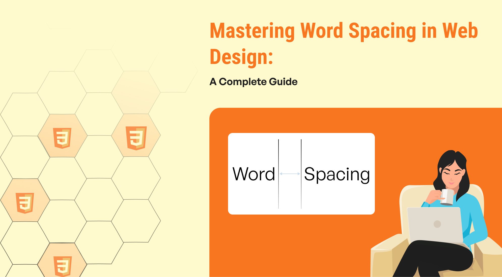
Word spacing refers to the amount of horizontal space between individual words in a block of text. It is an essential aspect of typography and layout design, influencing both readability and visual appeal.
Why is Word Spacing Important in Web Design?
Word spacing plays a vital role in web design as it directly affects how users perceive, read, and engage with content. Properly adjusted word spacing contributes to a polished and professional look, improves accessibility, and enhances the overall user experience.
1. Improves Readability
- Flow of Text: Balanced word spacing ensures a natural flow, making it easier for users to read and comprehend content.
- For Long Texts: Proper word spacing is particularly important for paragraphs, where dense or uneven spacing can tire readers.
- Accessibility: Slightly increased spacing benefits users with cognitive or visual impairments, such as dyslexia, by reducing visual clutter.
2. Enhances Visual Design
- Professional Appearance: Consistent and intentional word spacing contributes to a clean, organized layout that looks professional.
- Creative Styling: Adjusted word spacing in headers, banners, or hero sections can add a unique and eye-catching design element.
- Alignment with Brand: Custom word spacing can reflect a brand's identity, creating a sleek and modern or bold and creative look
3. Complements Text Justification
- Avoiding "Rivers": In justified text, word spacing adjustments prevent the formation of large gaps or "rivers" of white space, which can disrupt the reading experience.
- Better Alignment: Adjustments ensure text aligns evenly, creating a visually harmonious block of text.
4. Optimizes Responsive Design
- Different Screen Sizes: Proper word spacing adapts text for readability across devices, ensuring it remains legible on both small screens (mobile) and large displays (desktop).
- Consistency: Adjustments help maintain a uniform reading experience regardless of the screen's resolution or font scaling.
Common Word Spacing Mistakes to Avoid
Word spacing is a subtle yet critical component of typography and web design. Improper adjustments can lead to readability issues, visual imbalance, and a poor user experience. Here are the most common word spacing mistakes and how to avoid them:
Excessive Word Spacing
Problem:
- Too much space between words creates disjointed text, making it harder for users to follow and comprehend.
- Large gaps disrupt the natural reading flow and make text appear unprofessional.
Solution:
- Stick to small, incremental increases in word spacing, especially for body text.
- Use a value like word-spacing: 0.1em for slight adjustments instead of overly large values
Insufficient Word Spacing
Problem:
- Tight word spacing causes words to blend together, reducing legibility.
- This is particularly problematic for smaller text sizes or dense font families.
Solution:
- Ensure the spacing is adequate for the font and size used.
- Test on different screen sizes to confirm readability across devices.
Ignoring Accessibility Standards
Problem:
- Inadequate or inconsistent word spacing can make text inaccessible for people with cognitive or visual impairments, such as dyslexia or low vision.
- It may also fail to meet Web Content Accessibility Guidelines (WCAG).
Solution:
- Use accessible word spacing recommendations: at least 0.12em in most cases.
- Combine word spacing adjustments with other accessibility practices like proper font choice and readable line heights
Word Spacing Example in HTML & CSS
Here’s an example of how to use word spacing in HTML and CSS to adjust the spacing between words in a web page:

Word Spacing in Web Design
This paragraph uses the default word spacing applied by the browser.
This paragraph has increased word spacing for enhanced readability.
This paragraph has reduced word spacing, making the text more compact.
Conclusion
Word spacing is a subtle but powerful tool in typography. By understanding its role and using tools like CSS effectively, designers can create content that is visually balanced and easy to read. Fine-tuning word spacing demonstrates attention to detail, resulting in polished and professional designs.


%201.png?width=1016&height=912&name=image%20(54)%201.png)