Listen to the Blog
Choosing the right font weight is more than just a stylistic choice—it can significantly affect readability, user experience, and brand perception. In this guide, we’ll explore the different font weights, how they work in various design contexts, and tips for pairing them to create balance and impact.
Understanding Font Weights and Their Uses
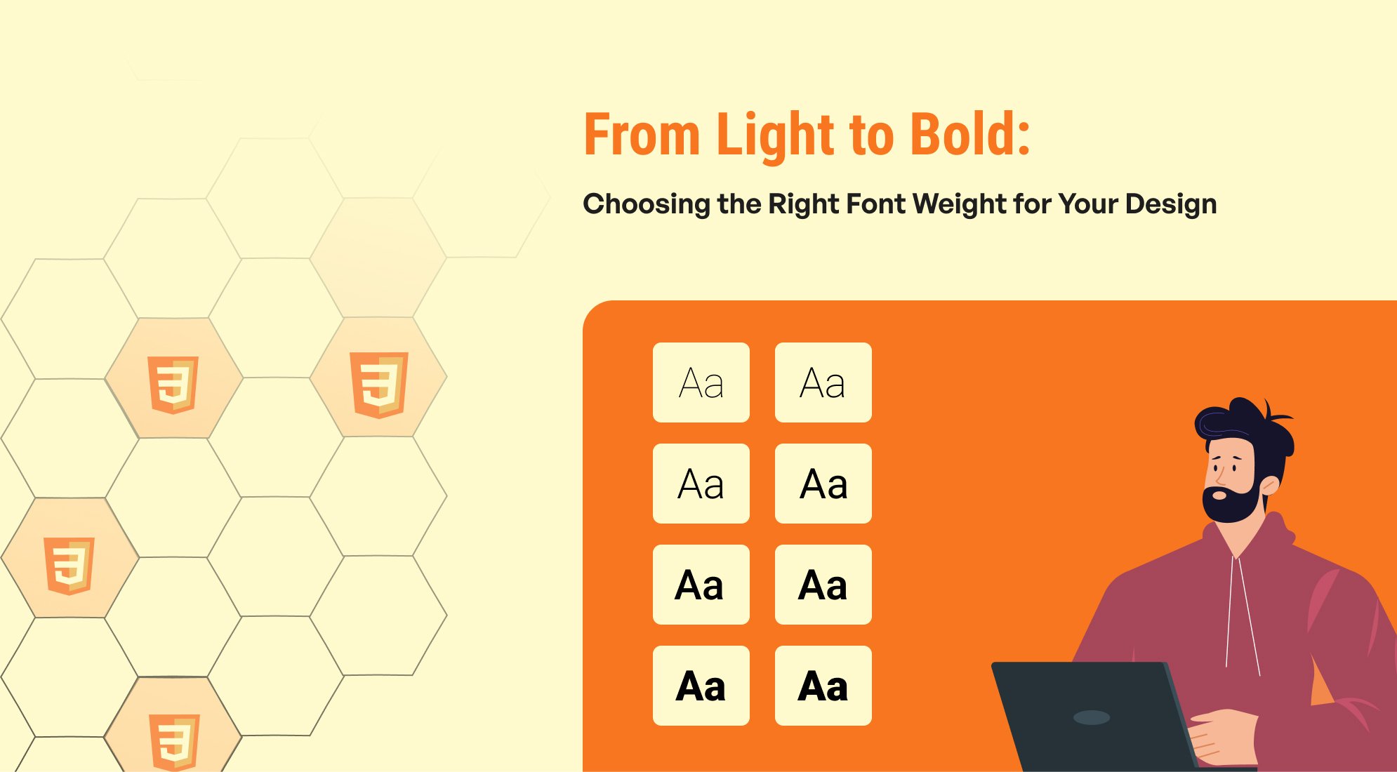
Font weights typically range from 100 (thin) to 900 (extra bold), allowing you to adjust the visual strength of text. Here’s a breakdown of common weights and where to use them:
- Thin (100–200): Rarely used in body text due to readability issues; often effective in large headings or decorative contexts.
- Light (300): Great for subtle headings and accents, especially when aiming for a minimalist aesthetic.
- Regular (400): Standard weight for body text, providing excellent readability across devices.
- Medium to Semi-Bold (500–600): Often used for subheadings and emphasized text, striking a balance between boldness and subtlety.
- Bold to Extra Bold (700–800): Common in headings, buttons, and calls to action, creating strong visual impact.
- Black (900): Best for maximum emphasis, such as logos or key headings. Use sparingly to avoid overwhelming your design.
Font Weight and Readability
Font weight plays a major role in readability, especially on screens. Here are a few best practices:
- Avoid extremely light weights for small text as they can be hard to read on high-resolution screens.
- Bold weights can improve readability for headings or important statements, especially when users quickly scan content.
- Contrast in font weights between headers, subheaders, and body text helps users differentiate sections.
Font Weight and Hierarchy in UI Design
A clear hierarchy helps users navigate information more easily, and font weight is one of the most effective tools for establishing this. Here’s how different font weights can create hierarchy:
- Heading 1 (Extra Bold): Primary heading at 800 or 900 weight for maximum impact.
- Heading 2 (Bold): Secondary heading at 600–700 weight to signal importance but stay distinct from H1.
- Body Text (Regular): Regular (400) weight for readability.
- Buttons and Links (Medium): 500 weight for emphasis, standing out from body text but not overpowering.
Font-weight property in CSS
The font-weight property in CSS is used to control the thickness or boldness of text, allowing designers to adjust the visual emphasis and hierarchy within a design.

Font weight plays a crucial role in web design. By choosing the right weight, designers can create clear visual hierarchy, improve readability, and guide the user’s attention to the most important information.
Note: Use bold fonts sparingly to avoid overwhelming the user.
Conclusion
Using font weights effectively is a simple yet powerful way to enhance your design. By carefully choosing and combining weights, you can craft visually appealing, user-friendly designs that align with your brand’s voice. Remember, balance is key—experiment with different weights to find the perfect combination that resonates with your audience.



%201.png?width=1016&height=912&name=image%20(54)%201.png)