
6 Minutes Read
Listen to the Blog
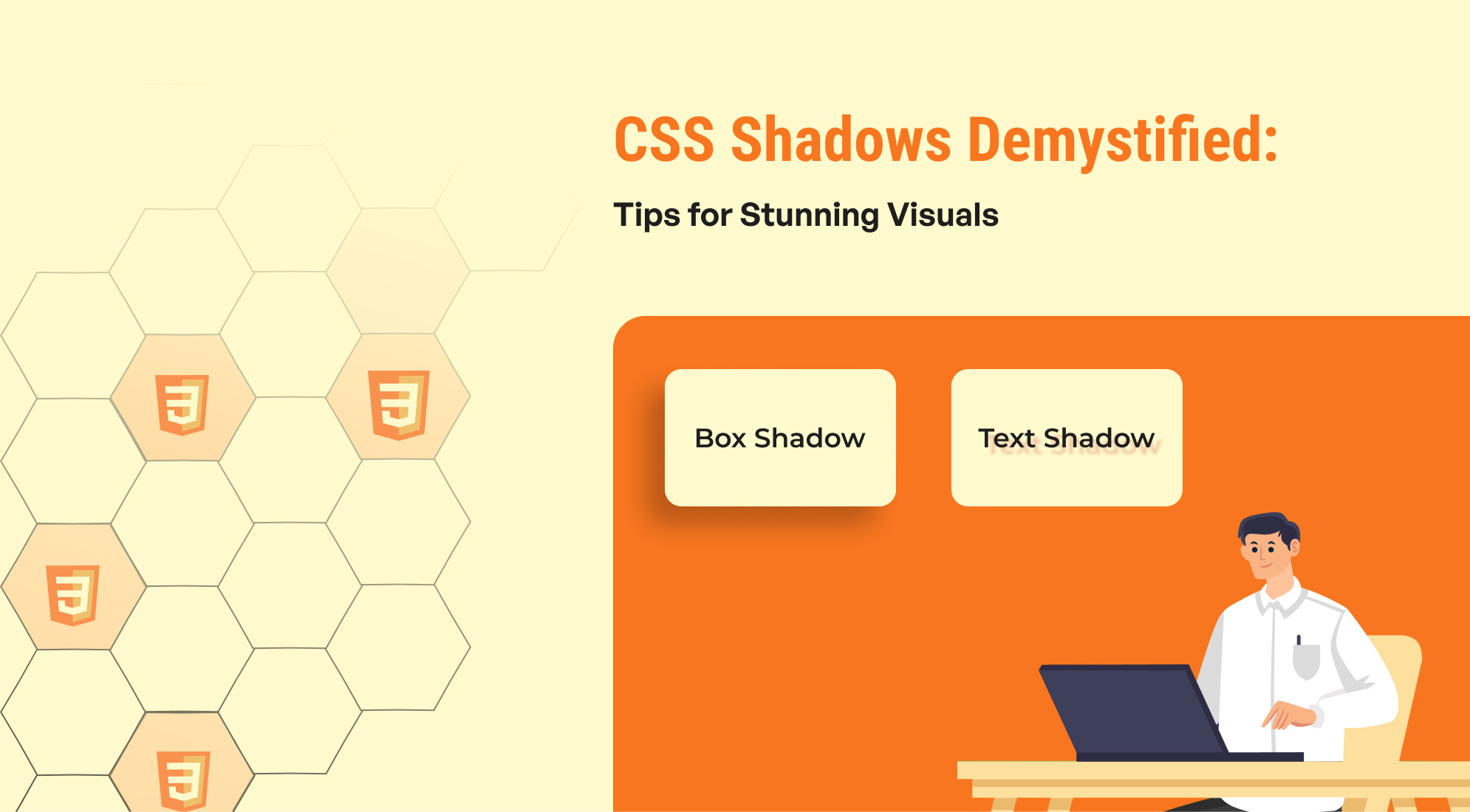
CSS shadows are an excellent way to add depth and visual appeal to your web designs. Whether you're looking to enhance buttons, cards, images, or text, shadows can make your elements pop and create a more engaging experience for your users. In this blog, we’ll explore different types of CSS shadow effects, how they work, and provide examples to help you apply them in your own projects.
The Benefits of Using CSS Shadows in Web Development
CSS shadows are an essential design tool that can enhance the appearance and user experience of a website. Here are several reasons why using CSS shadows is beneficial:
1. Adding Depth and Dimension
CSS shadows help create a sense of depth by making elements appear lifted off the page or recessed into it. This can improve the visual hierarchy by giving important elements prominence.
- A shadow around a button can make it look clickable, enhancing its visibility and encouraging interaction.
2. Improving Readability
For text, shadows can increase legibility, especially when the text is displayed over complex backgrounds or images. Subtle shadows can help the text stand out without changing the color or font size.
- Adding a slight shadow behind white text can improve its contrast on a light or busy background.
3. Creating a Modern, Polished Look
Shadows can give a more refined and polished look to your website, making it feel professional and well-designed. Modern web design often employs subtle shadows to achieve a clean, sophisticated aesthetic.
- Cards with soft shadows have become a popular design pattern in Material Design and other contemporary design frameworks.
4. Focusing User Attention
Shadows can help direct the user’s focus to key content by highlighting specific elements, like call-to-action buttons, forms, or featured content sections. Shadows naturally draw the eye and indicate hierarchy.
- A shadow around a highlighted section can indicate importance or guide the user to interact with that element.
5. Creating Visual Separation
Shadows can be used to create visual separation between elements on the page. By adding shadows, you can create the illusion of layers or different planes, helping to avoid clutter and making the design more organized.
- Using shadows on cards or containers gives each element its own space, distinguishing it from the background and nearby elements.
6. Mimicking Real-World Objects
Shadows help create a more tactile, real-world feel by mimicking how objects behave in real life under light. This can make the digital experience feel more intuitive and familiar, especially when using skeuomorphic or neumorphism design trends.
- Neumorphism uses soft shadows to create the illusion of buttons being pressed or lifted, giving a more “real” interaction.
7. Customization Flexibility
CSS shadows provide great flexibility. You can control not only the size and color of the shadow but also its blur and spread radius. You can even create multiple layered shadows or inset shadows, allowing for creative freedom in design.
- Multi-shadow effects can be used for creating depth or even glowing effects, allowing for various visual effects beyond simple drop shadows.
8. No Extra Resources
Unlike image-based shadows or graphic design, CSS shadows do not require additional resources, like images or assets. Shadows are rendered entirely by the browser using just CSS, meaning they are lightweight and responsive.
9. Browser Performance
CSS shadows are efficiently rendered by modern browsers and offer a lightweight solution compared to older methods, such as using images to simulate shadows. CSS shadows also scale well across different screen sizes and resolutions without losing quality.
Types of CSS Shadows
There are two main types of shadows you can use in CSS:
- Box Shadow (box-shadow): This applies to block-level elements such as divs, images, buttons, etc.
- Text Shadow (text-shadow): This applies to text elements, enhancing readability or creating decorative effects.
Understanding the box-shadow Property
The box-shadow property allows you to create a shadow effect around an element’s box.
Explanation of Parameters:
- offset-x: Horizontal distance of the shadow (positive to the right, negative to the left).
- offset-y: Vertical distance of the shadow (positive down, negative up).
- blur-radius: Controls the blurriness of the shadow (optional). The larger the value, the more blurred the shadow.
- spread-radius: Controls the size of the shadow (optional). Positive values make the shadow bigger, negative values make it smaller.
- color: Defines the color of the shadow.
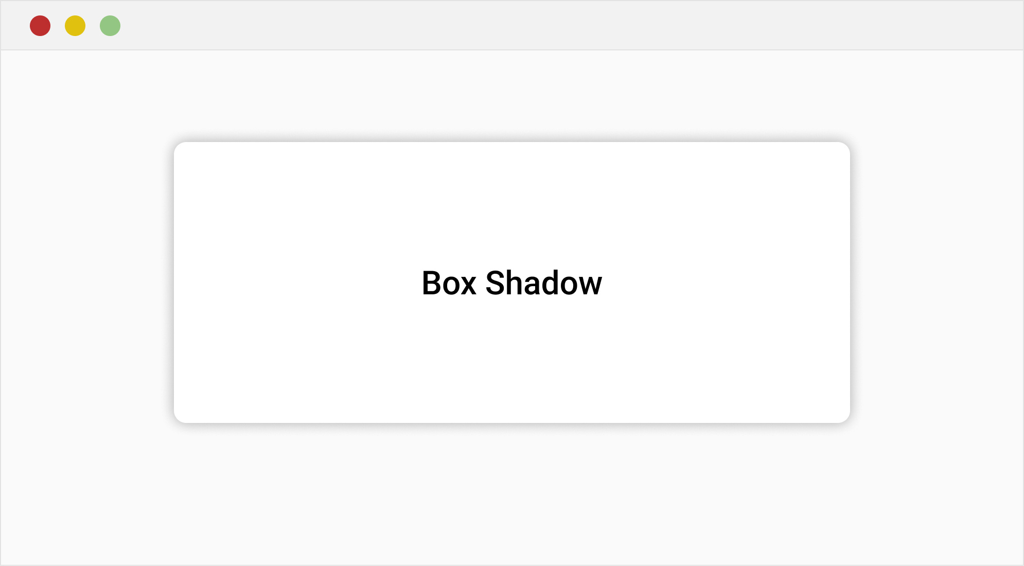
Box Shadow Example
This card has a subtle, modern shadow effect.
.card { width: 300px;padding: 20px;background-color:#fff;border-radius: 10px; box-shadow: 0 4px 15px rgba(0, 0, 0, 0.3); /* Clean shadow effect */ margin: 100px auto;text-align: center;font-family: Arial, sans-serif;} .card h1 {font-size: 24px;margin-bottom: 10px; color: #000;} .card p { font-size: 16px;color: #333; }
Understanding the text-shadow Property
The text-shadow property in CSS allows you to add shadow effects to text, enhancing its appearance and creating a sense of depth or glow. It's a powerful styling tool that can be used for subtle effects like slight shadows for better readability, or more dramatic effects like glowing or blurred text.
Parameters:
- offset-x: Horizontal distance of the shadow (positive values move it to the right, negative values move it to the left).
- offset-y: Vertical distance of the shadow (positive values move it downward, negative values move it upward).
- blur-radius: (Optional) Controls the blur level of the shadow. The higher the value, the blurrier the shadow. Defaults to 0 (a sharp shadow).
color: The color of the shadow, which can be defined using any valid CSS color value (hex,rgb, rgba etc. )

Elegant Text Shadow
body { display: flex; justify-content: center; align-items: center; height: 100vh; margin: 0; background-color: #f0f0f0; font-family: Arial, sans-serif; } h1 { font-size: 64px; color: #333; text-shadow: 2px 2px 5px rgba(0, 0, 0, 0.2); /* Subtle shadow effect */ }
Inset Shadows
An inset shadow is applied inside the element’s border, rather than outside. You can create this effect by using the keyword inset in the box-shadow property.

.inset-box { width: 200px; height: 200px; background-color: #ccc; box-shadow: inset 5px 5px 15px rgba(0, 0, 0, 0.2); }
Adding Multiple Shadows
You can add multiple shadows to an element by separating each shadow definition with a comma.

.multi-shadow-box { width: 200px; height: 200px; background-color: #fff; box-shadow: 5px 5px 10px rgba(0, 0, 0, 0.1), -5px -5px 10px rgba(0, 0, 0, 0.1), inset 0px 0px 10px rgba(0, 0, 0, 0.1); }
Conclusion
Shadows are a powerful tool in CSS that can drastically improve the visual appeal of your website. From simple text shadows to complex neumorphism effects, mastering shadow properties can help create depth, focus, and sophistication in your designs. Experiment with different values, colors, and shadow types to find the style that works best for your project.
By understanding the various options for creating shadows and using them judiciously, you'll be able to create visually stunning and professional-looking websites.
Let me know if you need any help implementing these effects in your projects!

%201.png?width=1016&height=912&name=image%20(54)%201.png)