
4 Minutes Read
Listen to the Blog
Styling links is an essential part of web design, as it helps improve both aesthetics and user experience. In this guide, we will explore how to style links using pseudo-classes for their hover, focus, and active states, complete with HTML examples.
Understanding Link States
Links have several states that can be styled using CSS pseudo-classes:
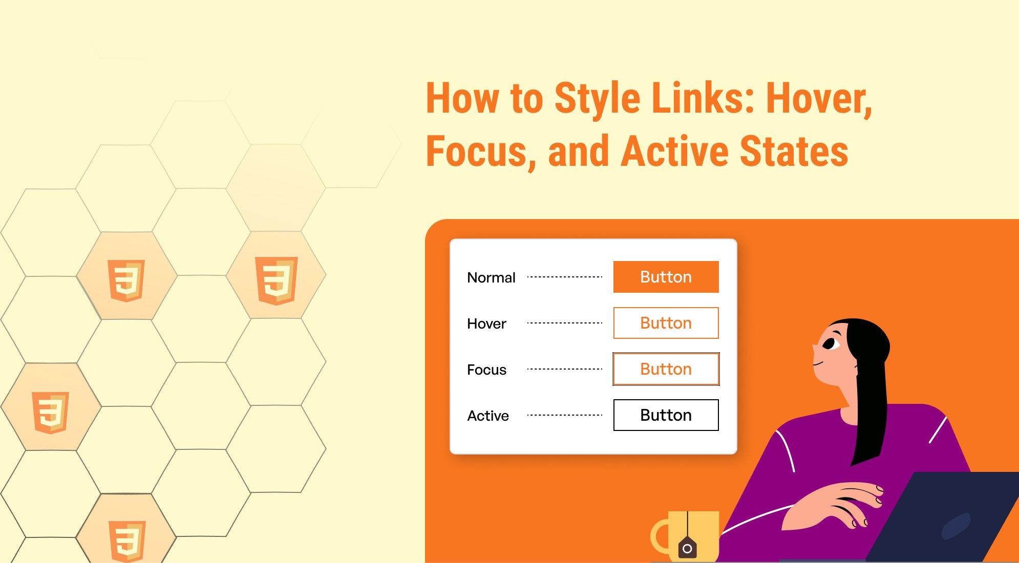
- Normal State (a): The default appearance of a link.
- Hover State (a:hover): When the user places their cursor over the link.
- Focus State (a:focus): When the link is focused, typically via keyboard navigation or assistive devices.
- Active State (a:active): When the link is being clicked or activated.
Basic HTML Structure
CSS Styling
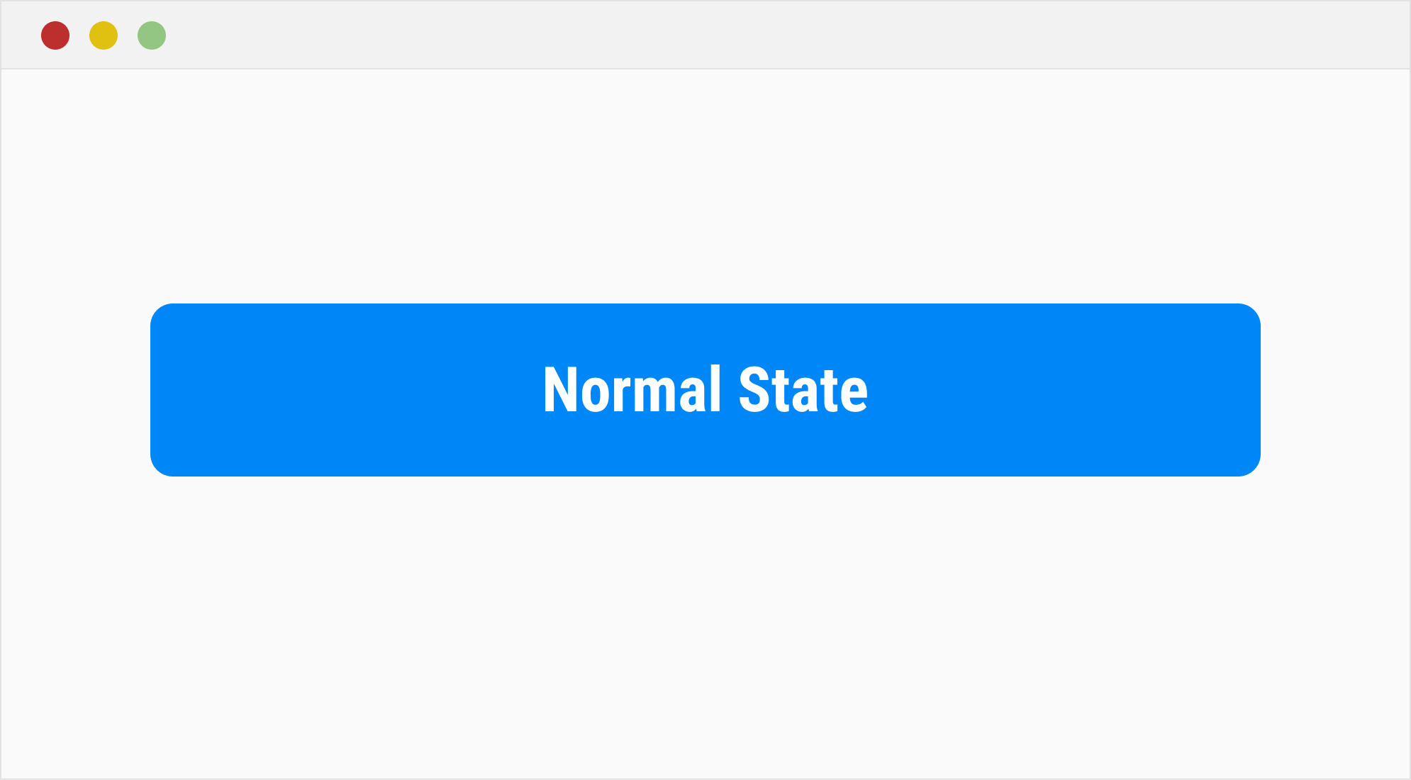
Normal State
The base styles for the link apply to the a selector. Here's an example of styling the normal state:
a { text-decoration: none; color: #007BFF; font-weight: bold; }
Hover State
The :hover pseudo-class is triggered when a user hovers over the link with a cursor. Here's an example of styling the hover state:

a { text-decoration: none; color: #007BFF; font-weight: bold; } a:hover { color: #0056b3; text-decoration: underline; }
Focus State
The :focus pseudo-class is triggered when a link gains focus, often via keyboard navigation. Here's an example of styling the focus state:

a { text-decoration: none; color: #007BFF; font-weight: bold; } a:focus { outline: 2px solid #ff9900; outline-offset: 2px; }
Active State
The :active pseudo-class is triggered when a link is clicked. Here's an example of styling the active state:

a { text-decoration: none; color: #007BFF; font-weight: bold; } a:active { color: #003366; background-color: #f0f8ff; }
Putting It All Together
Here is the complete CSS file, along with an HTML example that combines all the link states:
a { text-decoration: none; color: #007BFF; font-weight: bold; transition: color 0.3s ease, background-color 0.3s ease; } a:hover { color: #0056b3; text-decoration: underline; } a:focus { outline: 2px solid #ff9900; outline-offset: 2px; } a:active { color: #003366; background-color: #f0f8ff; }
Enhancing the User Experience
Keyboard Navigation
The :focus state is crucial for accessibility. Always ensure that focused links are visually distinct to assist users who navigate via keyboard or screen readers.
Transition Effects
Add smooth transitions for a polished look.
Here’s how you can observe transition effects in action:
a { text-decoration: none; color: #007BFF; font-weight: bold; transition: color 0.3s ease, background-color 0.3s ease; } a:hover { color: #0056b3; }
Example with Buttons
Links styled as buttons can use these states too, especially in navigation menus or call-to-action elements. For instance, a navigation menu might use button-styled links to ensure consistent design and intuitive interaction. Here's an example:
.button { display: inline-block; padding: 10px 20px; color: #ffffff; background-color: #007BFF; border-radius: 5px; text-align: center; } .button:hover { background-color: #0056b3; } .button:focus { outline: 2px solid #ff9900; outline-offset: 2px; } .button:active { background-color: #003366; }
Conclusion
Styling link states is a fundamental yet powerful aspect of web design. Together, the hover, focus, and active states enhance usability by providing visual feedback and improving accessibility for users navigating with different input methods. By thoughtfully crafting the hover, focus, and active states, you can create a more interactive and accessible user experience. Use these examples as a foundation and customize them to match your project’s design language.

%201.png?width=1016&height=912&name=image%20(54)%201.png)