
5 Minutes Read
Listen to the Blog
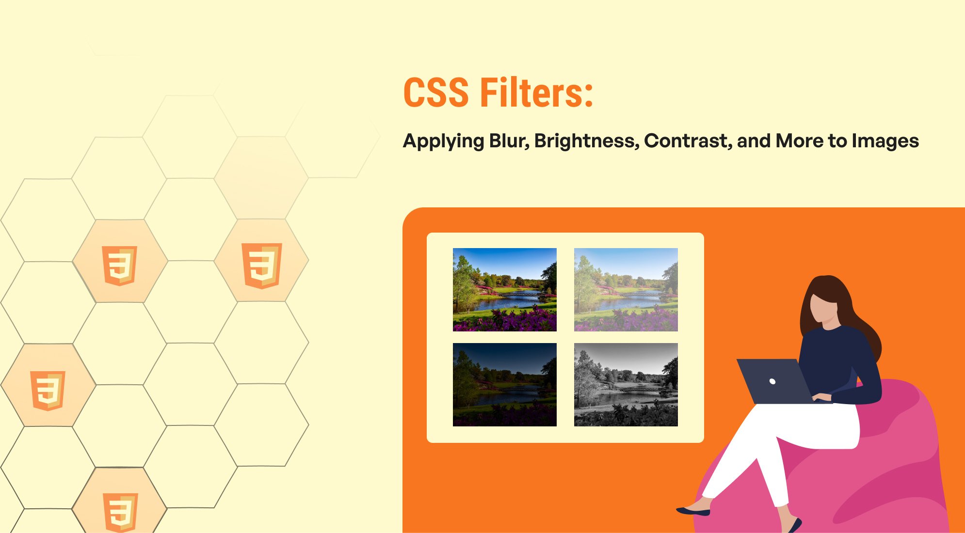
CSS filters provide an easy way to manipulate images directly within your web pages. They allow you to apply effects like blur, brightness, contrast, and more, enhancing the visual appeal of your content without needing to edit images in an external program. This blog post will explore various CSS filters, how to apply them, and offer examples to illustrate their usage.
Benefits of CSS Filters
- Dynamic Styling: Modify and animate filter effects directly in CSS, enabling engaging, interactive designs.
- Consistency: Use filters across your site to maintain a cohesive style or visual theme.
- Lightweight: Implement effects with a few lines of CSS, avoiding large image files or external editing tools.
What Are CSS Filters?
CSS filters are functions that allow you to apply graphical effects to elements. They are defined using the filter property in CSS. Common effects include:
- Blur
- Brightness
- Contrast
- Grayscale
- Sepia
- Saturate
- Invert
- Drop Shadow
Applying Blur
The blur filter in CSS allows you to apply a soft focus effect to an element, usually an image. The intensity of the blur is controlled by a pixel value, where a higher value creates a more intense blur.

Applying a CSS Blur Filter to an Image

.blur-effect { filter: blur(5px); /* Adjust the value to control the blur intensity */ width: 100%; /* Set the width or height as desired */ height: auto; }
Adjusting Brightness
The CSS brightness filter allows you to adjust the brightness of an element, making it appear lighter or darker. This filter is often applied to images to create visual effects or emphasize certain elements.

Applying a CSS Brightness Filter to an Image
/* Apply a brightness filter to the image */ .bright-effect { filter: brightness(150%); /* Increase brightness by 50% */ width: 100%; /* Optional: Adjust size */ height: auto; }
Modifying Contrast
The CSS contrast filter adjusts the contrast of an element, which affects the difference between light and dark areas of the image or element. Increasing contrast makes light areas lighter and dark areas darker, while reducing contrast can create a more muted or washed-out effect.

Applying a CSS Contrast Filter to an Image
/* Apply a contrast filter to the image */ .contrast-effect { filter: contrast(150%); /* Increase contrast by 50% */ width: 100%; /* Adjust size as needed */ height: auto; }
Converting to Grayscale
The CSS grayscale filter allows you to convert an image or other elements to shades of gray, removing color to create a black-and-white effect. This filter is useful for various design purposes, such as making images appear subdued, matching a specific aesthetic, or creating a hover effect that emphasizes certain elements.

Applying a CSS Grayscale Filter to an Image
/* Apply a grayscale filter to the image */ .grayscale-effect { filter: grayscale(100%); /* Fully desaturate the image */ width: 100%; /* Optional: Set width or height */ height: auto; }
Adding Sepia Tone
The CSS sepia filter applies a warm, brownish tone to an image or element, simulating the look of old photographs. This filter is useful for adding a vintage or classic feel to your images without needing to edit them in graphic design software.
Applying a CSS Sepia Filter to an Image
/* Apply a sepia filter to the image */ .sepia-effect { filter: sepia(100%); /* Fully apply sepia tone */ width: 100%; /* Optional: Set width or height as needed */ height: auto; }
Saturation Control
The CSS saturate filter adjusts the color intensity or saturation of an element, typically an image. Increasing saturation makes colors appear more vibrant and intense, while decreasing saturation makes colors appear more muted or closer to grayscale. This filter is handy for enhancing or subduing the colors of images or other elements on a webpage.
Applying a CSS Saturate Filter to an Image
* Apply a saturate filter to the image */ .saturate-effect { filter: saturate(150%); /* Increase saturation by 50% */ width: 100%; /* Optional: Set width or height as needed */ height: auto; }
Inverting Colors
The CSS invert filter reverses the colors of an element, typically an image, creating a negative or photo-negative effect. This filter is useful for creative styling effects, dark mode adjustments, or to make elements stand out.
Applying a CSS Invert Filter to an Image
/* Apply an invert filter to the image */ .invert-effect { filter: invert(100%); /* Fully invert colors */ width: 100%; /* Optional: Adjust width as needed */ height: auto; }
Adding Drop Shadow
The CSS drop-shadow filter applies a shadow effect to an element, similar to box-shadow, but with more flexibility in applying shadows to non-rectangular elements, such as images with transparent backgrounds or SVGs. This filter is excellent for adding depth and dimension to images or icons.
Applying a CSS Drop Shadow Filter to an Image

/* Apply a drop shadow filter to the image */ .shadow-effect { filter: drop-shadow(10px 10px 15px rgba(0, 0, 0, 0.5)); /* Shadow with offset and blur */ width: 100%; /* Optional: Adjust width */ height: auto; }
Conclusion
CSS filters are a powerful tool for web designers, allowing for quick and efficient image manipulation without needing graphic design software. By experimenting with different filter effects, you can create visually engaging content that enhances the user experience on your website. Try combining various filters to discover unique styles that fit your brand!

%201.png?width=1016&height=912&name=image%20(54)%201.png)