
Lorem ipsum dolor sit amet, consectetur adipiscing elit. Sed do eiusmod tempor incididunt ut labore et dolore magna aliqua. Ut enim ad minim veniam, quis nostrud exercitation ullamco laboris nisi ut aliquip ex ea commodo consequat. Duis aute irure dolor in reprehenderit in voluptate velit esse cillum dolore eu fugiat nulla pariatur.
5 Minutes Read
Listen to the Blog
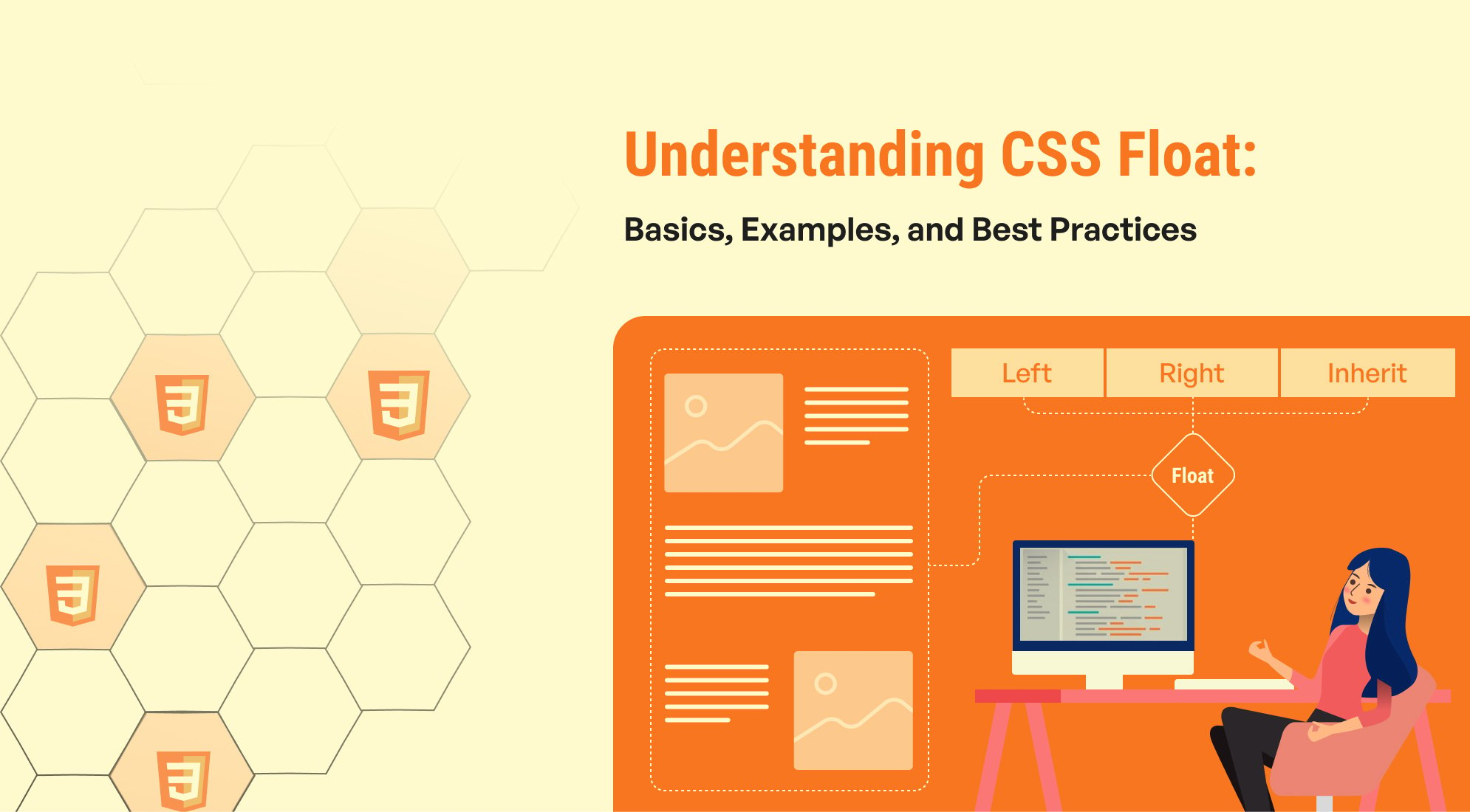
The float property in CSS is a fundamental tool used for positioning elements and controlling the layout of content. Although its use has diminished with the advent of modern layout techniques like Flexbox and Grid, understanding how float works remains crucial for certain design tasks. This guide provides an overview of the float property, including its basic usage, examples, and best practices for effective implementation.
The float Property
The float property is used to position an element to the left or right of its containing element, allowing other content to wrap around it. This property is particularly useful for creating multi-column layouts and aligning images within text.
Values
- Left: Floats the element to the left side of its container.
- Right: Floats the element to the right side of its container.
- None: The default value, which does not float the element.
- Inherit: Inherits the float value from its parent.
Overview of CSS Float Left
The float property in CSS is used to position an element to the left or right within its containing element, allowing other content to flow around it. When you set an element to float: left;, it moves the element to the left side of its container, and text or inline elements wrap around it. This property is useful for creating layouts with images, text, or other elements that need to be positioned side by side.

.float-left { float: left; width: 30%; /* Adjust width as needed */ margin-right: 15px; /* Space between the floated element and the text */ } .text-content { overflow: hidden; /* Clearfix for containing floated elements */ }
Overview of CSS Float Right
The float property in CSS is used to control the positioning of an element, allowing text or other inline elements to wrap around it. When you use float: right;, the element is positioned to the right side of its containing block, and any subsequent content wraps around it. This can be useful for aligning images, buttons, or other elements to the right within a container.

Lorem ipsum dolor sit amet, consectetur adipiscing elit. Sed do eiusmod tempor incididunt ut labore et dolore magna aliqua. Ut enim ad minim veniam, quis nostrud exercitation ullamco laboris nisi ut aliquip ex ea commodo consequat. Duis aute irure dolor in reprehenderit in voluptate velit esse cillum dolore eu fugiat nulla pariatur.
.float-right { float: right; width: 30%; /* Adjust width as needed */ margin-left: 15px; /* Space between the floated element and the text */ } .text-content { overflow: hidden; /* Clearfix for containing floated elements */ }
Overview of CSS Float None
The float property in CSS is used to position elements relative to their container, allowing other content to flow around them. The float: none; value is the default setting for the float property, meaning the element is not floated and will behave according to the normal document flow. This setting is used when you want to ensure that an element does not float to the left or right, and instead, remains in the standard layout flow of the document.
Floated Element
Non-Floated Element
Lorem ipsum dolor sit amet, consectetur adipiscing elit. Sed do eiusmod tempor incididunt ut labore et dolore magna aliqua. Ut enim ad minim veniam, quis nostrud exercitation ullamco laboris nisi ut aliquip ex ea commodo consequat. Duis aute irure dolor in reprehenderit in voluptate velit esse cillum dolore eu fugiat nulla pariatur.
.float-left { float: left; width: 30%; /* Adjust width as needed */ margin-right: 15px; /* Space between the floated element and the text */ } .float-none { float: none; /* Ensures the element does not float */ width: 100%; /* Full width of the container */ background-color: #f0f0f0; /* Background color for visibility */ margin-top: 10px; /* Space above the element */ } .text-content { overflow: hidden; /* Clearfix for containing floated elements */ }
Overview of CSS Float Inherit
The float property in CSS allows elements to be positioned to the left or right of their container, with text or inline elements wrapping around them. The value inherit for the float property instructs an element to inherit the float value from its parent element. This means that the floating behavior of an element is determined by its parent, rather than being explicitly set.
Inheriting Float
Lorem ipsum dolor sit amet, consectetur adipiscing elit. Sed do eiusmod tempor incididunt ut labore et dolore magna aliqua. Ut enim ad minim veniam, quis nostrud exercitation ullamco laboris nisi ut aliquip ex ea commodo consequat.
.parent { float: left; width: 50%; /* Adjust width as needed */ background-color: #f0f0f0; /* Background color for visibility */ padding: 10px; /* Padding for spacing */ } .child { float: inherit; /* Inherits float value from the parent */ width: 30%; /* Adjust width as needed */ background-color: #c0c0c0; /* Background color for visibility */ margin-left: 10px; /* Space between the floated elements */ } .clearfix::after { content: ""; display: table; clear: both; }
Conclusion
Understanding and effectively using the float and clear properties is essential for creating clean and well-structured layouts in CSS. By mastering these properties and following best practices, you can ensure that your designs are both functional and visually appealing.
Feel free to experiment with these properties in your projects, and explore how they can enhance your layout design skills.


%201.png?width=1016&height=912&name=image%20(54)%201.png)