
.png)
2 Minutes Read
Listen to the Blog
Bring together Shapes, Layers, Colors, Typography, and Grids in one hands-on Figma project.
Project Goal
Create a simple UI page (e.g., a landing page or card layout) that demonstrates:
- Organized Shapes & Layers
- Consistent Color & Styles
- Clear Typography hierarchy
- Balanced Layout Grids & Spacing
This exercise reinforces everything you’ve learned and prepares you for real-world Figma projects.
Step 1: Set Up the Frame & Layout Grid
- Press F to create a frame (desktop or mobile size).
- Add a Layout Grid (12-column for desktop, 4–6 columns for mobile).
- Adjust Gutters and Margins for spacing and alignment.
.png?width=1497&height=817&name=01.%20Figma%20Practice%20Project_%20Apply%20Shapes%2c%20Color%2c%20Typography%20%26%20Grids%20(2025).png)
Tip: Keep grids visible while designing to snap elements precisely.
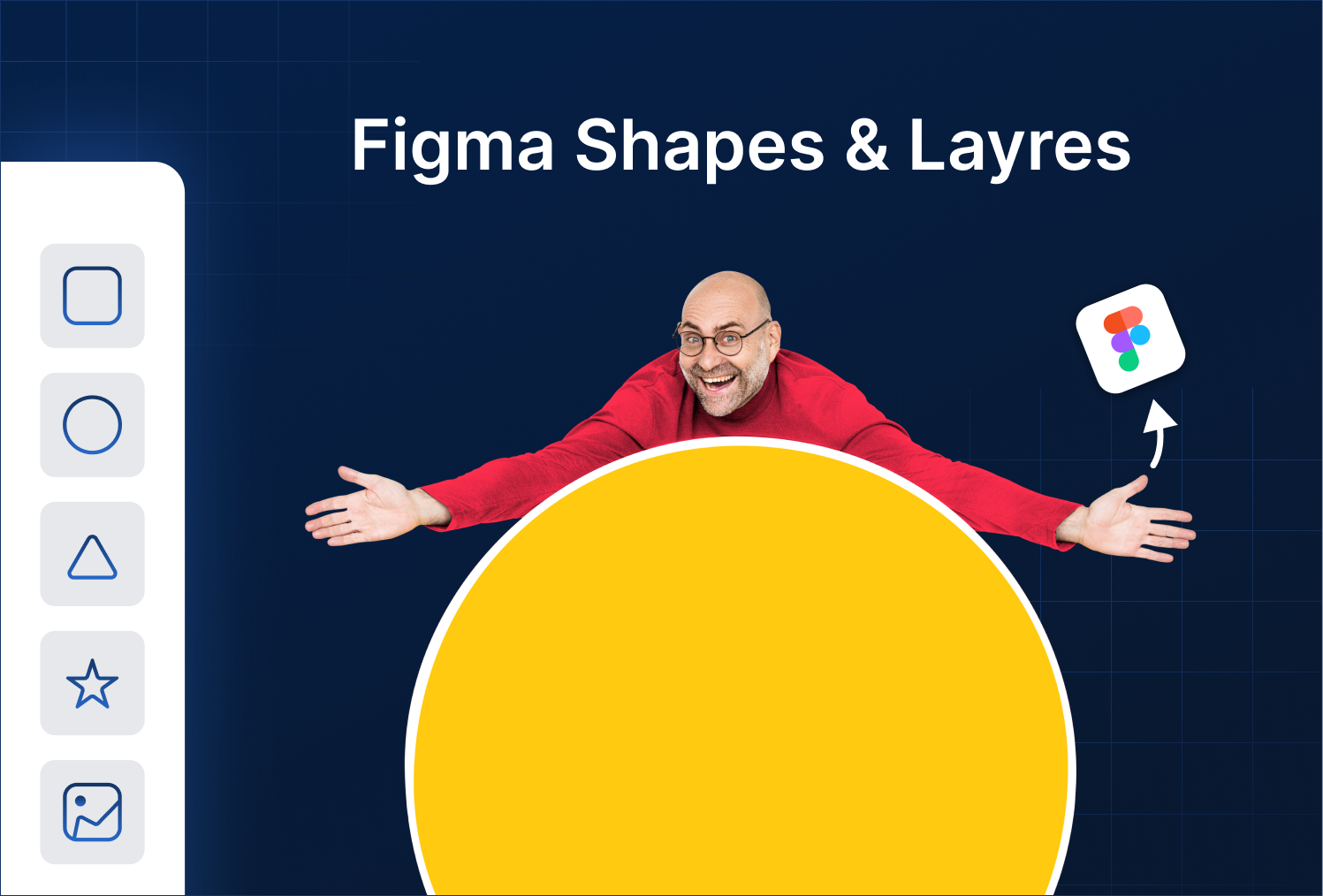
Step 2: Build the Base with Shapes & Layers
- Add rectangles cards section.
- Use circles or ellipses for icons or profile avatars.
- Rename layers logically (e.g.,
Card_BG,CTA_Button,Card_1). - Group related layers (
Ctrl/Cmd + G) to maintain a clean layer hierarchy.
.png?width=1497&height=817&name=02.%20Figma%20Practice%20Project_%20Apply%20Shapes%2c%20Color%2c%20Typography%20%26%20Grids%20(2025).png)
Proper layer organization now will save tons of time later.
Step 3: Apply Color & Styles
- Assign Color Styles to backgrounds, buttons, and text.
- Use brand colors for primary elements and neutral tones for secondary/background elements.
- Ensure consistent contrast for readability.
Tip: Update one color style and watch all related layers change fast consistency.
Step 4: Add Typography
- Use Text Tool (T) for headings, subheadings, body text, and buttons.
- Apply Text Styles you’ve previously created (H1, H2, Body, Caption).
- Maintain hierarchy: Heading > Subheading > Body > Caption.
Typography + color = readable, visually appealing content.
.png?width=1497&height=817&name=03.%20Figma%20Practice%20Project_%20Apply%20Shapes%2c%20Color%2c%20Typography%20%26%20Grids%20(2025).png)
Step 5: Fine-Tune Spacing & Alignment
- Use Auto Layout for buttons, cards, or menus.
- Snap elements to your layout grid to maintain balance.
- Check padding, spacing between cards, and alignment for a polished design.
.png?width=1497&height=959&name=04.%20Figma%20Practice%20Project_%20Apply%20Shapes%2c%20Color%2c%20Typography%20%26%20Grids%20(2025).png)
Tip: Small spacing inconsistencies break visual harmony grids + Auto Layout solve this.
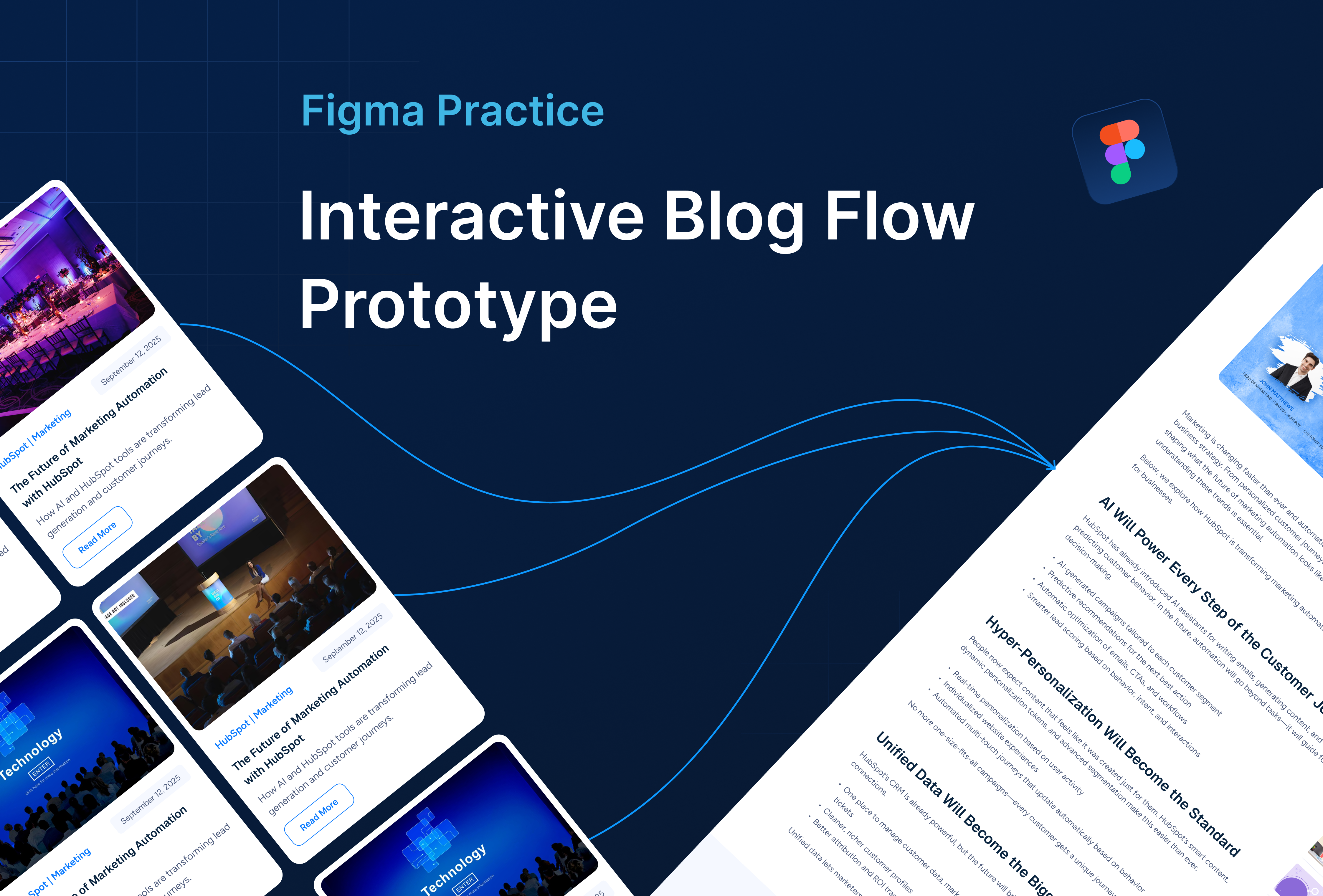
Step 6: Review & Iterate
- Check layer names for clarity.
- Make sure Text Styles and Color Styles are applied consistently.
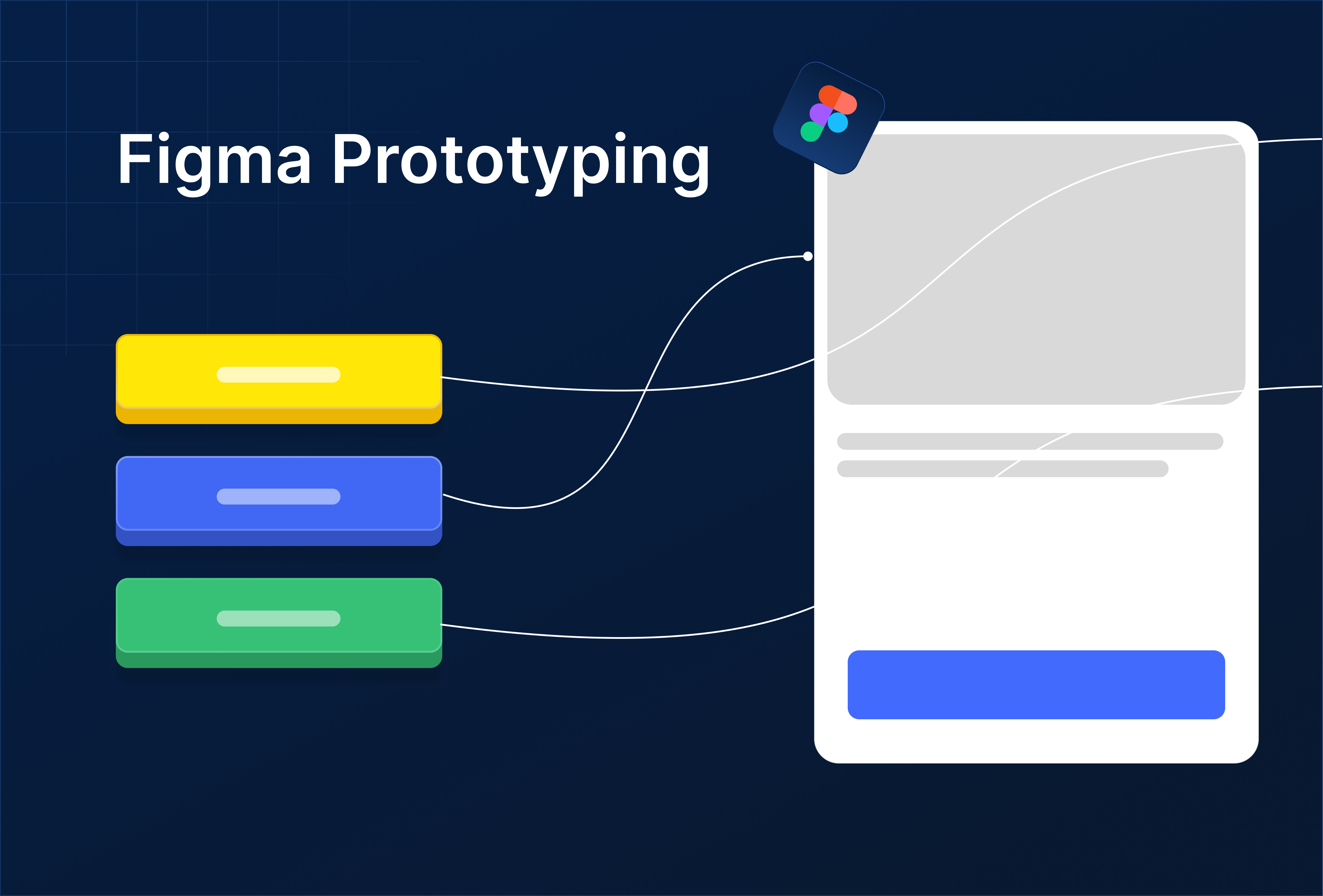
- Preview the design in Prototype mode to test flow.
- Adjust based on visual balance and hierarchy.
.png)

%201.png?width=1016&height=912&name=image%20(54)%201.png)