
3 Minutes Read
Listen to the Blog
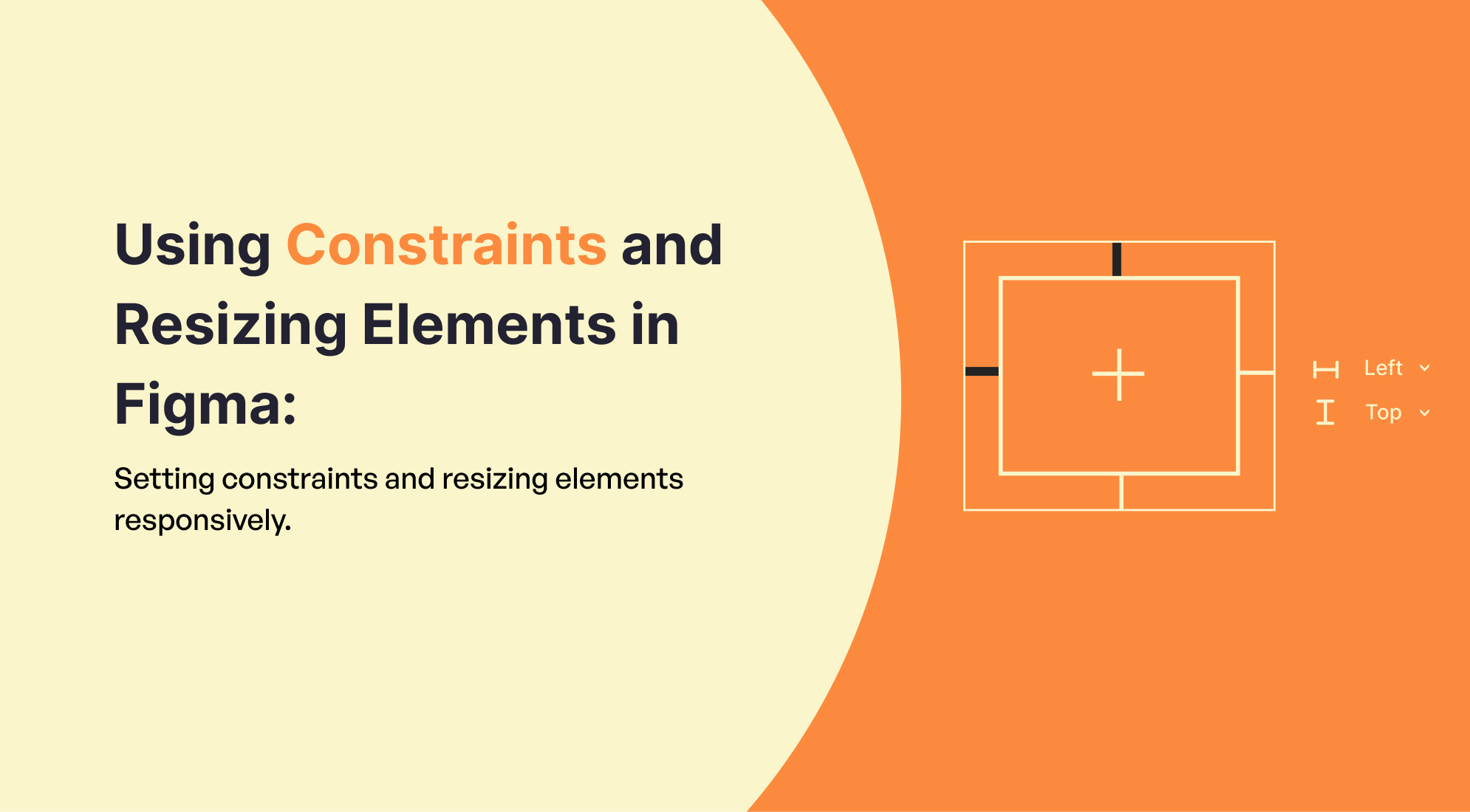
In Figma, constraints and resizing are essential for making designs adaptable to different screen sizes and layouts. Here's how to use them effectively:
1. Understanding Constraints
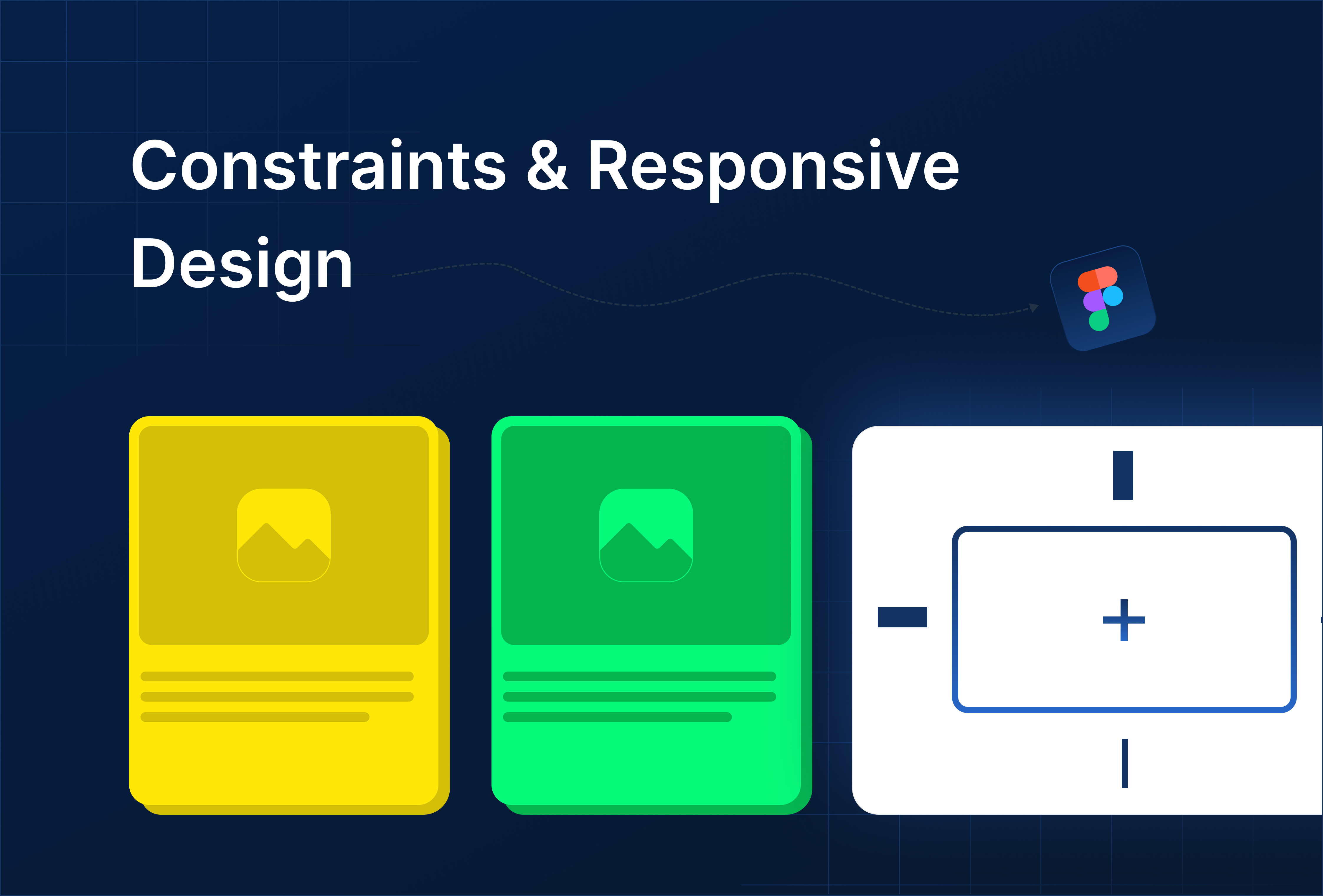
Constraints allow you to control how elements behave when their parent frame is resized. This is crucial for responsive design.
Setting Constraints:
- Select an Element: Click on the element you want to set constraints for.
- Constraints Panel: In the right sidebar under the "Constraints" section, you'll see options for setting constraints.
- Options:
- Left/Right/Top/Bottom: Determines if the element remains a fixed distance from the respective side of its parent frame.
- Center: Keeps the element centered relative to the parent frame.
- Scale: The element will scale proportionally as the parent frame is resized.
- Fixed Width/Height: Maintains the element's size even if the parent frame is resized.
Examples:
- Left and Right Constraints: The element will stretch horizontally when the parent frame resizes.
- Center Alignment: The element will stay in the center, regardless of the parent's resizing.

2. Resizing Elements Responsively
Responsive resizing ensures that your design adapts seamlessly to different screen sizes.
Resizing Options:
- Manual Resizing: You can manually resize elements by dragging the edges or corners of a frame or component.
- Responsive Resize: In the "Constraints" section, you can adjust how an element resizes:
- Fixed: The element does not resize.
- Hug Contents: The element resizes based on its content.
- Fill Container: The element stretches to fill its parent container.

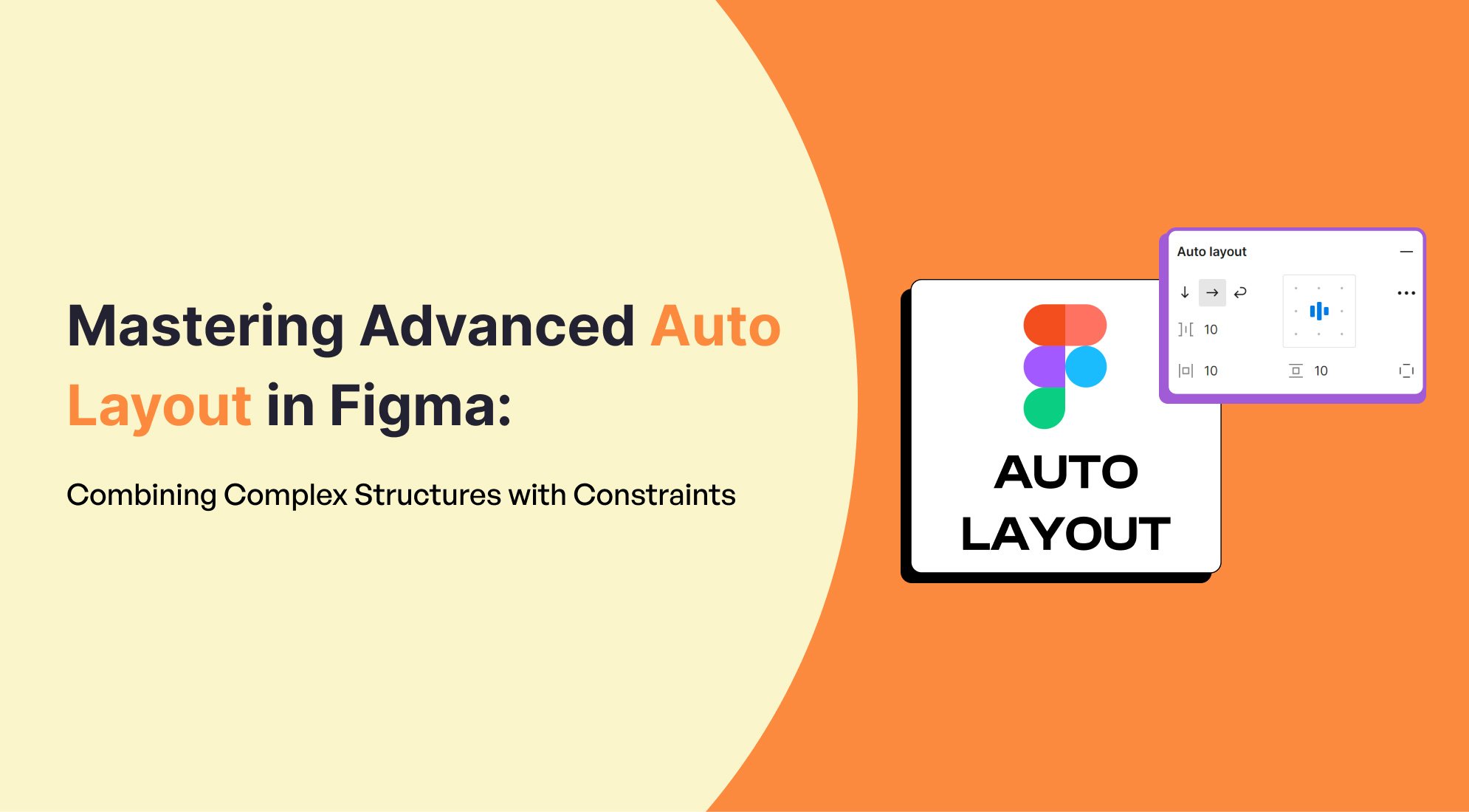
Auto Layout:
- Auto Layout is a powerful tool in Figma for creating responsive designs. It automatically adjusts the size of a frame based on its content.
- Steps:
- Select a frame or group.
- Click on "Auto Layout" in the right-hand panel.
- Adjust the padding, spacing between items, and alignment options.

3. Practical Example:
- Navbar Example: If you're designing a navbar, you might set the constraints of each menu item to "Left and Right" so that they spread out evenly as the screen size changes.

- Button Example: For a button within a frame, you could set its width to "Fixed" or "Hug Contents," ensuring that it remains appropriately sized.

4. Testing Responsiveness:
- Resize Parent Frame: Once constraints are set, resize the parent frame to see how the elements adapt.
- Preview Mode: Use Figma's preview mode to simulate how your design looks on different devices or screen sizes.
Conclusion
Mastering constraints and resizing in Figma is key to creating adaptable and responsive designs that perform well across various devices and screen sizes. By setting appropriate constraints, you ensure that your design elements behave predictably when their parent frames are resized, preserving the integrity of your layout. Additionally, leveraging responsive resizing options and tools like Auto Layout can further enhance your design's flexibility, allowing it to dynamically adjust based on content and container sizes.
.png)


%201.png?width=1016&height=912&name=image%20(54)%201.png)