
5 Minutes Read
Listen to the Blog
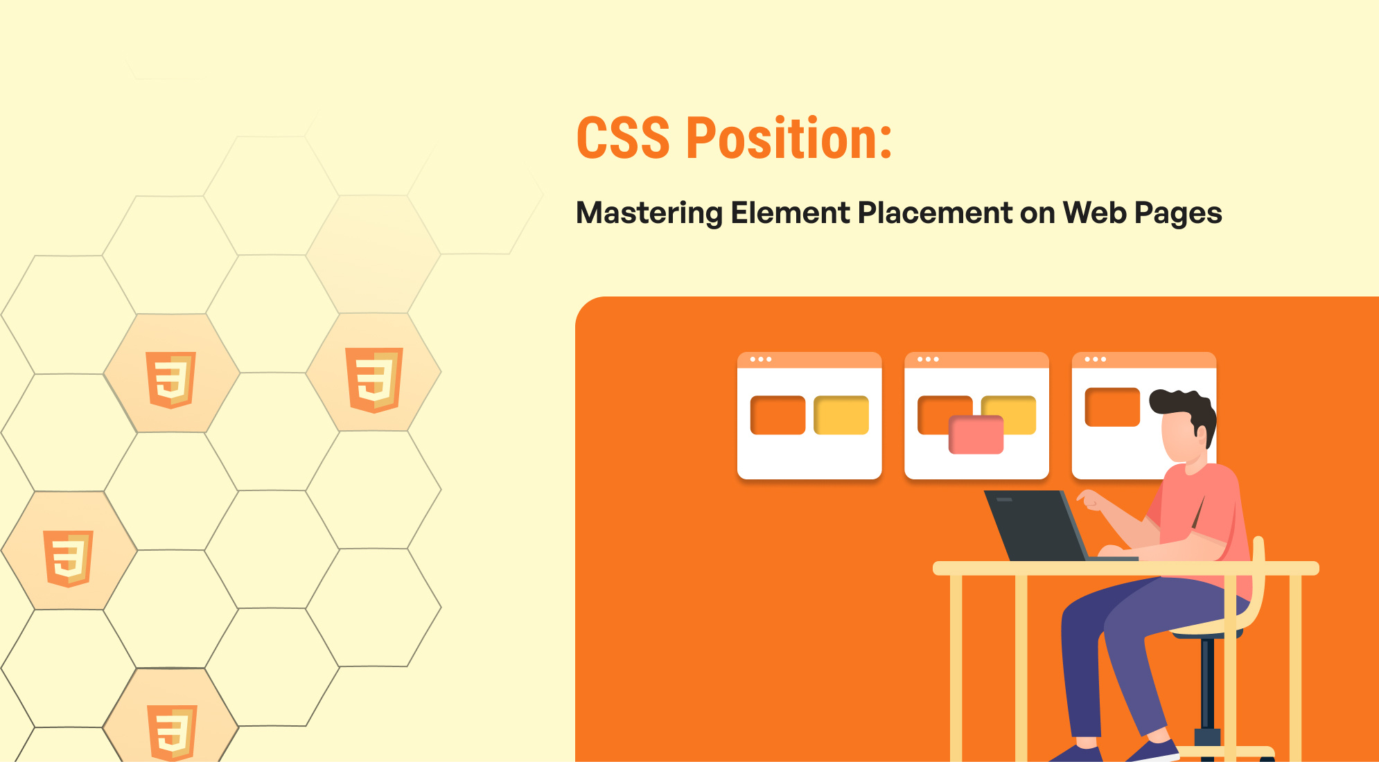
CSS Position: Mastering Element Placement on Web Pages
0:54
The position property in CSS is used to set the positioning method for an element. There are several values that can be assigned to the position property, each of which affects how the element is positioned within its containing element or relative to other elements. Here are the most common values.
- Static Position
- Relative Position
- Absolute Position
- Fixed Position
- Sticky Position
1. Static Position
Static is the default value for the position property in CSS. When an element is positioned statically, it follows the normal flow of the document. In this positioning method, the top, right, bottom, and left properties do not have any effect on the element.
- Elements are positioned according to the normal flow of the document.
- The top, right, bottom, and left properties are ignored.
- This is the default positioning method applied to all elements.
This is a statically positioned element.
.static { position: static; background-color: lightblue; padding: 20px; }
In this example, the div element with the class static is positioned according to the normal document flow. It will appear where it naturally falls in the HTML, and any top, right, bottom, or left properties applied to it will not have any effect.
2. Relative Position :
In CSS, relative positioning allows you to position an element relative to its normal position in the document flow. When an element is set to position: relative;, you can use the top, right, bottom, and left properties to offset its position from where it would normally be placed.
- Elements are positioned relative to their normal position in the document flow.
- The top, right, bottom, and left properties can be used to offset the element from its normal position.
- Other elements on the page are not affected by the relative positioning of the element.
This is a relatively positioned element.
.relative { position: relative; top: 20px; left: 30px; background-color: lightgreen; padding: 20px; }
In this example, the div element with the class relative is positioned 20 pixels down (top: 20px;) and 30 pixels to the right (left: 30px;) from where it would normally appear in the document flow. This positioning does not affect the positions of other elements on the page.
3. Absolute Position :
In CSS, absolute positioning allows you to position an element relative to its nearest positioned ancestor or, if no positioned ancestor is found, relative to the initial containing block (usually the document body). When an element is set to position: absolute;, it is removed from the normal document flow, and its position is determined by the top, right, bottom, and left properties.
- The element is positioned relative to its nearest positioned ancestor (an ancestor with a position value other than static).
- If there is no positioned ancestor, the element is positioned relative to the document body.
- The element is removed from the normal document flow, so it does not affect the positions of other elements.
This is an absolutely positioned element.
.container { position: relative; background-color: lightgrey; width: 300px; height: 300px; } .absolute { position: absolute; top: 20px; left: 30px; background-color: lightcoral; padding: 20px; }
In this example, the div element with the class absolute is positioned 20 pixels down (top: 20px;) and 30 pixels to the right (left: 30px;) within its nearest positioned ancestor, which is the div element with the class container. The container has a position: relative; making it the reference point for the absolute element's positioning. The absolutely positioned element is removed from the normal document flow, so it does not affect the positions of other elements within the container.
4. Fixed Position :
In CSS, fixed positioning allows you to position an element relative to the browser window, regardless of scrolling. When an element is set to position: fixed;, it is removed from the normal document flow and its position is determined by the top, right, bottom, and left properties relative to the viewport.
- The element is positioned relative to the viewport (browser window).
- It remains fixed in its position even when the page is scrolled.
- Fixed-positioned elements are not affected by scrolling and do not affect the layout of other elements.
This is a fixed-positioned element.
Scroll down to see the effect of fixed positioning.
.fixed { position: fixed; top: 20px; right: 30px; background-color: lightblue; padding: 20px; } .content { height: 2000px; /* Adding height to create scrollable content */ }
In this example, the div element with the class fixed is positioned 20 pixels down from the top of the viewport (top: 20px;) and 30 pixels from the right edge of the viewport (right: 30px;). This element remains fixed in its position relative to the browser window, even when the page is scrolled.
5. Sticky Position :
In CSS, sticky positioning is a hybrid between relative and fixed positioning. An element with position: sticky; is treated as relative until it reaches a defined threshold (using top, right, bottom, or left properties), at which point it becomes fixed within its containing block. This allows the element to "stick" in place when the user scrolls past it.
- The element is positioned based on the user's scroll position.
- It toggles between relative and fixed positioning depending on the scroll position relative to its containing block.
- The element will stay fixed within the viewport when it crosses the specified threshold, and revert to relative when scrolling back up.
This is a sticky-positioned element.
Scroll down to see the effect of sticky positioning.
.sticky { position: sticky; top: 0; /* The element will stick to the top of the viewport */ background-color: lightyellow; padding: 10px; border: 1px solid gold; } .content { height: 1500px; /* Adding height to create scrollable content */ }
This behaviour is useful for creating elements like sticky headers or navigation bars that remain visible as the user scrolls through a page.
Conclusion
The position property in CSS is essential for controlling the layout and appearance of elements on a webpage. By mastering the different values (static, relative, absolute, fixed, and sticky), you can create sophisticated and responsive designs that enhance user experience.

%201.png?width=1016&height=912&name=image%20(54)%201.png)