
6 Minutes Read
Listen to the Blog
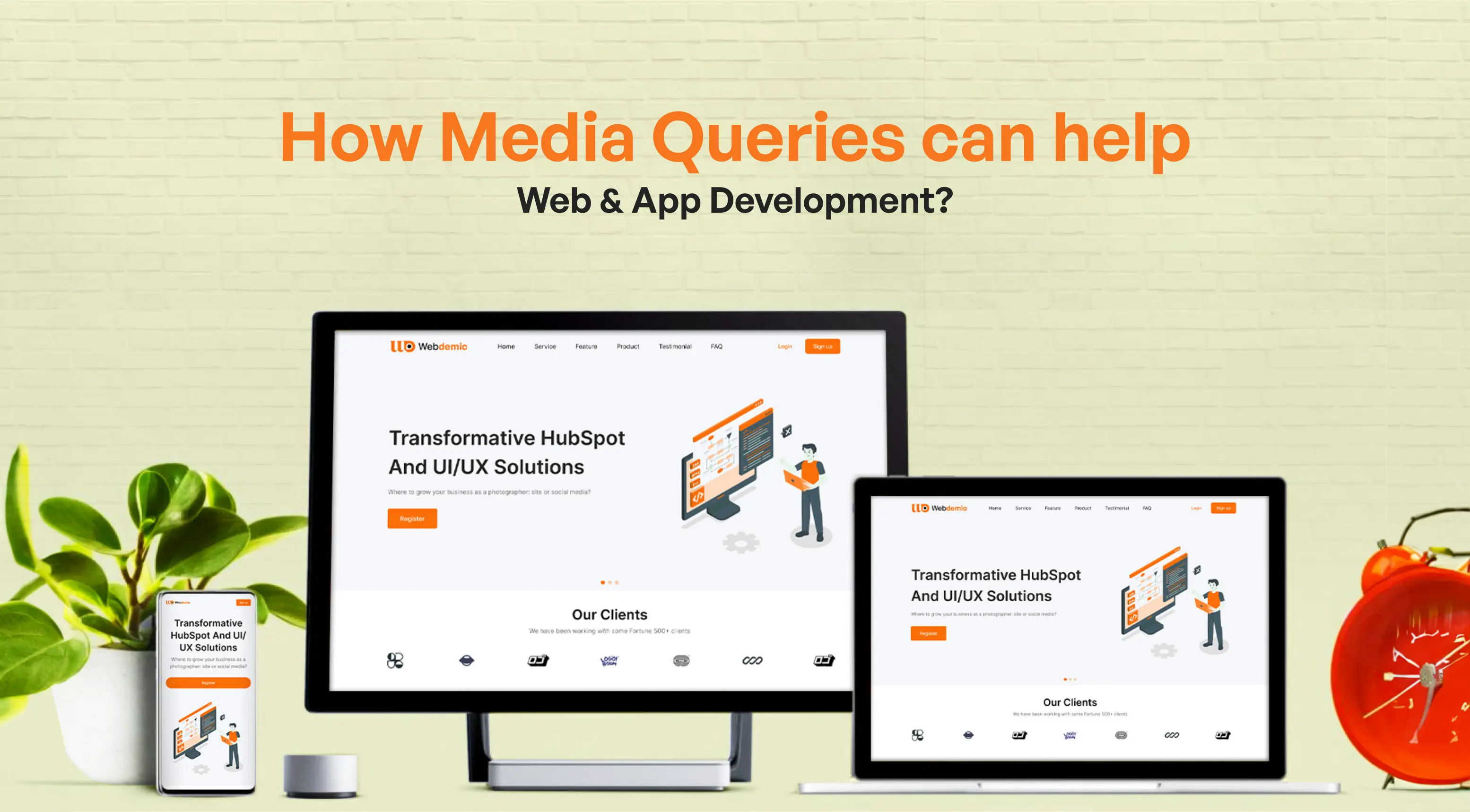
Users today have various devices at their disposal through which they can access different applications and websites. The most important aspect is that users expect to get the same streamlined experience when accessing the apps and websites on different devices.
Desktops, laptops, tablets, smartphones, and even smart watches all require a seamless and user-friendly experience. This is where media queries come in.
It is a powerful tool in the web and app developer's toolkit for creating responsive designs that adapt to different screen sizes and user preferences. Using media queries, web developers can focus on web and app development that will provide a better user experience.
But how can they do that? This article will provide you with a comprehensive idea about how media queries can help you in web and app development by building responsive and user-friendly experiences. But before that, let's understand what media queries are all about.
What are Media Queries?
As a beginner developer, you might want to know what media queries are. In simple words, media queries are conditional statements written in CSS (Cascading Style Sheets).
These statements allow developers to apply specific styles to a web page or app based on the characteristics of the device it's being viewed on. These characteristics can include:
- Device orientation: Is the device held in portrait or landscape mode? Media queries can adjust layouts for each orientation.
- Device type: Is it a desktop, tablet, or mobile phone? Media queries can target specific device types or categories.
- Resolution: This refers to the number of pixels displayed on the screen. Media queries can be used to optimize content for high-resolution displays.
- Viewport size: This refers to the width and height of the user's browser window. Media queries can target specific screen widths (e.g., devices wider than 768px) or ranges of widths (e.g., devices between 480px and 1024px).
- Other features: Media queries can even target features like the user's preferred colour scheme or whether they're using a touchscreen device.
.webp?width=880&height=486&name=What%20are%20Media%20Queries_%20(1).webp)
By incorporating media queries, developers can create a single website or app that delivers an optimal experience across various devices. As a result, it ensures users, regardless of their device, can easily navigate, interact with, and use the website or applications.
Putting Media Queries into Practice: Using Them for Web and App Development
Now that we know what media queries are, we can turn our attention to the main question: how to use them for web and app development. Here's a basic example of how media queries are used in CSS:
/* Default styles for all devices */ body { font-size: 16px; } /* Styles for screens wider than 768px */ @media (min-width: 768px) { body { font-size: 18px; } .content { width: 70%; margin: 0 auto; } } /* Styles for screens narrower than 768px */ @media (max-width: 768px) { body { font-size: 14px; } .content { width: 100%; } }
In this example, the default font size is set to 16px. However, the media queries adjust the font size and layout based on the screen width. This ensures the content is displayed appropriately on desktops, tablets, and mobile phones.
Here’s another example of a basic media query in CSS targeting device orientation:
/* Default styles for all orientations */ .image-container { width: 300px; height: 200px; } /* Styles for landscape orientation */ @media (orientation: landscape) { .image-container { width: 400px; } } /* Styles for portrait orientation */ @media (orientation: portrait) { .image-container { height: 300px; } }
In this example, there is a class named .image-container that defines the default width and height of an image. The media queries then target the orientation of the device. When the device is held in landscape mode, the media query increases the width of the image container to 400px, potentially allowing the image to be displayed fully.
Conversely, in portrait mode, the media query adjusts the height to 300px, which might be more suitable for a portrait-oriented image. This is a simple example, but it demonstrates how media queries can be used to adapt layouts based on more than just screen size.
Easy Responsive Design Example
To give you a better idea, look at the code below. It is an easy responsive design example where a user can see a login button in three different layouts for different devices, which include smartphones, tablets, and desktops.
.username: after { content: "Insert your user name"; } @media screen and (max-width: 1024px) { .username: before { content: "User name"; } } @media screen and (max-width: 480px) { .username: before { content:""; } }
The smartphone will just have a simple icon for log-in. As for the tablet, you will have the same icon as the smartphone only with the icon accompanied by “User name.” On the desktop version, there will be a short instructional message (“Insert your user name”).
Media Query Basics
The easiest media query syntax consists of different parts which include a media type, media expression, and set of CSS rules. The media types play a major role in helping the browser find out which type of media this code is for (e.g. print, or screen).
On the other hand, a media expression is a set of rules that contain CSS that must be clear in order to be applicable. This is what the basic media query syntax will look like:
@media media-type and (media-feature-rule) { /* CSS Rules Goes here */ }
Wrapping up
Beyond responsive design, there can be some advanced uses of media queries as well. While responsive design is the primary use case for media queries, their capabilities extend beyond screen size and other basic things in web development. For instance, it can play a major role in optimizing for high-resolution displays.
Developers can use media queries to serve higher-resolution images on devices with Retina displays. In addition, media queries can adjust styles for printing, which will enhance print layouts. All in all, there is a wide range of applications for media queries that you can check out for web and app development.
Our website is the cornerstone of your online presence, and ensuring it delivers a seamless experience across all devices is paramount. This is where responsive design comes into play. By hiring an experienced developer who specializes in responsive web design, you not only guarantee a visually stunning and functional website but also prioritize user experience and accessibility. With a responsive design, your site adapts effortlessly to various screen sizes and resolutions, enhancing user engagement and SEO performance. Moreover, integrating HubSpot Content Hub into your website equips you with powerful tools to manage and optimize your content effectively. Seamlessly integrating with your marketing efforts, HubSpot Content Hub provides insights into content performance, streamlines collaboration, and enhances lead generation. Together, responsive design and HubSpot Content Hub form a winning combination, ensuring your website stands out, drives traffic, and converts visitors into loyal customers

%201.png?width=1016&height=912&name=image%20(54)%201.png)