
3 Minutes Read
Listen to the Blog
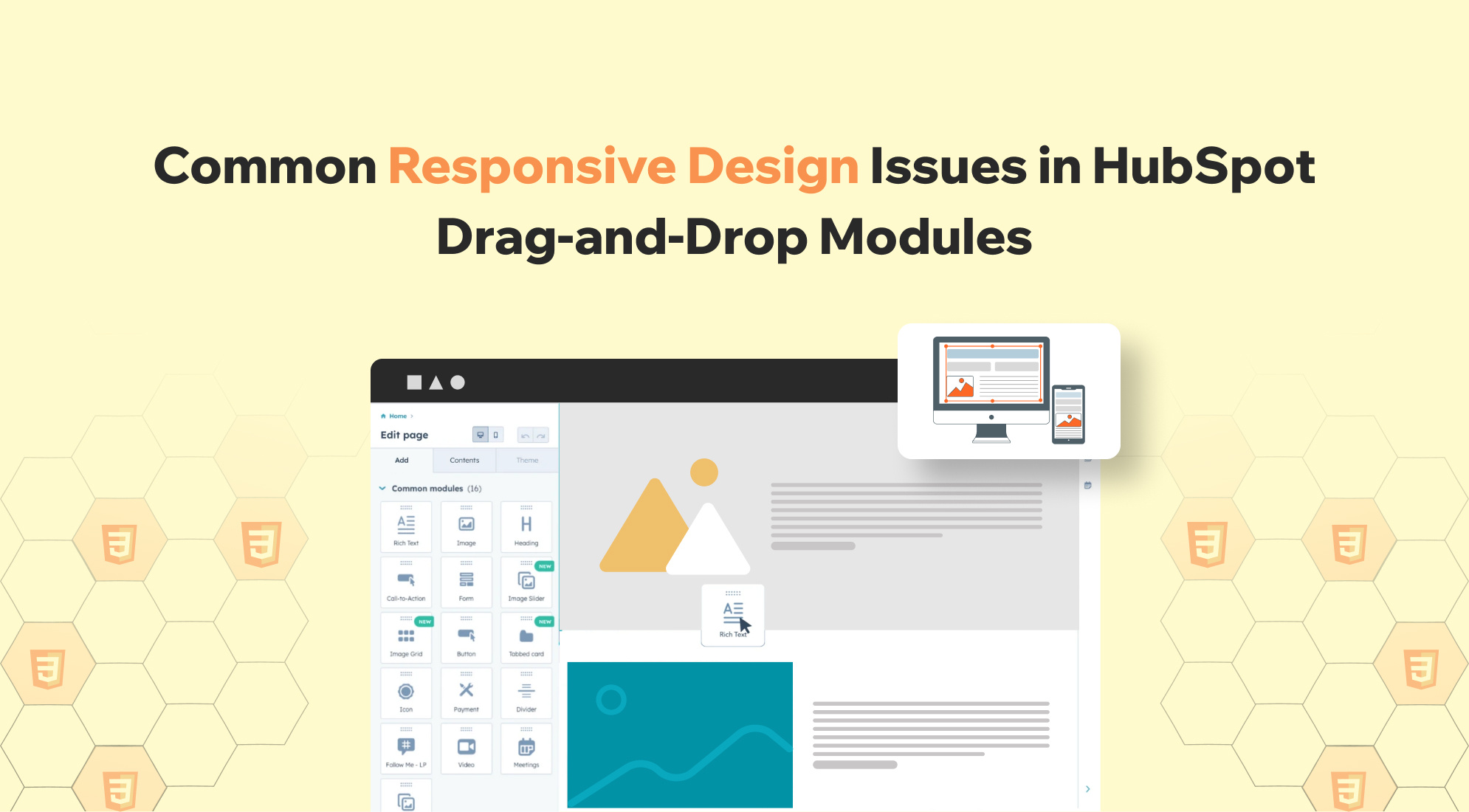
1. Modules Not Adapting to Different Screen Sizes
Issue: Modules may not resize or rearrange appropriately on various devices, leading to a suboptimal user experience.
Solution:
Make sure your modules are designed to be responsive! It's great to use flexible grid systems and relative units like percentages instead of fixed widths. Don’t forget to incorporate media queries to tweak styles for various screen sizes. When creating custom templates, try implementing a column layout system similar to HubSpot's CMS Theme Boilerplate to boost that responsiveness.

2. Stacking Issues in Email Templates
Issue: In drag-and-drop email templates, elements may not stack as intended on mobile devices, affecting readability.
Solution:
HubSpot's drag-and-drop email templates are super responsive right from the start! If you encounter any stacking issues, don’t worry—you can easily customise the classes, styling, and markup to fit your needs. Using HubSpot's default classes effectively can help you achieve the perfect stacking order and keep everything looking excellent and responsive!

3. Compatibility Issues with Email Clients
Issue: Emails designed with drag-and-drop modules may display differently across email clients, particularly in Outlook.
Solution:
For smoother rendering in Outlook, it's best to set pixel width values for blocks rather than using percentages. To achieve the perfect size, don’t forget to use the width attribute in the <table> tag and inline CSS!

4. Challenges with Custom CSS Frameworks
Issue: Integrating custom CSS frameworks with HubSpot's drag-and-drop areas can lead to conflicts or unexpected behaviour.
Solution:
You can quickly implement a custom CSS framework by adding it to your module and applying the necessary class names. If you run into any conflicts, consider excluding the framework’s grid system or renaming it to prevent clashes. This approach allows you to use your favourite CSS framework while enjoying the handy features of HubSpot's drag-and-drop functionality.

5. Mobile-Friendly Breakpoints in HubSpot
Issue: Responsive design relies on properly defined breakpoints, ensuring content looks good across all devices. HubSpot provides basic breakpoint settings, but fine-tuning with custom CSS is sometimes necessary.
Solution:
- HubSpot allows you to define breakpoint styles (desktop, tablet, mobile).
- Sometimes, you must manually adjust content like images, buttons, and text at different screen sizes.
- Use CSS media queries to set rules for different screen widths.
How to Implement in HubSpot:
- Go to the Design Manager on your HubSpot account.
- Edit the template or module where you want to apply custom CSS.
- In the CSS file section, you can either create a new CSS file or edit an existing one.
- Add the media queries (like the example below) to handle different screen sizes.
- Save and publish the changes.
Example:

6. Using Object-Fit for Responsive Images/Videos
Issue: The object-fit CSS property helps images or videos resize correctly within their containers. Without this, images may get stretched or cropped unpredictably.
Solution:
- The object-fit: cover rule ensures images fill their container, keeping their aspect ratio intact.
- It's beneficial for responsive images and videos, preventing them from distorting or overflowing.
Example:

CSS:

.webp)

%201.png?width=1016&height=912&name=image%20(54)%201.png)