Listen to the Blog
In modern web design, typography plays a crucial role in creating visually appealing and user-friendly experiences. Letter spacing, often overlooked, can drastically affect readability, aesthetics, and even the emotional tone of your website.
What is Letter Spacing?
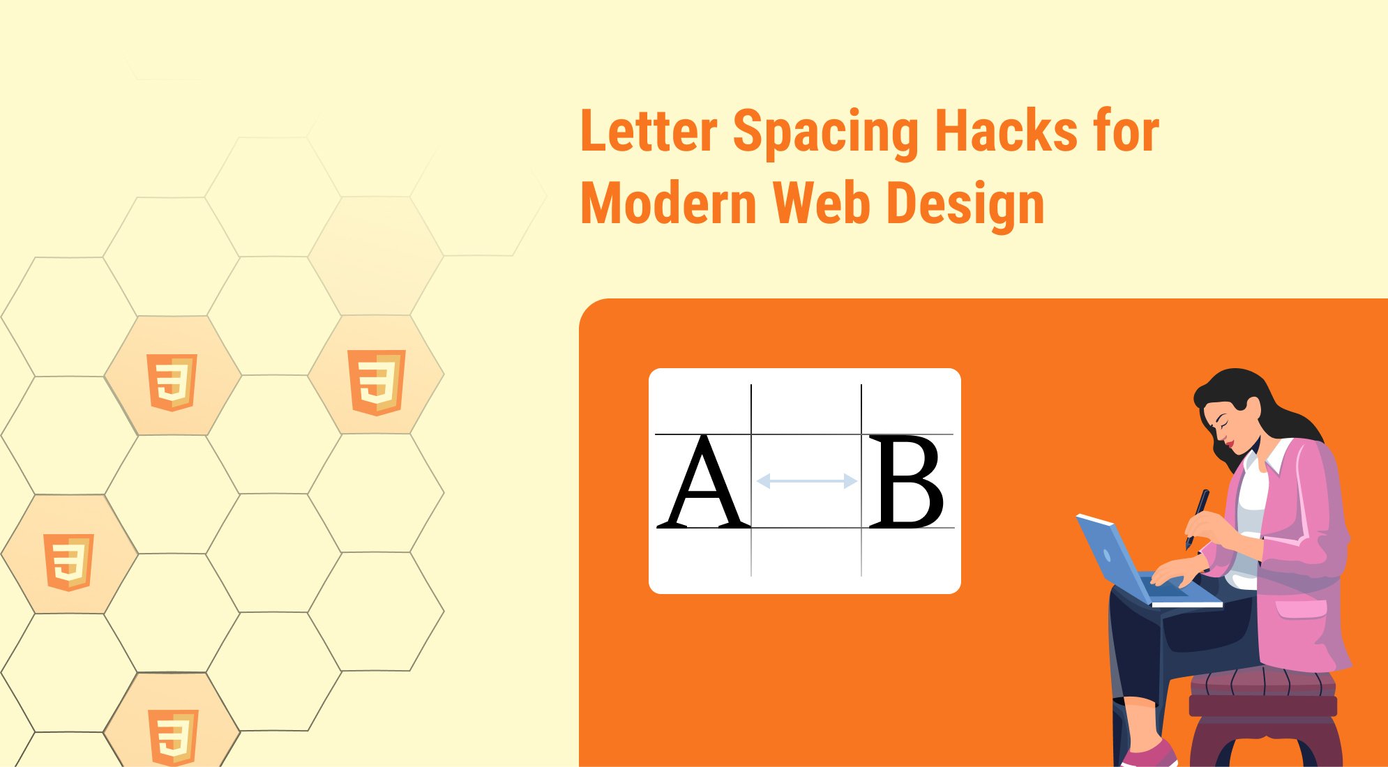
Letter spacing is the process of adjusting the space between characters in a block of text to improve readability, aesthetics, or overall design flow. In typography, it’s often used to achieve a specific visual effect, whether it’s creating a cleaner look for body text or emphasizing key elements like headings or call-to-action phrases.
Why is Letter Spacing Important in Web Design?
Letter spacing is a subtle yet powerful design element that significantly impacts both the aesthetic appeal and functional usability of web typography. Properly adjusted letter spacing enhances readability, sets the tone of the design, and contributes to a cohesive user experience.
1. Improves Readabilit
- Text that is too tightly spaced can feel cramped, making it harder for users to read, especially on small screens.
- Conversely, overly loose spacing can disrupt the natural flow of reading, forcing users to work harder to connect words.
- Best Practice: Use slightly looser letter spacing for body text and smaller font sizes to improve clarity.
2. Enhances Visual Aesthetics
- Letter spacing affects the overall look and feel of your text:
- Tight Letter Spacing: Creates a modern, compact, and bold look, often used for headlines or logos.
- Loose Letter Spacing: Feels elegant, airy, and sophisticated, suitable for luxury brands or minimalistic designs.
3. Sets the Tone and Emotion
- Typography, including letter spacing, plays a critical role in conveying mood and branding.
- Wide spacing gives an impression of calm, elegance, and openness.
- Tight spacing conveys urgency, compactness, or boldness.
4. Supports Responsive Design
- In responsive web design, adjusting letter spacing can optimize text readability across devices:
- Tighten spacing on large headings for desktop layouts.
- Slightly loosen spacing for smaller screens to compensate for reduced font sizes.
Common Letter Spacing Mistakes to Avoid
Proper letter spacing can make or break your typography. While experimenting with spacing can enhance your design, several common mistakes can lead to poor readability and a lackluster user experience. Here's what to watch out for:
Overly Tight Letter Spacing
- Problem: Text appears cramped, reducing readability, especially at smaller font sizes.
- Why It’s Bad: Tight spacing can make words blend together, creating visual clutter and causing eye strain.
- Fix: Maintain at least the default spacing for body text and avoid negative letter spacing for smaller font sizes.
Excessive Letter Spacing
- Problem: Letters feel disconnected, making words harder to read.
- Why It’s Bad: Overly loose spacing disrupts the natural flow of reading, especially in long paragraphs.
- Fix: Use wide spacing sparingly, such as in uppercase headings or logos, and avoid applying it to body text.
Inconsistent Spacing
- Problem: Using different letter spacing values for similar text elements (e.g., headlines or buttons) creates a lack of visual harmony.
- Why It’s Bad: Inconsistency makes your design look unpolished and confusing to users.
- Fix: Establish consistent spacing rules in your design system or CSS stylesheet.
Ignoring Context and Font Choice
- Problem: Applying the same letter spacing across all fonts without considering their inherent design.
- Why It’s Bad: Some fonts are naturally more condensed or spaced out than others, and ignoring this can lead to awkward visuals.
- Fix: Test your letter spacing with the specific font being used and adjust accordingly.
Poor Contrast Between Text Elements
- Problem: Applying the same letter spacing to headlines, body text, and CTAs creates a monotonous look.
- Why It’s Bad: Readers struggle to distinguish important elements.
- Fix: Use tighter spacing for headlines and slightly looser spacing for body text for a clear visual hierarchy.
Misusing Wide Spacing for Capitalized Text
- Problem: Applying extreme spacing to uppercase text makes it harder to read.
- Why It’s Bad: Uppercase letters already have a boxy, uniform structure, and excessive spacing amplifies this effect.
- Fix: Use subtle adjustments for uppercase text, like 1-2px for emphasis.
Letter Spacing Example in HTML CSS
Below is a practical example that demonstrates different uses of letter spacing for various types of text in a webpage.

Letter Spacing in Web Design
Why It Matters
Letter spacing is a critical aspect of typography that affects readability, aesthetics, and user experience. Proper spacing can make your text more engaging and easier to read.
Typography Tips for Designers
Conclusion
Letter spacing is more than a typographic adjustment—it's a key design tool that enhances readability, sets the tone of your content, and contributes to the overall aesthetic of your website. By fine-tuning the space between characters.
Key Takeaways:
- Always balance letter spacing for functionality and design—readability should come first.
- Use CSS to implement flexible letter spacing that adapts to different screen sizes.
- Avoid extreme letter spacing unless it serves a specific purpose, such as a logo or decorative text
With thoughtful use of letter spacing, you can elevate your typography, ensuring it not only looks polished but also effectively communicates your message to users.



%201.png?width=1016&height=912&name=image%20(54)%201.png)