
5 Minutes Read
Listen to the Blog
As web technologies continue to evolve, CSS remains at the forefront of modern web design and development. In 2025, CSS is pushing boundaries with new features and techniques that promise to revolutionize the way we create responsive, accessible, and visually stunning user interfaces. From enhancing performance to embracing creative possibilities, these trends reflect the growing needs of developers and the expectations of users in an increasingly dynamic digital world.
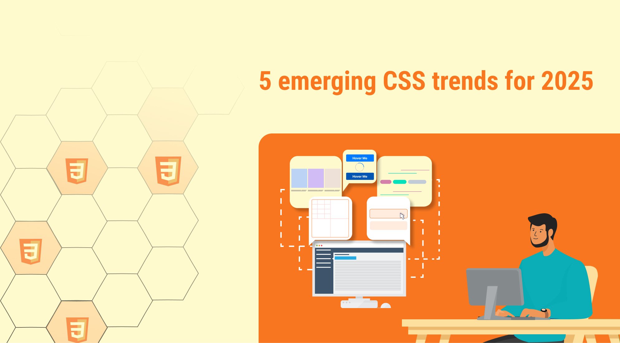
Here’s a full overview of 5 emerging CSS trends for 2025:
1. CSS Container Queries
Overview:
- What it solves: Unlike media queries that adapt based on viewport size, container queries allow elements to adapt based on their parent container's size.
- Use cases:
- Adaptive components in responsive design.
- Layouts that adjust dynamically when embedded in different containers.
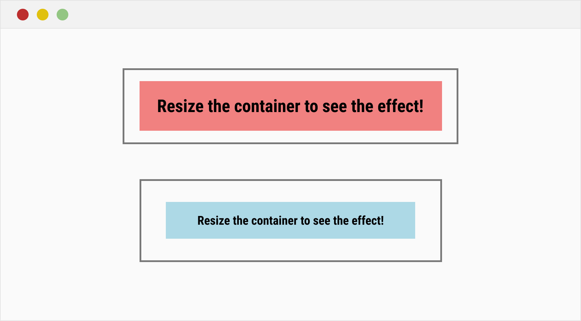
Resize the container to see the effect!
.container { container-type: inline-size; border: 2px solid #ccc; padding: 20px; } .box { background-color: lightblue; padding: 20px; font-size: 1rem; } @container (min-width: 400px) { .box { background-color: lightcoral; font-size: 1.5rem; } }
2. CSS Custom Properties for Animations
Custom properties (--variables) are now being leveraged for dynamic animations and theming.

:root { --color-start: #6a11cb; --color-end: #2575fc; } .animated-box { width: 100px; height: 100px; background: linear-gradient(135deg, var(--color-start), var(--color-end)); animation: colorShift 3s infinite alternate; } @keyframes colorShift { to { --color-start: #ff6a00; --color-end: #ee0979; } }
3. Nested Grid
A nested grid layout in HTML can be very useful for creating complex, responsive layouts. Here’s a simple example of a nested grid layout using CSS Grid. This example will demonstrate how to create a parent grid and then nest additional grids within the child items.

Item 1
Nested 1
Nested 2
Nested 3
Item 3
/* Basic reset */ * { margin: 0; padding: 0; box-sizing: border-box; } /* Grid container */ .grid-container { display: grid; grid-template-columns: repeat(3, 1fr); /* 3 equal columns */ gap: 10px; padding: 20px; } /* Grid items */ .item { background-color: lightgray; padding: 20px; text-align: center; border: 1px solid #ccc; } /* Nested grid inside item2 */ .nested-grid { display: grid; grid-template-columns: 1fr 1fr; /* 2 equal columns for the nested grid */ gap: 10px; } .nested-item { background-color: lightblue; padding: 10px; text-align: center; border: 1px solid #aaa; }
4. CSS Variables and Custom Properties for Theming
With the rise of dark mode and custom branding, CSS variables (custom properties) will be widely adopted for managing themes. Using @media queries and JavaScript, it’s easier to dynamically change themes based on user preferences or system settings.
Why it matters:
- Provides an easy and efficient way to handle theming and customization.
- Facilitates a more personalized user experience.

Welcome to Themed Website
This is a sample paragraph with a light/dark theme.
/* Default Theme (Light Mode) */ :root { --bg-color: #fff; --text-color: #333; --button-bg: #007bff; --button-color: #fff; } body { background-color: var(--bg-color); color: var(--text-color); font-family: Arial, sans-serif; margin: 0; padding: 20px; } header { display: flex; align-items: center; } button { background-color: var(--button-bg); color: var(--button-color); border: none; padding: 10px 15px; cursor: pointer; font-size: 16px; margin-left: 40px; border-radius: 5px; } button:hover { opacity: 0.8; } /* Dark Theme */ [data-theme="dark"] { --bg-color: #333; --text-color: #fff; --button-bg: #6c757d; --button-color: #000; }
const button = document.getElementById('toggleTheme'); button.addEventListener('click', () => { const currentTheme = document.documentElement.getAttribute('data-theme'); if (currentTheme === 'dark') { document.documentElement.setAttribute('data-theme', 'light'); } else { document.documentElement.setAttribute('data-theme', 'dark'); } });
5. Advanced Transitions and Animations
Advanced CSS transitions and animations provide dynamic, engaging effects to improve user experience. By leveraging features like custom keyframes, easing functions, and interactive triggers, you can create visually appealing elements.

body { margin: 0; font-family: Arial, sans-serif; display: flex; justify-content: center; align-items: center; height: 100vh; background-color: #f5f5f5; } .container { text-align: center; } /* Button with hover transition */ .button { background-color: #007bff; color: white; font-size: 1rem; padding: 1rem 2rem; border: none; border-radius: 5px; cursor: pointer; transition: transform 0.3s ease, background-color 0.3s ease; } .button:hover { background-color: #0056b3; transform: scale(1.1); } /* Animated loader */ .loader { margin-top: 2rem; width: 50px; height: 50px; border: 5px solid #ccc; border-top: 5px solid #007bff; border-radius: 50%; animation: spin 1s linear infinite; } @keyframes spin { from { transform: rotate(0deg); } to { transform: rotate(360deg); } }
Conclusion
The CSS trends of 2025 emphasize a shift toward creating more dynamic, adaptable, and user-friendly web designs. By embracing creativity through advanced layouts, expressive typography, and immersive visuals, designers can craft experiences that captivate users.
Performance and sustainability remain key priorities, with a focus on lightweight and efficient CSS practices that enhance load times and align with eco-conscious web development principles. Features like container queries, dark mode optimization, and responsive typography ensure adaptability across various devices and user preferences. Inclusivity is at the forefront, with accessible designs that cater to a diverse audience, ensuring equal usability for everyone. The integration of subtle motion design and interactivity adds depth to web experiences, creating intuitive and engaging user journeys.
Incorporating these trends not only keeps designs current but also fosters a forward-thinking approach that meets the evolving needs of users and the web development landscape.

%201.png?width=1016&height=912&name=image%20(54)%201.png)