
4 Minutes Read
Listen to the Blog
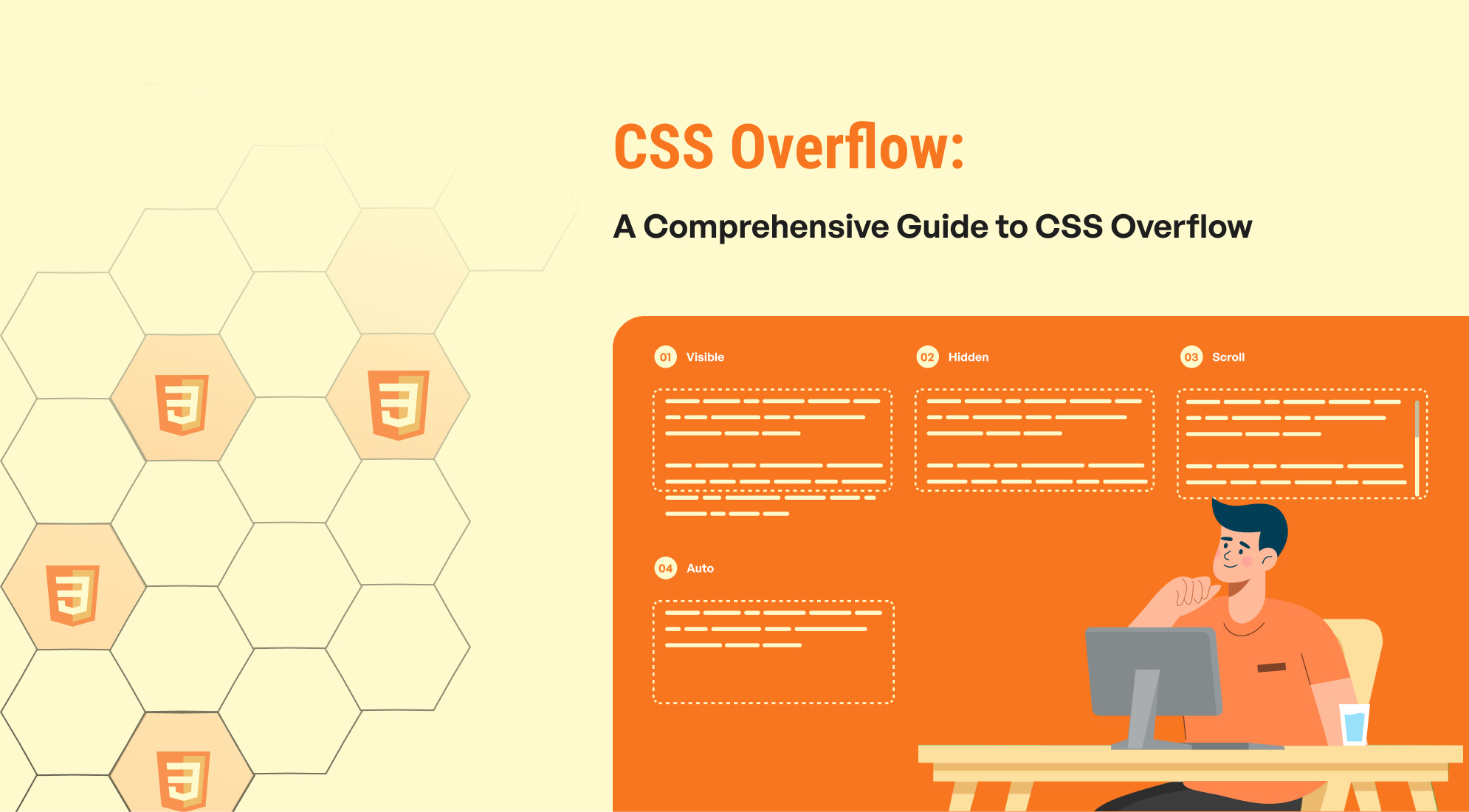
In CSS, the overflow property controls how content is displayed when it exceeds the bounds of its container. It determines whether the extra content should be visible, hidden, or if scrollbars should be added. This property is essential for managing the layout and ensuring content fits within designated areas on a webpage.
What are the CSS overflow property values?
The overflow property in CSS offers several unique values to handle overflow issues effectively. These values dictate how excess content is managed and can be used to hide, clip, or otherwise control how content is displayed when it exceeds the container's bounds.
- Visible
- Hidden
- Scroll
- Auto
1. Visible
The visible value for the overflow property allows content that exceeds the dimensions of its container to be visible outside of its bounds. This means that any overflowing content will not be clipped or hidden, and no scrollbars will be provided.
- Content will extend beyond the container’s edge if it overflows.
- No scrollbars will appear, as the content is not clipped.
- Useful for design elements that need to break out of their containing element for visual reasons.

This is some content that may overflow the container's bounds.
Additional content here...
.container-visible { overflow: visible; }
Using overflow: visible can be particularly effective for certain UI elements, but be mindful of its impact on layout, especially if overflowed content can interfere with other page elements.
2. Hidden :
The hidden value for the overflow property clips any content that exceeds the dimensions of its container. Overflowing content is not visible, and no scrollbars are provided to access the hidden content.
- Content that extends beyond the container’s edges is clipped and not visible.
- No scrollbars are added, so users cannot access the hidden content.
- Useful for creating layout constraints and ensuring that excess content does not disrupt the design.

This content will be clipped if it overflows the container's bounds.
Additional content here...
.container-hidden { overflow: hidden; }
Using overflow: hidden is effective for managing content overflow in a way that keeps the layout tidy and prevents any visual clutter from overflowing elements. However, be cautious that important content may become inaccessible if it overflows.
3. Scroll :
The scroll value for the overflow property forces scrollbars to be added to the container, regardless of whether the content actually overflows. This ensures that scrollbars are always present, enabling users to scroll through any content that extends beyond the container’s dimensions.
- Scrollbars are always visible, even if the content does not exceed the container’s dimensions.
- Both horizontal and vertical scrollbars will appear if the content overflows in those directions.
- Provides a consistent interface where scrollbars are always present, which can be useful for ensuring users know they can scroll if needed.

This content will always have scrollbars, regardless of whether it overflows the container's bounds.
Additional content here...
.container-scroll { overflow: scroll; }
Using overflow: scroll ensures that scrollbars are always available, which can be beneficial for user experience and consistency, especially in fixed-size areas or components where content overflow is expected or desired.
4. Auto :
The auto value for the overflow property adds scrollbars to the container only when the content overflows its bounds. If the content fits within the container, no scrollbars are shown. This provides a dynamic approach to managing overflow.
- Scrollbars will appear only when the content overflows the container’s edges.
- Both horizontal and vertical scrollbars will be added as needed.
- If the content fits within the container, no scrollbars are visible, keeping the layout clean.

This content will have scrollbars only if it overflows the container's bounds.
Additional content here...
.container-auto { overflow: auto; }
Using overflow: auto is a flexible solution that adapts to content size and ensures that scrollbars are shown only when necessary, providing a user-friendly way to manage overflow without cluttering the design.
Conclusion
The overflow property in CSS is essential for managing how content is handled when it exceeds the dimensions of its container. By understanding and utilizing its various values, you can effectively control the visibility and accessibility of overflowing content, thereby enhancing the layout and user experience of your webpage.


%201.png?width=1016&height=912&name=image%20(54)%201.png)