What Is CSS? How Does It Affect Our Web Pages?

  • Blog /
  • What Is CSS? How Does It Affect Our Web Pages?
Blog Featured Image

HTML is something that we have all heard about, even those who have no relations with web development or the field of IT (Information Technology). It is a basic markup language that was been used since the 1990s. However, you might not be familiar with the word CSS in the context of web development.

It refers to a crucial aspect of the programming language. Along with HTML and JavaScript, CSS is one of the critical pillars of web technology. As a beginner web developer, it is vital to understand what CSS is and how it impacts web pages.

This article dives deep into the world of CSS, exploring its role in web development and how it affects the way we experience websites. So, without further ado, let's understand what CSS stands for and the role it has in the world of web development.

Unveiling the Mystery: What is CSS?

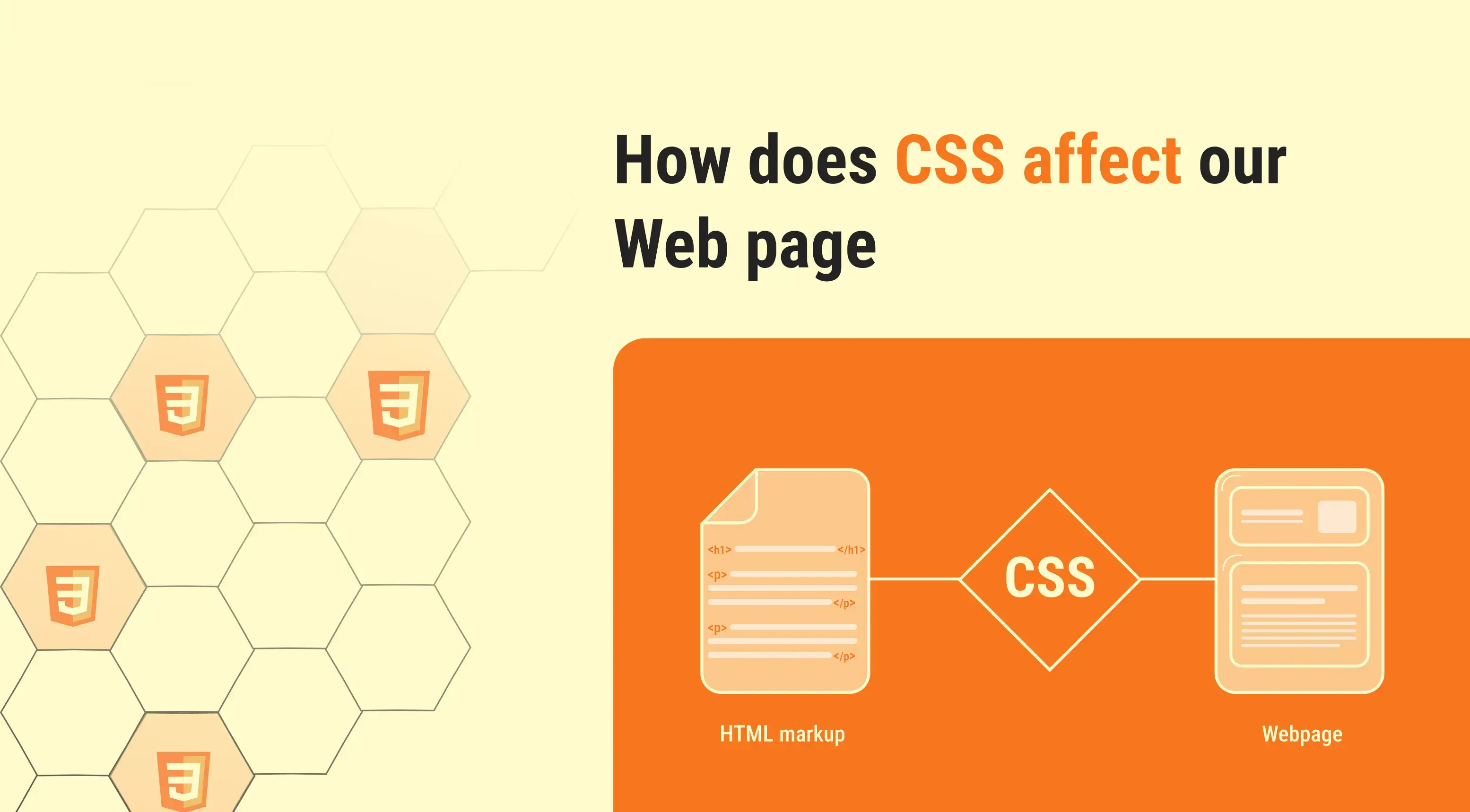
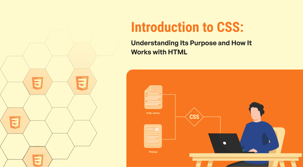
CSS stands for Cascading Style Sheets. As the name suggests, it's a specific language used to define the presentation of a web document. Keep in mind that HTML focuses on the content and structure of a webpage (headings, paragraphs, images, etc.).

On the other hand, CSS handles the visual aspects – fonts, colors, layouts, backgrounds, and more. Think of HTML as the skeleton of a website, providing the basic framework. CSS acts as the muscles and skin, breathing life into the structure by defining its appearance and functionality.

Here's a simple analogy: Imagine writing a story. HTML would be the words and sentences that form the narrative, while CSS would be the font style, text size, and even the color of the paper – all elements that affect how you read and perceive the story.

How Does CSS and HTML Work Together?

CSS works with HTML to control the presentation and styling of web pages. HTML defines the structure and content of a webpage, while CSS specifies how that content should be displayed. CSS selectors target HTML elements, allowing developers to apply styles like colors, fonts, layout, and spacing.

These styles can be defined inline within HTML elements, in a separate CSS file linked to the HTML document, or embedded directly within the HTML file using <style> tags. When a web browser renders a webpage, it interprets both the HTML and CSS files.

It applies the CSS styles to the corresponding HTML elements according to the rules specified in the CSS selectors. As a result, it gives a visual appearance of the webpage as designed by the developer. This separation of structure (HTML) and presentation (CSS) enables easier maintenance, scalability, and flexibility in web design.

Copied


/* CSS is applied to HTML elements in a web page */

selector {
	property: value;
}

/* Selector */
p {
}

/* Property */
p {
  font-family:
  font-size: 
  color: 
}

/* Value */
p {
  font-family: Arial;
  font-size: 16px;
  color: #000000;
}

The Power of Style: How CSS Affects Web Pages?

CSS offers a wide range of functionalities that significantly impact the way web pages are displayed and experienced. Here are some key areas where CSS makes a difference.

The Power Of Style_ How CSS Affects Web Pages_

  • Visual Appeal:  CSS controls the visual elements that make a website attractive and engaging. From defining font styles, colors, and backgrounds to creating borders, shadows, and other effects, CSS allows designers to craft a unique visual identity for each website.
  • Layout and Structure: Beyond aesthetics, CSS plays a crucial role in structuring the layout of a web page. It allows for positioning elements like text, images, and buttons on the page. As a result, it creates a clear hierarchy and organization for the content.
  • Responsiveness and Adaptability: In today's mobile-first world, websites need to adapt to different screen sizes and devices. CSS provides tools like media queries to create responsive layouts that adjust automatically. This way, you can ensure an optimal viewing experience across various devices of your website.
  • Usability and Accessibility: CSS can enhance the usability of a website by making it easier to navigate and interact with. It can define hover effects for buttons, improve readability by adjusting text size and contrast, and even implement features that cater to users with visual impairments.
  • Consistency and Maintainability: CSS allows designers to define styles that can be applied across multiple pages on a website. This ensures a consistent look and feel throughout the site. Furthermore, it also simplifies maintenance by making changes in one central location instead of editing each page individually.

Copied


/* CSS affects web pages */

/* Default CSS of web page */
body {
	font-family: value;
    font-size: 16px;
    font-weight: 500;
    background: #ffffff;
    margin: 0;
}
/* Default CSS of web page end */


/* Responsiveness and Adaptability CSS */

/* Default Css for all devices */
h1 {
  font-size: 40px;
}
p {
  font-size: 18px;
}

/* For mobile devices CSS start */
@media (max-width: 767px) {
h1 {
  font-size: 30px;
}
p {
  font-size: 14px;
}
}
/* mobile devices CSS end */

/* For larger device CSS will be applied */
@media (min-width: Device width) {
	selector {
		property: value;
	}
}
/* For larger device CSS end */

/* For tablet device CSS start */
@media (min-width: 768px) and (max-width: 991px) {
h1 {
  font-size: 34px;
}
p {
  font-size: 16px;
}
}
/* tablet device CSS end */

/* Responsiveness and Adaptability CSS */


/* Consistency and Maintainability of CSS  */
h1, h2, h3, h4, h5, h6 {
   color: #232323;
   font-weight: 700;
   font-family: Verdana;
}
p {
  font-family: Arial;
  font-size: 16px;
  color: #000000;
}

Beyond the Basics: Advanced Techniques with CSS

While the core functionalities of CSS are relatively straightforward, the language offers a vast array of advanced features that allow for complex and dynamic web design. For, instance, it can assist in animations and transitions: CSS can be used to create smooth animations and transitions, making web pages more engaging and interactive. Here are some other examples of advanced techniques with CSS

    • Pseudo-Classes and Pseudo-Elements: These advanced selectors allow for targeting specific states of elements (e.g., hover effects, focus states) or creating entirely new visual elements like progress bars.

Tree-structural pseudo-classes

      • :empty - Element with no children and white-space characters.
      • :nth-child - Uses An+B notation to select elements from a list of sibling elements.
      • :nth-last-child - Uses An+B notation to select elements from list of sibling elements, counting backwards from the end of the list.
      • :first-child - Matches an element that is the first of its siblings.
      • :last-child - Matches an element that is the last of its siblings.
      • :only-child - Matches an element that has no siblings. For eg. a list item with no other list items in list.
      • :nth-of-type - Uses An+B notation to select elements from a list of sibling elements that match a certain type
      • :nth-last-of-type - Uses An+B notation to select elements from a list of sibling elements that match a certain type counting backwards from the end of the list.
      • :first-of-type - Matches an element that is the first of its siblings, and also matches a certain type selector.
      • :last-of-type - Matches an element that is the last of its siblings, and also matches a certain type selector.
      • :only-of-type - Matches an element that has no siblings of the chosen type selector.

User action pseudo-classes (These pseudo-classes require some interaction by the user in order for them to apply, such as holding a mouse pointer over an element.)

    • :hover - Matches when a user designates an item with a pointing device, such as holding the mouse pointer over the item.
    • :active - Matches when an item is being activated by the user. For example, when the item is clicked on.
    • :focus - Matches when an element has focus.
    • :focus-visible - Matches when an element has focus and the user agent identifies that the element should be visibly focused.
    • :focus-within - Matches an element to which :focus applies, plus any element that has a descendant to which :focus applies.

Copied


/* Tree-structural pseudo-classes start */

div:empty {
 display: none;
}

div:nth-child(2) {
 font-size: 14px;
}

div:nth-last-child {
 margin-bottom: 0;
}

div:first-child {
 text-align: center;
}

div:last-child {
 margin-bottom: 0;
}

div:only-child {
 font-size: 14px;
}

div:nth-of-type {
 font-size: 14px;
}

div:nth-last-of-type {
 font-size: 13px;
}

div:first-of-type {
 font-size: 18px;
}

div:last-of-type {
 font-size: 16px;
}

div:only-of-type {
 font-size: 15px;
}


/* User action pseudo-classes */

button:hover {
color: #ff0000;
background-color: #ffffff;
}

button:active {
background-color: transparent;
border: none;
outline: none;
stroke: none;
}

button:focus {
	background: transparent;
    border: 1px solid #ff0000;
    color: #ff0000;
}

button:focus-visible {
	outline: none;
}

button:focus-within

  • Media Queries: Media queries enable responsive design by adapting the layout and styles based on the screen size and device accessing the website. For more information visit the blog
  • Flexbox and Grid: These powerful layout systems provide more flexible and intuitive ways to arrange elements on a webpage, making responsive design and complex layouts easier to achieve.

Properties for the Parent (flex container)

  • row (default): left to right in ltr; right to left in rtl
  • row-reverse: right to left in ltr; left to right in rtl
  • column: same as row but top to bottom
  • column-reverse: same as row-reverse but bottom to top
  • nowrap (default): all flex items will be on one line
  • wrap: flex items will wrap onto multiple lines, from top to bottom.
  • wrap-reverse: flex items will wrap onto multiple lines from bottom to top.
  • flex-start (default): items are packed toward the start of the flex-direction.
  • flex-end: items are packed toward the end of the flex-direction.
  • start: items are packed toward the start of the writing-mode direction.
  • end: items are packed toward the end of the writing-mode direction.
  • left: items are packed toward left edge of the container, unless that doesn’t make sense with the flex-direction, then it behaves like start.
  • right: items are packed toward right edge of the container, unless that doesn’t make sense with the flex-direction, then it behaves like end.
  • center: items are centered along the line
  • space-between: items are evenly distributed in the line; first item is on the start line, last item on the end line
  • space-around: items are evenly distributed in the line with equal space around them. Note that visually the spaces aren’t equal, since all the items have equal space on both sides. The first item will have one unit of space against the container edge, but two units of space between the next item because that next item has its own spacing that applies.
  • space-evenly: items are distributed so that the spacing between any two items (and the space to the edges) is equal.
  • stretch (default): stretch to fill the container (still respect min-width/max-width)
  • self-start: items are placed at the start of the cross axis. The difference between these is subtle, and is about respecting the flex-direction rules or the writing-mode rules.
  • self-end: items are placed at the end of the cross axis. The difference again is subtle and is about respecting flex-direction rules vs. writing-mode rules.
  • center: items are centered in the cross-axis
  • baseline: items are aligned such as their baselines align
  • normal (default): items are packed in their default position as if no value was set.
  • flex-start / start: items packed to the start of the container. The (more supported) flex-start honors the flex-direction while start honors the writing-mode direction.
  • flex-end / end: items packed to the end of the container. The (more support) flex-end honors the flex-direction while end honors the writing-mode direction.
  • center: items centered in the container
  • space-between: items evenly distributed; the first line is at the start of the container while the last one is at the end
  • space-around: items evenly distributed with equal space around each line
  • space-evenly: items are evenly distributed with equal space around them
  • stretch: lines stretch to take up the remaining space

This is a shorthand for the flex-direction and flex-wrap properties

  • flex-flow: column wrap;

Properties for the (grid container)

  • grid – generates a block-level grid
  • inline-grid – generates an inline-level grid

Properties for the grid (justify-items)

  • start – aligns items to be flush with the start edge of their cell
  • end – aligns items to be flush with the end edge of their cell
  • center – aligns items in the center of their cell
  • stretch – fills the whole width of the cell (this is the default

Copied


/* Properties for the Parent (flex container) */

.container {
  display: flex; /* or inline-flex */
}

.container {
  flex-direction: row | row-reverse | column | column-reverse;
}

.container {
  flex-wrap: nowrap | wrap | wrap-reverse;
}

/* This is a shorthand for the flex-direction and flex-wrap properties */
.container {
  flex-flow: column wrap;
}

.container {
  justify-content: flex-start | flex-end | center | space-between | space-around | space-evenly | start | end | left | right ... + safe | unsafe;
}

.container {
  align-items: stretch | flex-start | flex-end | center | baseline | first baseline | last baseline | start | end | self-start | self-end + ... safe | unsafe;
}

.container {
  align-content: flex-start | flex-end | center | space-between | space-around | space-evenly | stretch | start | end | baseline | first baseline | last baseline + ... safe | unsafe;
}

/* The gap property explicitly controls the space between flex items. */
.container {
  display: flex;
  ...
  gap: 10px;
  gap: 10px 20px; /* row-gap column gap */
  row-gap: 10px;
  column-gap: 20px;
}

/* ----Grid-CSS---- */

/* Properties for the Parent (Grid Container) 

.container {
  display: grid | inline-grid;
}

/* Defines the columns and rows of the grid with a space-separated list of values. */
.container {
  grid-template-columns: ...  ...;
  /* e.g. 
      1fr 1fr
      minmax(10px, 1fr) 3fr
      repeat(5, 1fr)
      50px auto 100px 1fr
  */
  grid-template-rows: ... ...;
  /* e.g. 
      min-content 1fr min-content
      100px 1fr max-content
  */
}

.container {
	display: grid;
    grid-template-columns: repeat(3, 1fr); /* This would display the children elements in  three equal columns with equal width */
    gap: 5px; /* To set a gap between  thegrid items */
}

.container {
  grid-template-columns: 1fr 1fr 1fr;
}

/* Specifies the size of the grid lines.( – a length value) */
.container {
  /* standard */
  column-gap: ;
  row-gap: ;

  /* old */
  grid-column-gap: ;
  grid-row-gap: ;
}

.container {
  justify-items: start | end | center | stretch;
}

/* place-items sets both the align-items and justify-items properties in a single declaration. */
 .center {
  display: grid;
  place-items: center;
}

/*  – can be a length, a percentage, or a fraction of the free space in the grid (using the fr unit) */
.container {
  grid-auto-columns:  ...;
  grid-auto-rows:  ...;
}
.container {
  grid-template-columns: 60px 60px;
  grid-template-rows: 90px 90px;
}

These are just a few examples, and the world of CSS continues to evolve with new features and techniques being developed constantly.

Takeaway

With that, this article comes to an end and I hope that you have a clear idea about what CSS is. Simply put, using CSS ensures that you can try something new with colors, spacing, fonts, and layouts to create visually appealing. With the help of CSS, you can also decrease the developer workload simply by separating the style formatting from the main webpage structure.

Our website is the cornerstone of your online presence, and ensuring it delivers a seamless experience across all devices is paramount. This is where responsive design comes into play. By hiring an experienced developer who specializes in responsive web design, you not only guarantee a visually stunning and functional website but also prioritize user experience and accessibility. With a responsive design, your site adapts effortlessly to various screen sizes and resolutions, enhancing user engagement and SEO performance. Moreover, integrating HubSpot Content Hub into your website equips you with powerful tools to manage and optimize your content effectively. Seamlessly integrating with your marketing efforts, HubSpot Content Hub provides insights into content performance, streamlines collaboration, and enhances lead generation. Together, responsive design and HubSpot Content Hub form a winning combination, ensuring your website stands out, drives traffic, and converts visitors into loyal customers

Group 5474

Still unsure which pack to choose for your business requirements? The Code Accelerator team can help you find the perfect HubSpot match for your organization. With our myriad expert HubSpot services, our skilled and experienced professionals will assist your business in investing in the right place. Share your requirements or queries with our team, and we'll connect with you as soon as possible to discuss the best possible solutions.