

4 Minutes Read
Listen to the Blog
Most marketers blame their ads, copywriting, or even the product when conversions don’t improve. But the hidden truth is this Your UX directly controls your conversions more than your ads do.
You don’t need to be a designer to make your UX better just understand a few simple principles, and you’ll instantly level up your design game.
If your landing page looked premium, clean design, fancy animations, but conversions were stuck. These could be some major reasons:
- No proper visual hierarchy
- Too much text
- CTA hidden below the fold
- Zero trust signals
- Confusing flow
After making these simple UI/UX fixes, their conversions jumped to 4.1% without changing a single line of copy.
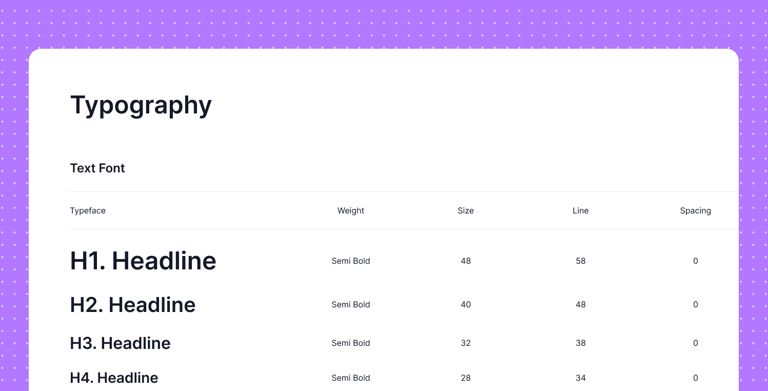
1. Use Clear Visual Hierarchy
Your headlines, sub-headlines and body text should never fight for attention.
Make it easy for the eyes to scan:
- H1: Biggest
- H2: Medium
- Body: Small
- CTA: Bold & attention-grabbing
The brain decides in 0.2 seconds what to look at. If everything looks equal, nothing stands out.
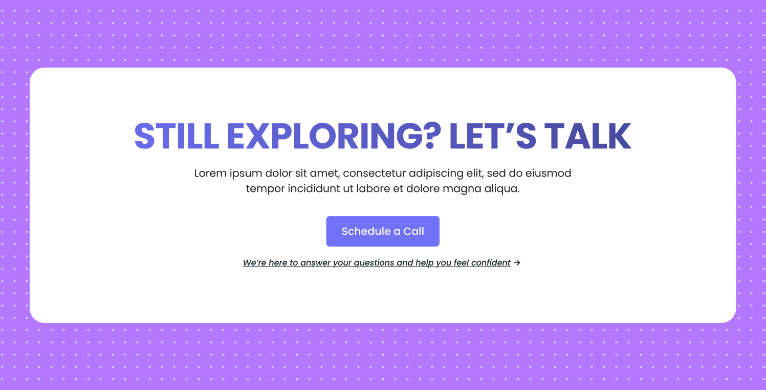
2. Keep Only One Primary CTA
Most marketers end up adding too many buttons on their landing pages, which only confuses visitors and makes the page less effective. for example:
- Learn More
- Get Started
- Book a Call
- Download PDF
Give them one clear action and repeat it multiple times on the page.
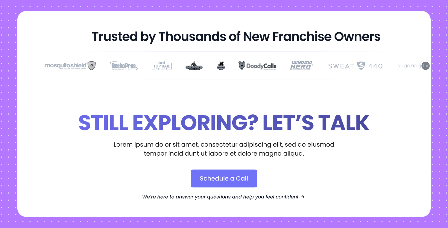
3. Add Social Proof Near the CTA
People trust on the people more than websites real stories, real faces, and genuine experiences always feel more believable than polished pages or fancy design elements.
Place these:
- Logos of clients
- Testimonial snippets
- Ratings
This removes hesitation at the decision point.
4. Reduce Text and Increase Clarity
Most marketers write way too much and forget that a landing page is not a detailed brochure. It should be a clear, focused pitch that quickly shows value and motivates people to take action.
Use the Rule of One:
- One message
- One core problem
- One CTA
- One value promise
If your page feels heavy, users bounce.
5. Use White Space Fearlessly
White space gives your design breathing room. It helps users focus, read comfortably, and move through your content without feeling overwhelmed.
- Process information faster
- Understand your message
- Focus on the CTA
Crowded pages feel stressful. Clean pages feel trustworthy.
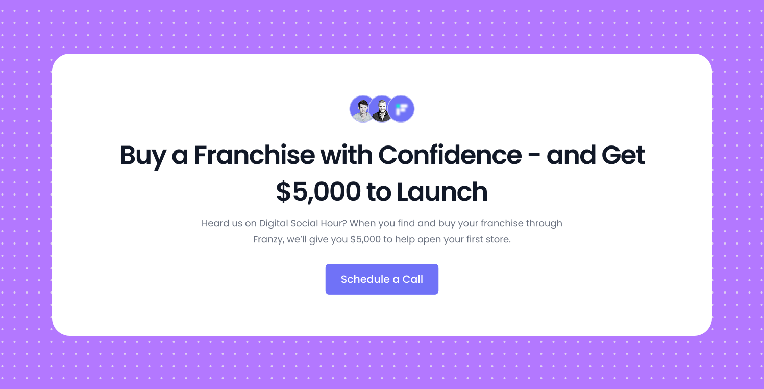
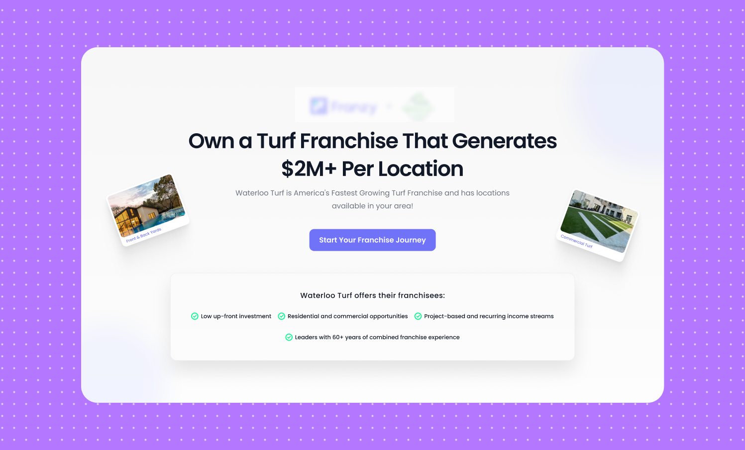
6. Make the First Fold Count
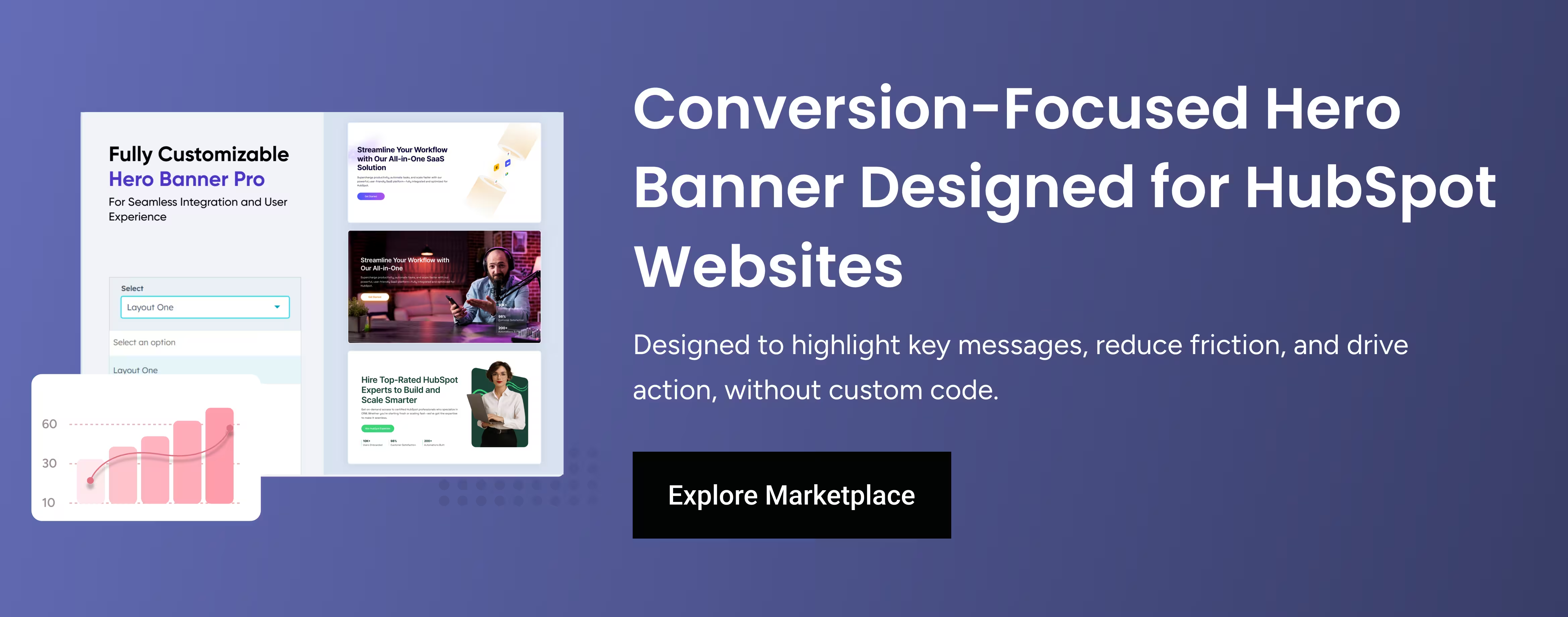
Your hero section is the most important part of your page because it decides whether a user scrolls or leaves.
You need:
-
Clear headline
-
Quick explanation
-
Trust signal
-
Strong CTA
-
Supporting visual
Simple rule: If your first fold fails, nothing else matters.
7. Use Contrast to Highlight What’s Important
If everything is the same color, nothing is important. Use contrast to highlight:
- Buttons
- Key benefits
- Metrics
- Proof sections
Your CTA should always be the most visible element on the screen.
8. Make Forms Shorter
The shorter the form, the higher the conversion. Ask only what you absolutely need:
- Name
- Phone
Avoid extra fields:
- Company size
- Budget
- Job title
- Country
- How did you hear about us?

Form friction kills conversions.
9. Break Long Sections Into Visual Blocks
People don’t read paragraphs they scan shapes.
- Icon
- Checkmarks
- Cards
- 1-2 line per benefit
- Short Title
- Bullet Points
Your content becomes instantly more digestible.
10. Make It Mobile-First, Not Mobile-Compatible
More than half of your traffic comes from mobile.
A mobile UI needs:
- Bigger buttons
- Larger text
- Shorter sections
- Better padding
- Fewer images
- Faster loading
If your mobile experience is weak, your conversions collapse.
If you follow these 10 principles, your conversions will automatically increase without rewriting your entire landing page or running new ads.
These UI/UX tips work for:
- Lead generation
- SaaS
- Agency landing pages
- Startup Website
- Sales Pages
- Webinar Funnels


%201.png?width=1016&height=912&name=image%20(54)%201.png)