

2 Minutes Read
Listen to the Blog
Getting traffic but not leads?
If your landing page isn’t converting, the issue is rarely your ads or your product.
In most cases, it’s a UX clarity problem. Users don’t clearly understand what you offer or what action to take next.
Before increasing ad spend or rebuilding everything, you should fix clarity, structure, and flow.
Figma won’t magically increase conversions, but it does help you test UX fixes and validate decisions before development or hiring an agency.
Let’s break it down.
1. Your Headline Doesn’t Explain the Value
When users land on your page, they immediately think:
“What is this and why should I care?”
If your headline is unclear, users leave. UX Fix
Your headline should clearly state:
- What problem do you solve?
- Who is it for?
- What outcome do users get?
Duplicate your landing page frame and test 3–4 headline versions.
The version that’s easiest to understand in 3 seconds usually converts better.
.avif)
2. Your First Fold Isn’t Helping Users Decide
Users decide whether to scroll or stay within a few seconds.
If the first fold is cluttered or confusing, conversions drop instantly.
UX Fix: Your hero section should clearly show:
- Headline
- Supporting message
- CTA
- Visual
- Social proof
Use Auto Layout to test spacing, alignment, and CTA visibility.
Minor layout tweaks can significantly improve clarity
3. Your Page Doesn’t Guide Users Through a Journey
Many landing pages feel like random sections stacked together.
Users convert when the page follows a clear flow:
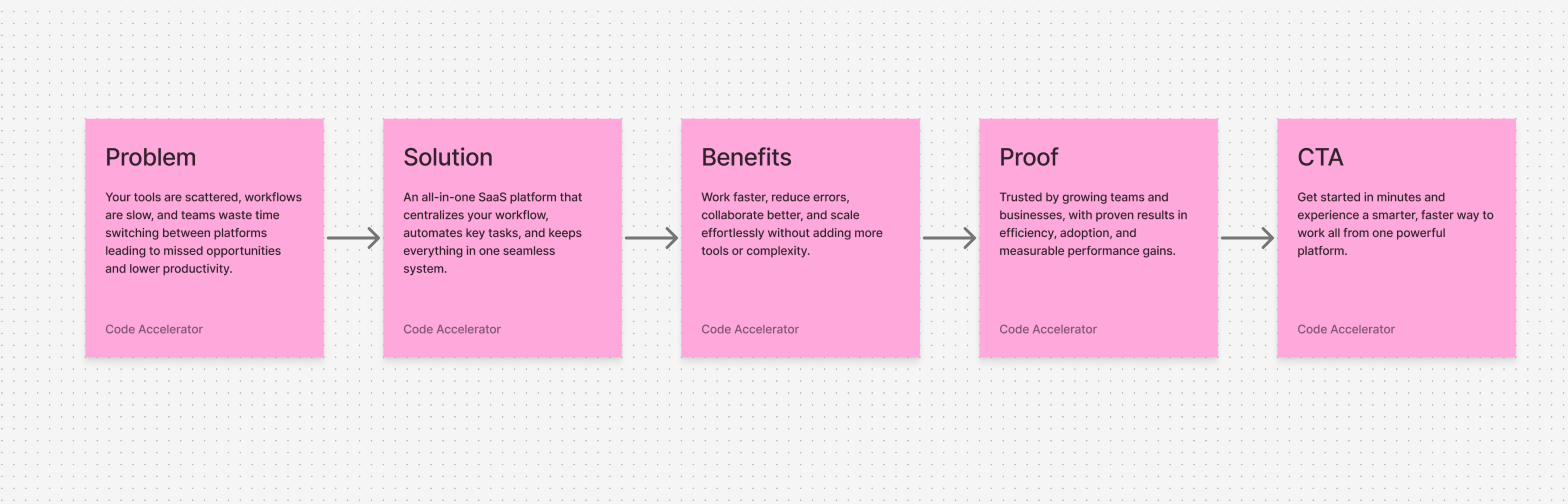
Map the journey visually before designing.
This ensures each section supports decision-making.
4. Your Page Is Hard to Scan
Users don’t read landing pages they scan. Large paragraphs and inconsistent spacing reduce engagement.
UX Fix: Use short, predictable sections:
- Problem
- Solution
- Benefits
- Social proof
- FAQ
- CTA
Use Figma Sections to visually group content and improve readability.
5. You’re Not Testing Variations Before Development
Most teams build first and test later which is slow and expensive.
UX Fix: Test UX variations before writing code.
Duplicate frames to test headlines, CTA text, visuals, and layout priority.
The clearer version almost always converts better.
Final Thoughts
Figma is not a conversion tool.
But it is the fastest way to identify and fix UX issues before spending more on ads or development.
Clear UX leads to:
- Better understanding
- Higher trust
- Stronger engagement
- Improved conversions


%201.png?width=1016&height=912&name=image%20(54)%201.png)