

3 Minutes Read
Listen to the Blog
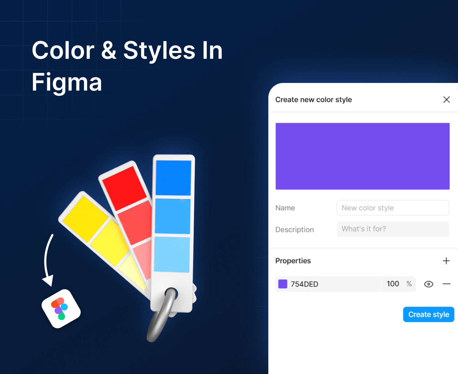
Designing landing pages used to be a slow, back-and-forth process between marketers and designers. But today, tools like Figma give marketers the freedom to visualize ideas, test layouts, and collaborate faster without needing advanced design skills.
If you want to build landing pages that convert better, Figma can become your secret weapon. Here’s how.
1. Start With Prebuilt Templates (Faster Ideation)
Many people start their designs from scratch or a blank frame, which takes a lot of time. Instead, marketers can use Figma’s large library to speed up their work and create better designs faster.
- UI kits
- Landing page templates
- Wireframe packs
- Community resources

Source: https://www.figma.com/community
This helps you quickly drag, drop, and shape ideas into a credible layout perfect for internal presentations or client pitches.
Search “landing page wireframe” in Figma Community to get dozens of free customizable layouts.
2. Use Auto Layout to Test Variations Quickly
Auto Layout is a marketer’s best friend in Figma.
With it, you can:
- Rearrange elements without breaking spacing
- Try long vs. short headlines
- Add or remove sections instantly
- Duplicate layouts for A/B variations

3. Apply Real Content Instead of Dummy Text
Marketers often finalize copy separately, but Figma lets you design using real marketing content:
- Real CTAs
- Real headlines
- Actual product benefits
- Real social proof

Use Figma’s “Content Reel” plugin to insert quick placeholder text or pull your saved headlines.
4. Create a Clear Visual Hierarchy
Good landing pages guide the user’s eyes in the right order. In Figma, you can quickly check:
- Which headline grabs attention first
- If your call-to-action button is clear and high contrast
- How each section flows into the next
- Where users might lose interest

Use basic tools like font sizes, color styles, spacing, and section dividers to keep everything organized and focused on driving conversions.
.avif)
5. Add Simple Interactions to Show User Flow
You don’t need advanced prototypes. Even small interactions in Figma help people understand your idea, like:
- How a button click works
- What happens when users scroll
- When a pop-up should appear
- How a multi-step form moves from one step to another

These quick, light interactions make your landing page concept clearer and more convincing.
6. Use Components to Build Sections Faster
Instead of designing the same blocks again and again, Figma components help you reuse common sections like:
- Hero areas
- Pricing sections
- Feature grids
- Testimonial blocks
- Call-to-action sections
This saves time and keeps all your landing page concepts clean and consistent.

7. Collaborate in Real Time With Designers and Developers
Figma’s biggest advantage is real-time teamwork. Marketers can:
- Leave comments
- Suggest new copy
- Edit CTA text
- Adjust spacing
- Upload brand assets
Designers see everything instantly. No email chains, no outdated files, no confusion.

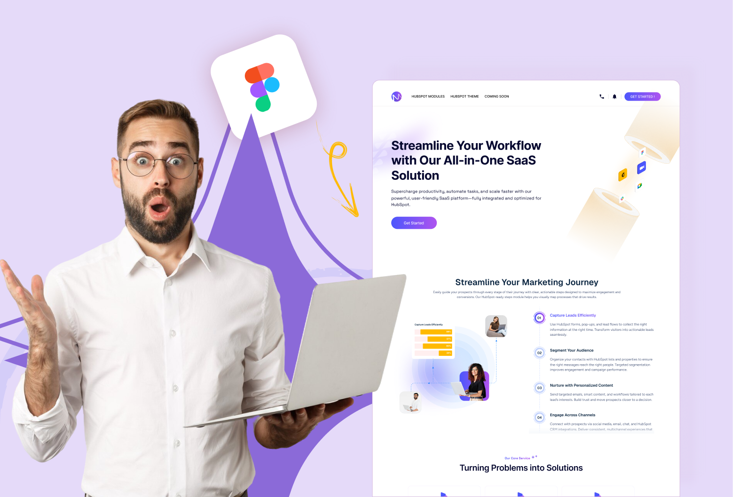
Final Thoughts
Figma gives marketers the power to participate in the design process in a real and meaningful way. It helps you brainstorm quickly, explore more ideas, and present landing page concepts that look polished and ready for development.
If you create landing pages often for campaigns, ads, or product launches, Figma will help you improve both the quality and the speed of your work.


%201.png?width=1016&height=912&name=image%20(54)%201.png)