
8 Minutes Read
Listen to the Blog
A Beginner’s Guide to Understand Color Theory
Color is the greatest weapon in a designer’s toolset. Choosing the right color pallete helps to elicit emotions, deliver messages, and dictate how your audience interprets your work of art. Colors are associated with certain emotions, ideas, and objects.
Color theory helps you make proper decisions about which colors of the palette you will use. Even for UI/UX designers, the basis of color theory helps to build a user-friendly website. Let's investigate the basic theory of color, its principles, and a few examples of how to select colors that will make your design successful across multiple platforms.
The Basics of Color Theory
Color theory is a science dedicated to the study of how each color interacts with every other color. It analyzes how colors can be combined to create visually appealing designs. Color theory includes several key concepts that form the foundation of any discussion on color in design. It is usually the basis for the primary rules and guidelines that often surround color and its use.
It helps in parsing the logical structure of color. It helps you create and use color palettes more strategically while understanding all color theory basics. The result leads to evoking a particular emotion, aesthetic, or vibe in the visitor or customer's mind.
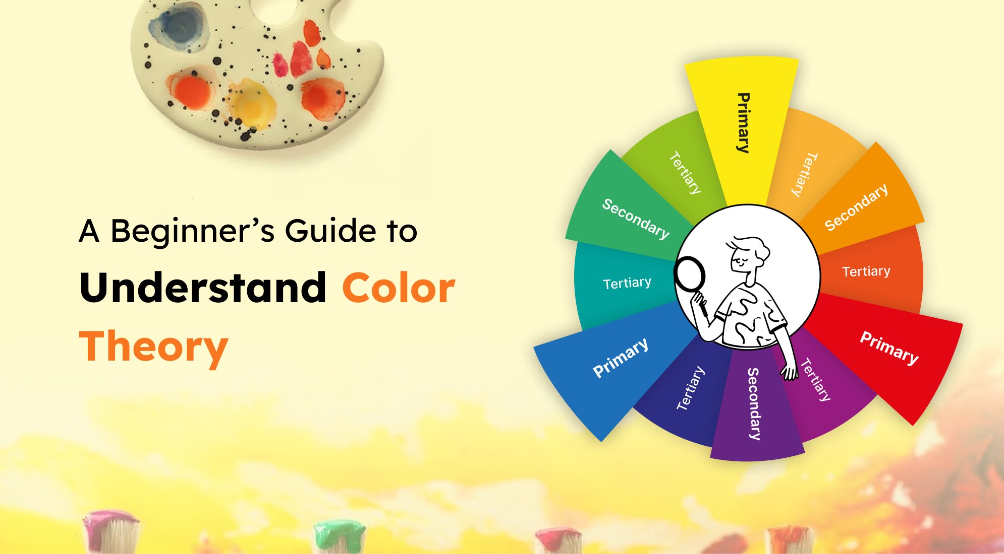
The Color Wheel
The color wheel is a system that represents colors visually. The arrangement of these colors happens according to their chromatic relationship. It is divided into the following:
- Primary Colors (red, blue, yellow)
- Secondary Colors (green, orange, purple)
- Tertiary Colors (primary+secondary colors)
You can grasp color relationships only when you understand the color wheel.
Color Harmony
Harmony in color theory refers to the pleasing visual effect that occurs when different colors are combined in specific ways. There are various color schemes based on the color wheel. Some may be dual colon, one in the parallel position and the other in the oblique position; some may be comparative, alike, threesome, and two-thirds. Each of them has a different visual effect, and this way, you can choose the one that fulfills your desire for the mood or message you want to convey.

Now that we have already touched on the basics of color theory let us delve into some key principles that guide the effective use of color in the design.
1. ContrastContrast is a crucial principle in color theory. It involves using colors that differ significantly from one another, creating a clear separation and enhancing visibility. High-contrast color combinations can be impactful, but be mindful of readability and accessibility.
2. Balance
Achieving balance in color involves distributing visual weight evenly across a design. Balancing colors ensures that no single hue dominates the visual hierarchy, providing a harmonious and visually pleasing result.
3. Emphasis
Emphasis involves highlighting certain elements within a design to draw attention. This can be achieved through color contrast, making key elements stand out against the background. Consider using a bold color for emphasis in areas where you want the viewer's focus.
4. Hierarchy
Establishing a clear color hierarchy helps guide the viewer's eyes through the design. It requires using color variations to indicate levels of importance or to organize information logically. This is particularly important in designs with multiple elements.
Understanding Color Psychology
Color psychology analyzes the psychological and emotional impact of colors on any human behavior. Different colors evoke different feelings and associations, making it crucial to consider the psychological aspects of your color choices.
1. Red:
Red is associated with energy, passion, and urgency. It evokes strong emotions and is often used to grab attention.
2. Blue:
Blue is calming and trustworthy. It's frequently used in corporate designs and is associated with stability and professionalism.
3. Yellow:
Yellow has a natural happiness and optimism about it. It can be attention-grabbing, but it should be used with caution not to overpower designs negatively.
4. Green:
Green symbolizes the environment, growth, and freshness. It demonstrates either health or peace.
5. Purple:
Purple is very well known for its association with luxury, sophistication, and creativity. It is a good choice for giving an elegant touch to a design.
6. Orange:
Orange comes with an energetic and warm tone. It is a good way of grabbing the audience's attention and can be used in a gentle way to show a friendly attitude.
7. Neutral Colors:
Neutral colors like black, white, gray, and brown can sometimes communicate minimalism, classicism, and elegance. They also do a great job as the backdrop to make other colors come alive or as the principal color itself.
Practical Tips for Choosing Colors
Here are some practical tips for selecting colors that work well together in your designs:
Consider Your Audience:
Understand your target audience, including their respective preferences. Colors can have cultural and demographic associations. So, customize the palette to resonate with your audience.
Start with a Base Color:
Begin your color selection with a primary color that reflects the essence of your brand or design. This will serve as a base for your color scheme.
Explore Color Combinations:
Experiment with different color combinations based on established color schemes. Tools like Paletton or Adobe Color Wheel can help you visualize and create cohesive color palettes.
Mind the Context:
Consider where your design will be displayed. Colors may appear to be different on various devices and mediums. So, test your color choices in the intended context.
Limit Your Palette:
Avoid overwhelming your audience with too many colors. Stick to a limited palette to maintain visual cohesion and prevent a chaotic or cluttered look.
Use Color Tools:
Use different color tools and generators to explore various shades, tones, and harmonies. These tools can inspire and ensure color consistency across your design.
Test for Accessibility:
Ensure that all your respective color choices consider accessibility standards. Test your design for readability. It will be helpful, especially for users with color vision deficiencies.
Stay Updated with Trends:
You must be aware of all color trends that can inspire fresh ideas and keep your designs contemporary. However, make sure to prioritize your project's unique requirements over trends.
Final Thoughts
Learning color theory can be challenging, and with practice, you will unconsciously develop an understanding of harmony between colors that allows you to convey the intended message. Firstly, do not be afraid of the saturation and use it as you wish. Even negative impressions are important as they demonstrate a real situation. With a huge color palette, the world of design becomes more creative and infinite, and the outlook is just a fraction of the endless possibilities.
However, when it comes to selecting the colors, the primary theory will inspire you to do greater things in whatever color you really go ahead with your selection. This can help with the illustration of branded visuals, more importantly, using design templates, and you can always customize colors.
If you are confused about what color palette will suit your website, you can always choose HubSpot CMS Hub, which comes with pre-designed website themes in different color palettes that suit your vision and brand identity. With customization functionalities, you can even add a personalized touch to the website template and deploy your website quickly. Connect with Code Accelerator experts to learn more about HubSpot CMS Hub.
Wrapping up
HubSpot Workflows are an effective tool that can help you increase productivity, automate your marketing chores, and improve your overall marketing outcomes. Adding HubSpot workflows to your marketing plan can increase the productivity and effectiveness of your staff.
Automating repetitive tasks and guaranteeing timely, personalized communication can save time and give your audience a more engaging experience. To fully utilize HubSpot Workflows for your marketing projects, it is best to hire a HubSpot professional who can help you save time building workflows and test them for efficiency.
If you are looking for such a professional, then Code Accelerator can help you! Our HubSpot specialists have the experience and expertise to transform your business by leveraging HubSpot to its full potential. Connect with our expert today and get maximum ROI on your HubSpot subscription plan. 
Still unsure which pack to choose for your business requirements? The Code Accelerator team can help you find the perfect HubSpot match for your organization. With our myriad expert HubSpot services, our skilled and experienced professionals will assist your business in investing in the right place. Share your requirements or queries with our team, and we'll connect with you as soon as possible to discuss the best possible solutions.


%201.png?width=1016&height=912&name=image%20(54)%201.png)