Listen to the Blog
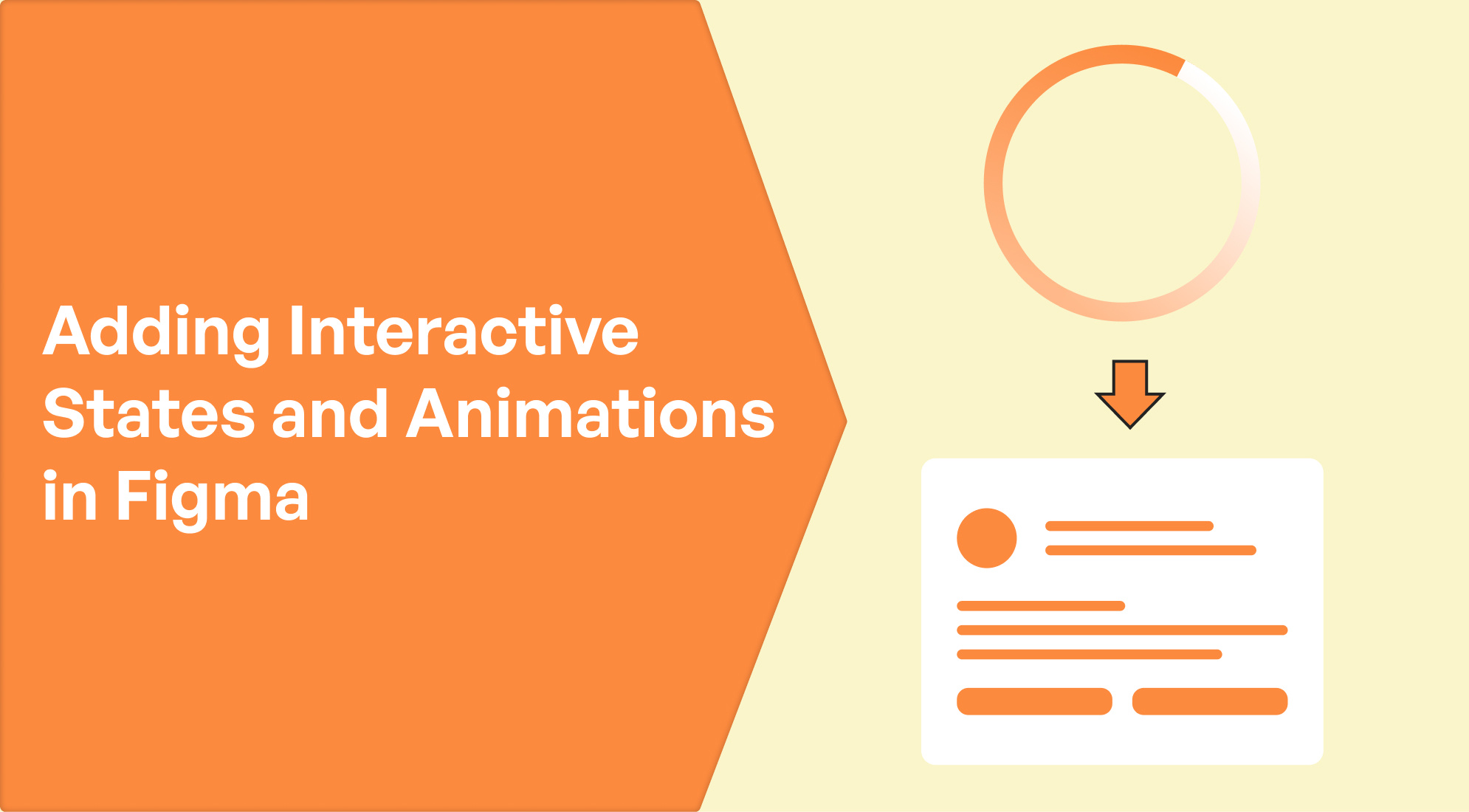
Interactive states and animations in Figma help enhance user experience by simulating real-world interactions with the UI. They allow you to create components that behave differently when interacted with (like buttons that change color when hovered over). Here's a guide to how they work and how you can apply them:
1. Creating Interactive States for Components
Interactive states are essential for UI components, such as buttons, dropdowns, and cards. Common states include:
- Default: The normal appearance of the component.
- Hover: How it looks when the user hovers over it.
- Pressed/Clicked: How it looks when clicked.
- Disabled: How it appears when the component is inactive or disabled.

Steps to create interactive states:
- Create multiple variants of the component: For example, a button might have "Default," "Hover," and "Clicked" states.
- Create the base component.
- Duplicate it to create different versions, and change the appearance (like color, size, etc.).
- Use Auto Layout to organize your components if necessary.
- Combine variants: Group them using the "Variants" option in Figma. This allows Figma to treat the multiple states of a component as a single, interactive entity.

2. Using Prototyping to Add Animations
Once you’ve created multiple states of a component, you can link them together using Prototyping to add interactivity and animations.

Steps to add animations:
- Enter Prototyping Mode: Switch to the "Prototype" tab in the right-hand panel.
- Create connections between interactive states:
- Click the component, drag the blue arrow to the variant you want to connect (e.g., Default to Hover).
- Choose the trigger event (e.g., "While Hovering" or "On Click").
- Add animation effects: Select how the state change should animate under the Interaction Details:
- Use transitions like Instant, Dissolve, or Smart Animate.
- Smart Animate: This is the most advanced option, as it creates smooth animations by recognizing differences between the properties of two states (e.g., size, opacity, position).

- Preview the interactions: Click "Play" in the top-right corner to preview your prototype and see the interactive states in action.

Conclusion:
Creating interactive states and animations in Figma adds an extra layer of depth and realism to your design prototypes. By utilizing Variants and Prototyping, you can simulate different interactions like hovering, clicking, or tapping on UI components. Combining these states with Smart Animate makes transitions smoother, giving you the ability to demonstrate complex behaviors and micro-interactions effectively. It’s a powerful way to bring your designs to life before development begins.


%201.png?width=1016&height=912&name=image%20(54)%201.png)