
8 Minutes Read
Listen to the Blog
As marketing UI/UX pros, we've teamed up with many businesses trying to level up their landing page game, all eager to take their landing page strategies to exciting new levels. Working together has enriched our skills and allowed us to achieve fantastic client results.
Great design isn’t just seen—it’s felt. A strong landing page connects, engages, and converts.
What have we discovered so far?
First Impressions Matter
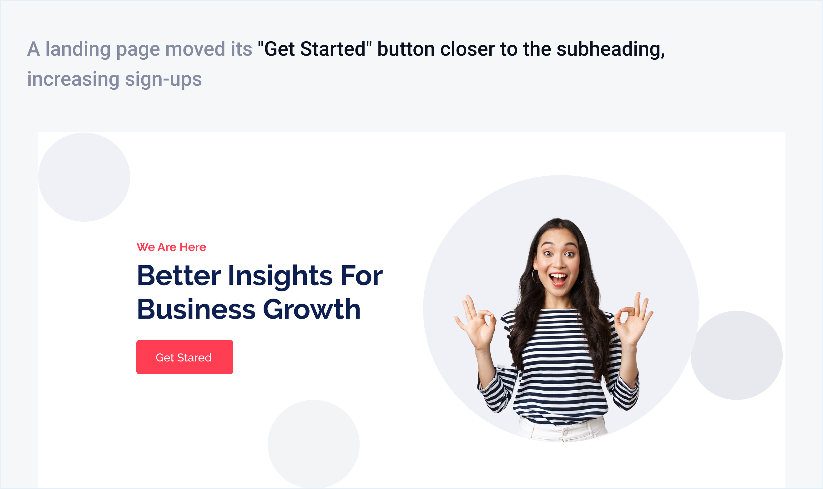
When it comes to landing pages, people often quickly judge their connection within just three seconds! These 3 seconds are critical because they determine whether a visitor continues exploring the site or leaves. Research from Jakob Nielsen, a respected expert in web usability, indicates that visitors often leave a page if they can't quickly find the information they want. This highlights how essential it is to capture attention quickly. By clearly displaying the most important and interesting information, we can meet users' expectations from the start!
How to Improve the First Impression of Your Landing Page?
Use a Clear, Benefit-Driven Headline
Your headline should instantly tell visitors what you offer and why it matters.

Keep the Design Simple & Visually Appealing
Use white space, structured sections, and readable fonts. A cluttered layout overwhelms users.

Resource: https://www.apple.com/in/
Add a Hero Image or Video That Connects
People connect with faces and real-life scenarios. A relevant image or video makes the page engaging.

Resource: https://www.dropbox.com/official-teams-page
Optimise for Fast Load Time
Visitors will leave if your page takes more than 3 seconds to load.

Use a Strong and Visible CTA (Call-to-Action)
Your CTA should be bold, specific, and action-oriented.

Make It Mobile-Friendly & Responsive
Over 60% of users browse on mobile—ensure smooth scrolling, readable fonts, and easy tap buttons.

Resource: https://www.airbnb.co.in/rooms/890978348611573455
Show Trust Signals (Logos, Testimonials, Reviews)
People trust businesses that others trust. Display customer reviews, case studies, or partner logos.

Resource: https://www.hubspot.com/
Your Landing Page Has Seconds to Win or Lose a Customer
Colour Speaks Louder Than Words
After diving into several landing pages, I've observed an interesting trend—some pages effortlessly captured users' attention and saw fantastic conversion rates, while others, even with excellent content and compelling CTAs, struggled to keep users engaged. So, what’s the secret ingredient? It’s all about colour psychology!
People decide whether or not they like a product in 90 seconds – and 90% of that decision is based on color.
We decided to dig deeper and found that research indicated:
- Blue builds trust, making it ideal for industries that require credibility, such as finance and technology.
- Red creates urgency and excitement, often used for promotions and call-to-action buttons.
- Green represents growth, harmony, and balance, making it popular in wellness, sustainability, and financial services.
- Yellow sparks optimism and grabs attention but should be used in moderation to avoid overwhelming the user.
- Black is associated with sophistication and exclusivity, making it a strong choice for premium and high-end services.
"Color is a power that directly influences the soul." – Wassily Kandinsky
How to Improve Your Landing Page with Color Psychology?
Use Color to Set the Right Mood
Blue builds trust, red creates urgency, and green represents growth.

Resource: https://dribbble.com/shots/25186232-Servicily-Fintech-Landing-Page-Tablet-Responsive
Make Your CTA Buttons Stand Out
High-contrast colors boost clicks

Maintain Brand Consistency
Align colors with brand identity.

Leverage While Space
A clutter-free design improves readability.

Test & Optimize
A/B test different color combinations.

Resource: https://www.figma.com/community/file/993910904620677970
The F-pattern: Where Eyes Lead, Conversion Follow
Did you know users typically don’t read web pages word for word? Instead, they tend to scan them in an F-shaped pattern. They begin at the top left, move across, and then go down the left side, occasionally stopping to glance at essential sections. That’s why designing your landing page with this natural behavior in mind is so important! If not, visitors might overlook essential information, miss out on your calls to action, and leave without taking that next step toward conversion.

Poorly structured pages force users to search for key details, increasing frustration and bounce rates
How to Optimize your Landing Page with the F-Pattern?
Place Key Information in the Top Left
Users start scanning here, so the headline, value proposition, and key details should be at the top.

Use Bold Headigins & Subheadings
Users skim rather than read, so breaking content into scannable sections improves readability.

Leverage Align CTAs with Eye Movement
Placing CTAs along the scanning path ensures that users see and act on them.
Decision Hatigue: Less is More
Every choice a user makes drains their mental energy. When a landing page presents too many options, buttons, or distractions, visitors feel overwhelmed, leading to higher bounce rates and lower conversions. This is called decision fatigue, where too many choices result in indecision or inaction.
A cluttered landing page makes users overthink, leading to frustration and drop-offs.
How to Reduce Decision Fatigue on your Landing Page?
Keep CTAs Clear & Limited
Too many choices confuse users—stick to one primary CTA.
Simplify Navigation
Reduce menu items and guide users smoothly.
Use Progressive Disclosure
Show only essential information upfront, revealing more as needed.
Limit Form Fields
Shorter forms increase completion rates.
Use Visual Hierarchy to Guide Focus
Highlight key actions with bold colors and whitespace.

Simplify choices, reduce friction, and make decisions effortless for users!
The Zeigarnik Effect: Keep Users Engaged & Converting
Ever felt the urge to finish something once you’ve started? The Zeigarnik Effect is a psychological trigger that keeps users engaged by making unfinished tasks hard to ignore. Use this on your landing page to boost sign-ups, form completions, and conversions!
How do you apply this to your landing page?
Show Progress Bars
Users are more likely to complete a task when they see their progress.

Use Break Forms into Steps
Long forms overwhelm users, but small steps feel easier.

Use Micro-Commitments
Get users to take a small action first, making them more likely to continue.

Highlight Unfinished Actions
Reminders of incomplete tasks create urgency.

Resource: https://www.figma.com/community/file/1158122940880652521
Small nudges = Big results!
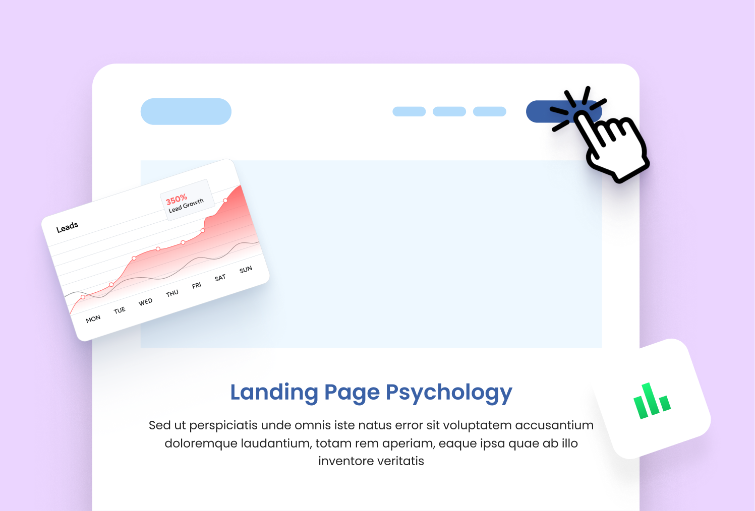
The A/B Testing Revelation: Data-Driven Growth
What if a simple tweak could double your conversions? A/B testing is the secret weapon that reveals what truly works on your landing page—by comparing two versions and letting the data decide.
How to Use A/B Testing to Optimize Your Landing Page?
Test your Headings
The right words can make or break engagement.
Experiment with CTA Colors & Placement
Small changes in design can drive significant results.
Try Different Images & Layouts
Visuals impact user engagement.
Refine Copy & Offers
Test different messaging for clarity and impact.
Conclusion: Crafting Landing Pages That Convert
From the excitement of first impressions to the fascinating psychology of colors, user behavior, and A/B testing, we've explored what really contributes to a successful landing page.
It’s not just about aesthetics—it’s about strategy, psychology, and data-driven decisions.
When you incorporate principles such as the F-Pattern for smooth user flow, minimizing decision fatigue, and leveraging the Zeigarnik Effect to enhance engagement, you’re not just attracting visitors—you’re crafting a delightful experience that keeps them coming back and motivates them to take action!
Key Takeaways:
✅ First Impressions Matter – Capture attention in the first 3 seconds.
✅ Color Psychology Works – Use the right colors to build trust and drive action.
✅ Less is More – Reduce choices and distractions for better conversions.
✅ Guide Users Naturally – Structure content using scanning patterns like the F-Pattern.
✅ Leverage A/B Testing – Optimize continuously with data-backed decisions.
A landing page should be like a welcoming guide, making it easy and enjoyable to navigate. Every design choice is a step toward a common goal—helping users convert seamlessly.
References & Further Reading
1️⃣ Jakob Nielsen’s Research on Web Usability – Nielsen Norman Group
2️⃣ Color Psychology in Marketing – The Psychology of Color in Marketing and Branding
3️⃣ The F-Pattern & User Behavior – Eye Tracking Research
4️⃣ A/B Testing & Conversion Optimization – Optimizely Guide to A/B Testing
5️⃣ Decision Fatigue in UX – Psychology Today
6️⃣ The Zeigarnik Effect & User Engagement – CXL Research


%201.png?width=1016&height=912&name=image%20(54)%201.png)