Knowlegebase: Hubspot FAQ Module
- Blog /
- Knowlegebase: Hubspot FAQ Module

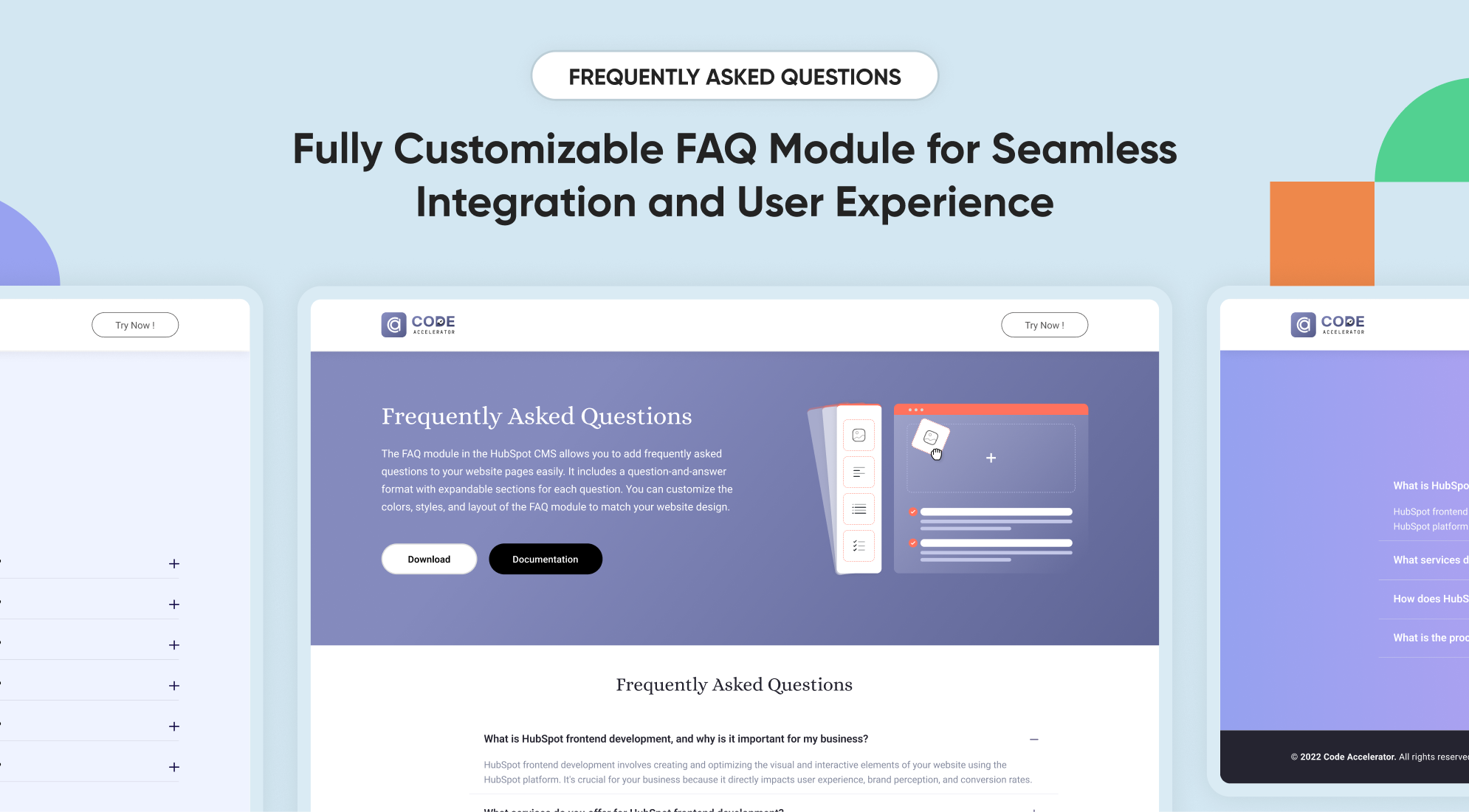
Customer support is essential for any business, and a well-organized FAQ section can significantly reduce the workload on your support team. Our FAQ Module is designed to streamline this process, enabling you to create, manage, and display FAQs on your website. In this knowledgebase, we will explore the features and setup process of our FAQ Module.
Key Features :
- Customizable Layouts: Choose multiple layout options to match your website’s design.
- Responsive Design: The FAQ section is optimized for all devices, ensuring a seamless experience for your users.
- Search Functionality: Integrated search functionality allows users to find answers quickly.
- Collapsible Sections: Organize your FAQs into collapsible sections for easy navigation.
Setting Up the HubSpot FAQ Module :
- In the main dashboard, go to the ‘Content’ tab and select ‘Website’ or ‘Landing Pages’ based on where you want the FAQ section.

- Choose the appropriate page on which you would like to use it.
.png?width=2850&height=1440&name=Screenshot%20(20).png)
- Search for the "FAQ with Accordian" and Drag and drop the module into the desired location on your page.
-2.png?width=2872&height=676&name=Screenshot%20(20)-2.png)
Module Defaults Options:
Heading & Description :
You can customize the content displayed in your FAQ Heading Sections. Easily modify and refresh the "Heading" and "Description" as desired, and even choose to hide the section if you wish.
Options :
- Heading & Description Hide/ Show Toggle
- Heading Type feature for Heading
.png?width=2384&height=1400&name=Screenshot%20(22).png)
Search Bar :
You can customize the design of the search bar. You can easily change the placeholder and button label of the search bar and hide the section if needed.
Options :
- Search bar Show/ Hide Toggle
- Button Position
- Button Label
.png?width=2770&height=1314&name=Screenshot%20(24).png)
FAQ Accordions :
You can natively customize the layout in 2 columns or one column. Easily change the icons, add your question and answer, and include a CTA in the answer if desired.
Options :
- Column Options
- Choice
.png?width=2820&height=1378&name=Screenshot%20(25).png)
-
- Answers FAQ
- Question FAQ
- CTA Enable
- CTA Choice
- CTA Label
- CTA Link/URL
- Answers FAQ
- Choice
Icons Select :
You can customize the icons when opening and closing the FAQ accordion.
.png?width=2616&height=1114&name=Screenshot%20(27).png)
-
-
- Icon Position Alignment
- Icon Vertical Alignment
- Open Icon
- Close Icon
-
Module Style Options:
Module Setting :
Adjust the maximum width of containers to fit your layout preferences. Fine-tune the spacing between elements for both desktop and mobile views to enhance visual appeal and usability. Enhance the look of your sections and modules by choosing suitable background colors and gradients. Set unified styles for headings across your module.

Heading & Description :
Users can customize the width, bottom spacing, max width and content alignments.
.png?width=2734&height=994&name=Screenshot%20(29).png)
Heading Settings :
Users can customize the typography to fit the Heading's font size, weight, and line height in Mobile & Desktop.

Description Settings :
Users can customize the typography to fit the sub-heading or description font size, weight, and line height in Mobile & Desktop.

Search Setting:
Users can customize the spacing, button, and input field design, including corners, colours, and spacing, to align with their branding.
.png?width=2722&height=740&name=Screenshot%20(32).png)
.png?width=2776&height=912&name=Screenshot%20(33).png)
.png?width=2746&height=1120&name=Screenshot%20(34).png)
Accordion Setting:
Users can customize the background, content size, border, colours, box-shadow, and corner radius to match their branding.
.png?width=2808&height=956&name=Screenshot%20(35).png)
Question Setting:
Users can customize the typography for mobile and desktop, including spacing.
.png?width=2778&height=888&name=Screenshot%20(36).png)
Answer Setting:
Users can customize the typography for mobile and desktop, including spacing.
.png?width=2858&height=884&name=Screenshot%20(37).png)
Answer CTA Setting:
Users can customize the typography and spacing for mobile and desktop, including spacing, background colour, label colour, corner radius, hover colour, and box shadow..png?width=2850&height=1164&name=Screenshot%20(39).png)
icon Setting:
Users can customize colour for active and default icons
.png?width=2752&height=412&name=Screenshot%20(40).png)
We hope you will love working with our FAQ module and creating a seamless experience for both your users and marketers on your team. Here at Code Accelerator, we strive to ensure that your experience with HubSpot is a great one! If you need a custom HubSpot module or require a customized HubSpot CMS or CRM setup, please contact us.
 Shubham Mishra

%201.png?width=1016&height=912&name=image%20(54)%201.png)